6 Reasons Everybody Hates Landing Pages

 ContentPowered.com
You know what a landing page is, right? I’m not using the broad definition of “anything an ad leads to” here. I’m talking about specific pages filled with information all with one goal; getting people to fill out a form. They don’t have social sharing buttons, they don’t have navigation, they don’t have links out; nothing. All they have is information and a form.
When was the last time you ended up on a landing page and really felt like you wanted to be there? When was the last time you filled out one of those forms? Oh, sure, you’ve joined mailing lists and downloaded free ebooks, sure, but in my case most of the time I do that, I’m doing it from in-blog marketing. Hello bars, slide-in pop windows, lightboxes, exit intent pops; these are the modern marketing wave. Landing pages are kind of 2010.
Now, I don’t think landing pages are ever going to die out completely. In fact, I think there’s a valid role for them, in the marketing funnel for some businesses, some of the time. However, I think many modern marketers are trying to use every possible method of conversion they possibly can, and aren’t paying enough attention to user experience.
Landing Pages Often Interrupt Browsing
The primary problem I often have with landing pages is that I’m looking for something specific in terms of information. Probably 99% of the Google searches I do have an ideal end result in the form of a blog post. I’m looking for an in depth case study, an anecdote, a source for an article, or something similar. When I run such a search, I often open up the top seven or ten search results, then tab through them to see which ones meet my needs.
The trouble here is that, sometimes, the link I click is not the link I end up with. Occasionally it’s misleading meta data on a landing page, so I end up on a landing page that doesn’t really answer my question. After all, landing pages are designed to sell, not to inform. So now I have a handful of hopefully decent blog posts to read and a landing page. What do you think I’m going to do? If you answered “immediately close the landing page without looking into it,” you’re pretty much correct.
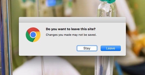
Then there are the cases where you’re browsing something and the website intentionally redirects you to a landing page. It’s very much a bait and switch, particularly if it’s a script-based redirect and doesn’t happen every time. It’s not quiet a landing page, but the Forbes welcome page that loads up before you can view an article the first time in a day is one particularly obnoxious version of the theme.
There’s Too Much Advertising Everywhere
One major gripe I have with landing pages in this sense is that when you do then go to visit the main site, you’re often greeted by a full screen ad in the form of a Hello Bar or a time-delayed lightbox pop. This essentially turns the website into a landing page temporarily, except the landing page can scroll away or be closed to still bring you to the main goal of your visit. This does a lot to make dedicated landing pages obsolete.
Many sites these days are simply layered with far too much advertising. It’s a problem that, I believe, Google is going to address in the next few years. It’s similar to how, four years ago, you would see pages with two dozen banner ads or AdWords units scattered around, leaving very little room for the content.
The same thing is happening now, it’s just deemed less offensive because the user can exit out of the advertising. You load a site and a Hello Bar descends, covering the screen. You close it and scroll a bit, and a lightbox pop shoes up. You exit out of that and scroll a bit more, and one of those little corner boxes rises up, demanding attention. I’ve even seen those boxes be animated to slowly circle the screen, one of the most obnoxious scripts I’ve seen this decade.

This isn’t even considering the actual banner and text ads the site may be using, from AdWords to Infolinks. It doesn’t count sidebars for conventions. It doesn’t count guest posts and sponsored stories, turning the very content into an advertisement as well. There’s simply so much advertising going on that it’s like pushing through a jungle to find the content. Some sites it feels like taking a machete to underbrush in the hopes of finding a lost city.
I’m not above saying that I’ve blacklisted certain sites from my casual and professional browsing due to the density of the ads, regardless of how opt-out-able they are. I’ve also made liberal use of script blockers and ad blockers picking specific elements. This is why I feel like Google will be taking action; it’s getting to be too much.
They Don’t Give Enough Information
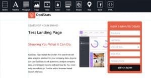
One of the cardinal sins of a landing page is to not have enough information, and yet I’ve been seeing it more and more recently. Some of the old lists of “best landing pages” out there show landing pages that are very little more than a single field form, an image, and a title. Yes, I get that Dropbox is a pretty simple service, but don’t you think I might have some questions? Maybe I want to learn about limitations, about transfer speeds, about costs, or additional features. All the information is there, but it’s not on the landing page.
Why not? Sure, people test landing pages and optimize them for conversion rate, but that’s missing the point. When you only have two possible actions – convert or bounce – it’s easy to consider the conversion rate to be the end goal. However, there’s more to a website than conversion rate. A “landing page” that is an informational blog post or resource page, with links to other parts of the site, can have fringe benefits on top of the conversion rate.
Think about it this way. If you have two landing pages, each that receives exactly 1,000 pageviews, you might go for the one with the higher conversion rate, and sure, that will get you more immediate profit. However, if the lower converting page also gets people to explore your site at a higher rate, perhaps those people will become customers in the future. Instead of two outcomes, you have three: convert, bounce, or become a lead.
 How to Tell Which of Your Pages Land the Most Sales Chances are, people arrive to your site…

Lead generation is just as important as conversions, and in many cases the conversion you’re measuring is just a lead. You have to get them to click on your ad to your landing page, you have to get them to fill out your form, you have to get them to read your correspondence through email or pick up the phone when you call, and you have to sell to them directly from there.
Meanwhile, a lot of that work can be done for you if you allow users to visit your site more naturally. They browse, they answer their own questions, they become leads that just don’t need to be subject to your direct sales. Much of the millennial crowd these days is made up of people who don’t like to be pressured into a sale; they like to research and take their time. They rebel against sales calls, and even determine that they won’t buy from companies that use high pressure sales tactics. They want to be in control of their decisions, and so a landing page is hurting you with that demographic.
They Ask For Too Much Information
Some landing pages go the opposite direction and try to pack themselves full of value, which in and of itself is fine. If I come across a landing page that looks more like a detailed FAQ and knowledge base, I’ll be more inclined to stick around and see what else there is to be found. Then I get to the opt-in form, and all bets are off.
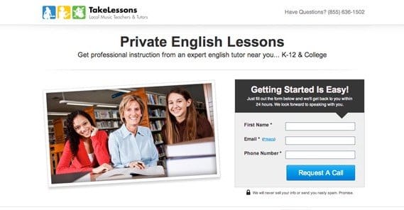
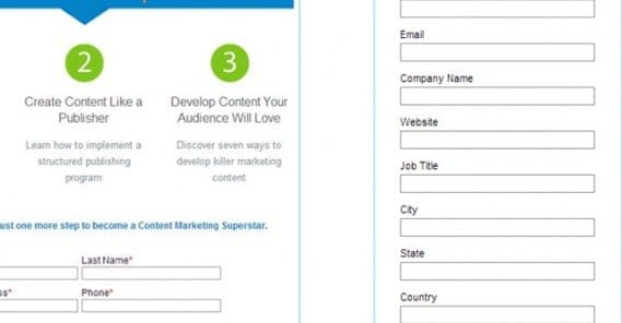
I often give this advice in conversion rate optimization from the other end, to people who are intent on using landing pages. Every field in your form is a stumbling block. Every single one. At the bare minimum, asking for an email address is fine. If you then ask name, sure, but some people will drop out. If you ask for company name, more will stop. If you ask for role in the company, even more will drop away. If you go on asking for enough information to fill out a job application on behalf of the user, you’re going to get very few conversions, and at that point some of them might actually be mistaking it for a job application.
The best forms on a landing page are the forms that have very few fields. Again, though, that’s primarily aimed at older generations. Anyone under 30 these days is likely to not want to fill out lengthy forms that they know are just going to lead to email spam, phone spam, or direct mail.
The best landing page for these people is actually a product page. Think about Amazon for a moment. Individual products don’t have landing pages. Amazon very rarely uses dedicated pages, and when they do, it’s for some major release like a new Kindle.
They Rely on Autoplay Videos
This one is really more of a problem with sites and marketers than it is with landing pages. Black hat marketing – spam marketing – tends to use fairly optimized techniques that work, but are annoying as hell to encounter when you’re not in their target demographic, which is usually “stupid people.”
I can almost guarantee that at some point in your life you have come across a site that is essentially one long vertical column. It’s designed with a half a dozen different fonts, an equal number of colors, and a bunch of sizes and formatting layers to make it look dynamic and emphasize key phrases. They top off the page with a smiling face of a man claiming to be an authority or the person who was cured, or whatever is relevant for the product on sale. In marketing, you often see it as the guy who “makes tens of thousands of dollars a week” doing essentially nothing.
Right there at the top, 9 times out of 10, is an autoplay video hosted on the site. The video starts up with a sketch and some narration, and it ends in a few seconds once you’ve frantically found the pause button and turned it off. It’s one of the single most annoying things to find on the internet, short of actual malware sites.

Admittedly, not all landing pages abuse this kind of video content. Most legitimate businesses know better than to use autoplay video, at the very least. Even so, whenever I see it, that site is going on my blacklist.
They Misrepresent a Company
Remember, the primary goal of a landing page is to sell something. The company wants to make a profit with as little effort put in as possible. For a long time, the idea of having a blog was a supplemental bit of marketing at best. The landing page today is a bit of a relic, because it’s entirely focused on one message: “We’re the best, our thing is the best thing, you want our thing, here’s why our thing is the best thing, buy our thing which is the best thing.”
When I start thinking about a product I want to buy, I’m going to look into the company. I’m going to check out their website, I’m going to check out their reviews, I’m going to look for third party sites, the whole works. I’m not going to be convinced by what a landing page says, because really, how can I trust that? A guy walking into a hospital saying he’s a top tier brain surgeon isn’t going to be taken at his word for it, he’s going to need external verification.
There’s a role for landing pages, particularly in B2B and in areas where there’s not much competition. If your audience is susceptible to direct sales, by all means, use one. However, I believe you can successfully run a business without creating a single traditional landing page.
Written by Kenny Novak

Kenny is an SEM and SEO professional. He uses blogging and content marketing as a launchpad for small businesses looking to grow their online presence.