15 of the Highest Converting Landing Pages
 ContentPowered.com
The eyes are the window to the soul, and the landing page is the eyes of the conversion funnel. It’s the make or break moment. You’ve captured the reader’s attention. You’ve hooked them in with your ad. Now you have to nail the sale, and to do that, you need the best possible landing page.
Now, out of necessity, every business for every product is going to have a unique landing page. You can’t very well create a one-page landing page for everything you sell, unless you’re selling everything in one large bundle. You can’t copy a landing page from another business, either. Even without duplicate content issues, you aren’t selling the same product, your sales funnel isn’t the same, so it just doesn’t work.
Still, you can learn a lot from existing, high-converting landing pages. Here are some of the best from around the web.
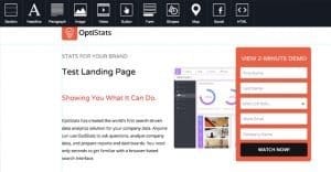
Unbounce’s Landing Page Course
Obviously enough, the company that literally wrote the book about landing page optimization has one of the best landing pages around. It’s really easy to see exactly what you need to be doing to convert. You get plenty of textual support in convincing you what you’re getting and why you should get it. You have more text deeper down that tells you more, if you’re not convinced. Plus, you have all those testimonials telling you about other satisfied users. What’s more to want?
WebDAM
There are two great things about this landing page. First is the conversion form. The site design is blue, so the CTA button is a nice high-contrast orange, only slightly obscured by the graphic to the side. The icons are particularly nice, a creative way to spice up the same boring form everyone uses.
Second is how well it fits within the page. Responsive design makes it fit no matter your resolution, scaling the text for the perks and testimonials as necessary.
Of course, the DAM pun helps in the humor department too.
Template Marketplace
This landing page has one benefit that I want to point out, as a trend that’s becoming more common and more necessary. Do you see a long, boring sign-up form on the page? Nope. All you see is a quick and easy sign up button. When you click that button, a lightbox subscribe form appears, complete with a graphic showing you how far along the conversion process you are.
I could do without the infinite-scroller nature of the product listing below, but interested users will be able to dig through it to find exactly what they want before they’re asked to sign up, so it’s a point in their favor.
Dropbox
Dropbox has wide graphics and plenty of compelling text to get users to convert, and they have the quick and easy sign-up button I mentioned above. They also have a nice gray bar at the bottom, showcasing the easily-recognizable logos of some of their customers. You’ll notice something about this customer list; it’s not skewed. You have a number of different industries and company sizes represented, so everyone who visits sees a few they recognize. They’re also all easily recognizable logos, they aren’t logos that look muddy or confusing in a low size grayscale.
The big cartoon man tells you exactly what to do, and the form is automatically filled in with sample text that doesn’t interfere with typing in your own information. When you click to the page for the first time, the number at the top spins up to the number it settles on, which draws your attention immediately. Click in individual sections of the form, and the cartoon man’s arm points to that section. None of that was necessary, but it goes the extra mile and tells you this business means business.
Bills
This is a super basic landing page asking you a single question; how much money do you owe? Select an answer and another question appears. Fill in the information it asks, and two things happen; one, they check to see if you qualify. Two, they present a form to get a quote.
 Which Landing Page Layouts Get the Most Sales? Your landing page is like a mystical…

A few things are great about this landing page. For one thing, you’ve got the interactivity of one question at a time. Second, you have the passive harvesting of information you don’t have to add to the form. Bills knows the basic scale of your problem before you tell them a thing, and can approach you with the information most relevant to your situation right off the bat.
Hootsuite Pro
You’ve got your graphical banner, check. You’ve got your high-contrast CTA button, check. You’ve got your graphical and textual illustrations of what you get. You’ve got a second CTA for anyone convinced by that section. You’ve got your logos, though they’re a bit muddier in a small font. You’ve got a detailed benefits table at the end, and it all works together. Then you’ve got yet another CTA, for anyone who needed that much more convincing.
Liquidations Online

Here you have a bright yellow banner enticing people to ask for a quote, and then the standard lengthy set of scenarios and reasons for signing on with the company. In particular, you can see here an illustration of a non-US company catering directly to their market, rather than a global market. To US-centric SEOs, the language all seems a little off. Still, it has everything it needs to convert the audience it attracts.
Intuit Quickbase
The top graphical banner on this site rotates, but every picture is carefully chosen to avoid distracting from the blue/orange contrast button for a CTA. You also have the logos at the bottom, this time in full color to showcase Google’s affiliation with the site, along with very potent quotes from the companies involved.
Styler
A site for a high-profile tailor, Styler’s landing page asks for all the relevant information up front, gives you a quick and easy in if you know what you’re looking for, and gives you a detailed – and collapsed by default – FAQ at the bottom if you have any questions.
Web Profits
If you’re coming to this site knowing what it does, you’re front-loaded with everything you need. If you’re new to the site, you can scroll down a bit and get a great detailed explanation of what they do and why you need their service. You even have another CTA at the end.
H.Bloom
As a business that thrives off their design, it stands to reason that H.Bloom’s landing page showcases that design. Great photography to show off their products as illustrations of their process set them apart.
Conversion Lab
Conversion lab is special, in that their homepage has everything. Literally, everything. There are no sub-pages on the site. All of the links just take you to places further down the page, with the exception of the footer links, which offer an alternate language or a link to their social media pages. Even the CTA button just pops out a sidebar, rather than taking you to a form page.
Industrial Strength Marketing
This landing page is notable for one primary reason; it’s timely. Football fans just celebrated the Superbowl, and this page plays off that with a football-themed set of icons and language.
Inbound Emotion
Sure, the site is Spanish, but it has one feature that more landing pages could stand to implement; a floating CTA form. Need more information, want to scroll down? The form follows you. It’s always there, ready for whenever you want to convert.
Written by Kenny Novak

Kenny is an SEM and SEO professional. He uses blogging and content marketing as a launchpad for small businesses looking to grow their online presence.