Which Landing Page Layouts Get the Most Sales?
 ContentPowered.com
Your landing page is like a mystical portal. On one side is your dark castle, full of treasure for adventurers willing to delve inside. On the other side are the green and verdant lands where everyone lives. You, uh, I guess want adventurers to come try to steal your treasure so you can steal their skeletons? I don’t know, this metaphor got away from me.
The point is, your landing page is incredibly important as a gateway that turns regular website visitors into paying website visitors. Therefore, you want the best landing page you can get.
Now, if you’re going to have a great landing page, you need to start with greatness. Why not copy what another business is doing, and adapt it to your own needs? Here are a whole bunch of examples you can try to adapt as a template for your own landing page.
Muck Rack
This page is pretty unique. It starts with two large graphics taking up half of the screen each, with labels and buttons. When you hover over one, it slides and expands to reveal a form to fill out. If that alone doesn’t convince you – and it might not, because it doesn’t have a lot of information up front – there’s plenty of information below, set to very nice typography. Every section has a conversion button along the way, as well, ensuring that visitors always have a way to convert no matter how far they scroll.
Read It For Me
A business that specializes in converting business ebooks into easily digestible videos should have a good sales pitch, because it’s kind of a complex idea and needs some selling. This landing page has that. It has a large picture of a smiling woman – always good for the emotional sympathy – and an example video. Then, if you wanted to scroll down, it has reasons to try their service. In particular, these reasons are short summaries of salient points, which is exactly what you’d be getting all the time if you contracted their service. It’s like a free demo!
Codecademy
This site teaches you how to code. The graphic indicates that yes, you will be learning how to code, and the form is quick and easy to fill out. Scroll down and you get deep testimonials, including a video and several very personal stories. It doesn’t need to explain any more about the service; you already know why you’re there.
Contently
Contently wants you to tell great stories. Visit their landing page and you’ll learn this, in large font. Then you see the logos of some very large, prominent brands that use the service, and a CTA button. Normally, a button should stand out a lot more, typically in a different color. In this case, it works because it’s the only button-like element on the page. Of course, if that doesn’t sell you, scrolling down gives you a whole bunch of rationale, explanation and more CTAs.
Wistia
Go ahead and visit this landing page for a second. What do you see? A patterned background, a large form for your email address, and a call to action for signing up. What is Wistia, what does it do? To find out, you need to scroll around or explore the site. This landing page is designed specifically for people who already know what Wistia is and what they do. Minimalism is good for a highly focused page.
 5 Examples of Successful CTA Marketing Campaigns Your call to action is an essential…

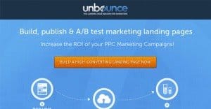
Unbounce’s Landing Page Course
This landing page is a bit unique. It’s darker than most landing pages, with a bright red button to convert. Red usually indicates a stop, but it works in this context. You’re immediately inundated with information, and there’s plenty more when you scroll. The important part to notice here is the directional cue; your eyes are easily drawn to the CTA in numerous ways. There’s not even a form to fill out, not until you click the button.
Basecamp
Basecamp has been mentioned before on this blog for its great landing page, but it’s worth mentioning again. When you load the page, the number at the top spins up, drawing your attention to the top. Then you scan down and you get bullet points for sales pitching purposes, and a cartoon drawing indicating what to do. Click from form field to form field and the cartoon adjusts to follow you. For a little easter egg, try filling out the email field with an invalid string; he’s suddenly no longer happy, and points out your error.
Webprofits
An Australian site for the list, Webprofits follows some slightly different rules than what you typically get with American SEO. The best part, though, is the dynamic form. Fill out your website URL and the rest of the form appears, with that field already filled out. It’s a nice trap to get you to continue with the form. It also doesn’t bar you from scrolling down and reading the rest of the pitch, even with the form expanded.
Conversion Lab
There’s a form hidden on this landing page somewhere. Can you guess where? It’s recessed to the side, and it pops up whenever you click one of the CTA buttons. More importantly, it goes away when it’s not wanted. You’re free to explore the site, and when you decide you want to convert, there’s always at least one button ready to bring that form right back.
Manpacks.com
Manpacks is like the Dollar Shave Club, but for a more robust selection of products shipped with no fuss. It’s designed for men, it’s marketed for men, and the macho background connects with men. It’s really easy to get started, though the process is a bit more complex than the DSC.
All of these landing pages are unique, and very few of them are designs you can use as templates. There’s a reason for this; you’re not really going to be able to take a landing page wholesale and get it to work for you. Instead, you need to focus on finding the elements of each that work for you. Is it the minimalism? Is it the deep details? Is it the imagery? The fancy code? It’s up to you to decide.
Written by James Parsons