How to Add a Lead Generation Form to a Landing Page

Landing pages have one thing in common, regardless of the company or the product or service. That thing is the opt-in or lead generation form. It’s a singular form made to gather information about the people interested in your business, whether it’s people looking to buy your product, pay for your service, download your ebook, or attend a webinar.
Lead generation forms are surprisingly serious business. A few simple tweaks to a form can double or halve the amount of interest it generates, all because of the nature of the forms themselves.
The Essential Elements of Lead Generation Forms
Every lead generation landing page needs a form, and every form needs certain elements to be successful.
Get these right and you’re ahead of 90% of the businesses out there, those that either don’t use or don’t optimize their lead generation funnels.
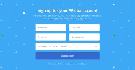
1: Form positioning. First of all, your form should be above the fold for most devices and display resolutions. It’s going to be prominent, front and center, though not literally the center of your page; you need details to make it attractive, of course. This is why so many landing pages put their form off to the right side, so the natural left to right reading movement gets visitors to read the details of your page first, then the form.
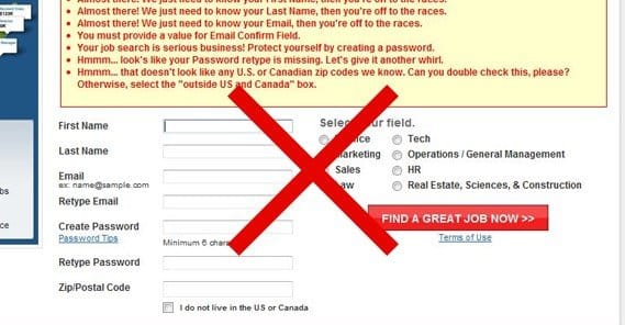
2: Form length. I’ll talk momentarily about what information you should harvest with your form. In general, you’ll have to find the right sweet spot between length and information. The more information you ask for, the more qualified the lead will be, and the easier a time you’ll have reaching out to them. However, the more information you ask for, the fewer people will actually take the time to fill out the form and submit it. This is actually why two-step lead generation has become so prominent in recent years.
3: Field choice. Which pieces of information do you choose to ask for? What do you consider essential to know about a lead when you want to follow it up? You need to collect enough information to try to hook the visitor with something personal to reel them in, but you can’t ask for so much trivial detail that it’s impossible to use it all. You have to decide between personal information the user might not want to give out, and business information they might not have. I can’t help you here; every business has different needs when their sales team reaches out to individual leads.
Part of this determination is asking yourself a question. “What makes a lead qualified?” A qualified lead is a lead that meets your target demographics and displays the signs that they have a problem your product can solve. It’s a determination of how likely that user is to become a customer. To figure this out, you need to have intimate knowledge of your customers, why they seek out your product, what compels them to convert, and how to ask for that information in your opt-in form.
4: Privacy statement. In testing done by Content Verve, they found that assurances of privacy – specifically the sentences “We guarantee 100% privacy. Your information will not be shared.” – increased opt-ins by almost 20%. Now, your mileage may vary with this, but you always want an assurance of privacy and, ideally, a link to an actual privacy policy that reflects the same sentiment. The actual privacy policy doesn’t need to be in-depth legalese, though you can certainly hire a lawyer to produce one for you.
5: Submission button. You obviously need a submit button that works, but there’s more to it than simply “submit.” Your call to action has a wide range of possible optimizations, which we’ve talked about in depth before. The CTA needs to match the form, and it should match the offer you’re presenting as well.
Making Information Mandatory
What information should you ask for in your lead generation form? I can’t give you hard and fast rules, only suggestions. The problem is that it’s going to be unique to your brand and business. You need to have a solid chat with your sales team to determine what they find most useful when hooking new customers, and you need to figure out how to ask for that information.
The first thing you need to do is recognize that every individual field in your opt-in form is essentially a step in a staircase. There’s a prize a the top of the staircase, which is whatever you’re offering alongside your product, be it a mailing list, an ebook, a coupon, or what have you. The stairs are steep, though, and the more of them there are, the more people will look at it and decide they don’t want to climb.
Hubspot claims that you have about six seconds to hook a reader into filling out your form. The larger and more daunting the form is, the less likely you’ll be able to hook them in that time. If nothing else, a large form draws attention away from the actual content of your landing page.
A study performed by Eloqua talked about how many questions businesses asked in their forms, and what their conversion rate was. The sweet spot seems to be between five and ten questions, though there was a bit of an uptick at a shocking sixteen, which is pretty crazy. I’m guessing it was a unique situation, and not one you’ll be able to replicate.
Before you start building your form, you need to determine what possible information you can ask for. I recommend making a list. Here are some ideas: full name, email address, phone, company name and address, website url, role in business, number of employees, b2b vs b2c, business niche, open-ended questions like “what’s your biggest <industry> challenge?” and so forth.
Once you have a list of the possible information you could ask for, you need to narrow down the list. Prune out the things that won’t matter. Separate the rest into two categories: absolutely essential and “nice to have.” At the simplest level, all you really need is a name and email address. Nothing else is truly essential for contacting someone. However, more information can help you filter leads more easily. At this point, you can also decide what information would be on your first stage and what on your second, for a two-stage opt-in.
You can also investigate ways you can harvest information without needing a form. Hidden fields give you the ability to pull in additional meta data about the user, like their geographic range based on their IP address, their browsing device and user agent, or the referral ID of the site they came from to reach your landing page. This tends to be information useful more for curiosity or for de mographic research than it is for sales. A lot of users don’t want to know about any information you harvest without their knowledge; they’re better off not knowing. Once they get suspicious, you’ll have a harder time converting them. Even if it’s harmless at the outset, they have no way of knowing what else you may have gotten.
Again, have a solid talk with your marketing teams to figure out what information is necessary. Some will be useful demographic information to put to use in future ad targeting. Some will be sales hooks your sales team can use to turn the leads into customers. Some will be extraneous and only exists for categorization. It’s up to you to find the right balance.
Implementing the Form
Now that you know what sort of fields you need in your form, you need to actually implement it. There are a ton of different opt-in options, so I’ve made a quick rundown.
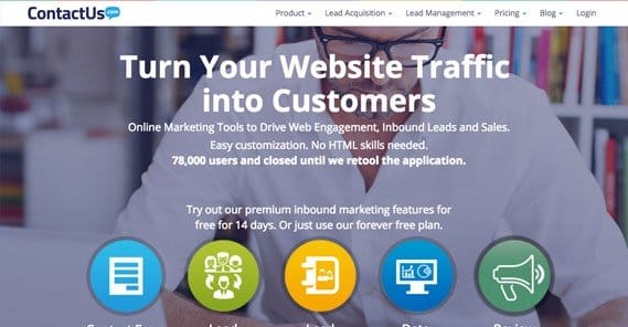
Contact Us – This site has both a form builder and lead management software, as well as analytics and additional tools to help you generate leads more efficiently.
Most of the features are locked behind their higher tier plans, but if all you want is a lead generation form to give you information for your own CMS, you can go with the lite option, which is only $20 per month. For $50 you can get call tracking, split testing, and a handful of other features. Split testing could very well be worth the price, if you’re not experienced in doing it manually.
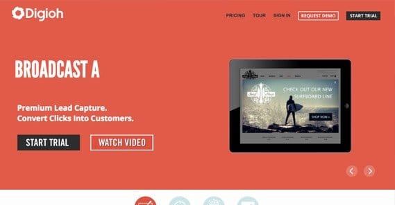
Digioh – Used by a wide number of high quality sites, Digioh is one of the top tier lead generation programs out there.
Unfortunately, it is very much not a setup designed for small businesses. Their lowest priced package is a whopping $500 per month if you’re going month to month, and while it does come with very few limitations, the best features – primarily targeting – are for even higher end packages. If you don’t have a massive advertising budget, I’d probably pass on these guys, but only because they’re overkill for most of us.
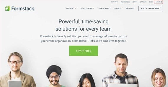
Formstack – This company has a very good basic form builder with a visual interface.
It has a high degree of security, has calculating fields if you want to use it for payment processing, and of course supports both API integration and form analytics. It’s probably one of the more robust options for a cheap price. The basic forms are $40 per month, but an upgrade to $100 per month gets you Facebook tabs, Google Analytics, integration with Hubspot and SalesForce, and workflow processes. Split testing is too rich for my blood, though, at the $250 monthly plan. The only downside is that the cheap plan is limited to 1,000 submissions per form and only 20 forms.
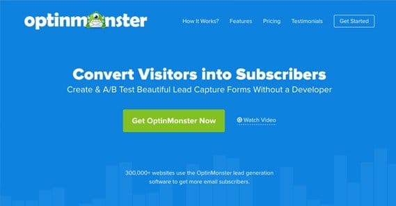
OptInMonster – This one is one of the cheapest and therefore one of the most widespread options for lead generation forms.
The basic tool is only $10 per month and gives you unlimited forms with split testing, targeting, and reporting. Paying more gets you floating forms on up to three sites for $20 per month, and $30 gets you exit intent pops, referral detection, slide-in boxes, campaign scheduling, and a whole lot more. There’s a reason why OptIn Monster is one of the top tier lead generation platforms, and it’s not just the pricing.
Marketo Lead Generation – This is one of the top end enterprise-level options along with Digioh, primarily because they have about a thousand different programs and apps, all of which work together as parts of a greater whole.
They don’t even list pricing, because they have so many different bundles to pick through to find what you want. I list them because they’re popular amongst certain industries, but you’ll know if you’re in the range to want them.
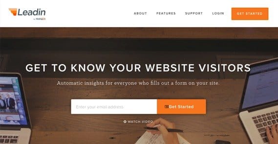
Hubspot Leadin – Hubspot has one primary benefit over many other form builders, and that’s an import form option.
If you’re using a different form builder or custom forums, Leadin can read and recreate them in its own engine when you switch. Plus, their forms come in a variety of different locations, including drop shades and slide-ins. It’s also notable because, while it may not have a lot of advanced features, it’s also free to use.
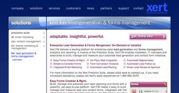
XertFM – This option is pretty strange, because the site looks like it’s straight out of 1995, and doesn’t inspire a lot of confidence.
Their software is pretty good, from all reports, however. I couldn’t tell you their pricing, though; you need to message them yourself.
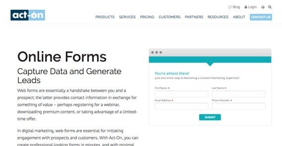
Act-On – Another of the high-end, does-everything lead management and marketing suites, this one is perhaps not quite as good as the others, but it’s still very robust and has a ton of features for its steep price tag.
It’s the most expensive option on the list, and again, it’s overkill for most of you. Still, some people like it, and they have some unique features, like activity tracking for individual contacts throughout your various marketing streams.
So there you have it. At least one of these form builders should be able to fill the role for you admirably. If not, or if you have a better suggestion, feel free to let me know in the comments.
 ContentPowered.com
