5 Ways to Increase the Sales From Your Landing Page
Your landing page is the lifeblood link between your customers and your profit line. Without it, you have to hope something on your blog catches their eye well enough to hook them into a product, or you have to hope your sales team can connect with the right people at the right time to make a purchase.
Obviously, you need to make sure your landing page is as focused and optimized as possible. You don’t have to worry too much about SEO, beyond the traditional steps to avoid copied content or spam. Just worry about conversion rate and optimize your site as best you can.
1. Improve your Page Design
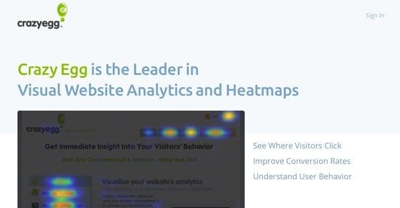
The design of your landing page says a lot about your audience and your product. Some products are simple and don’t require more than 100 words in bullet points to get everything across. Some services are much more detailed and require a lot more information. Some services, like Crazy Egg, are able to post a landing page with under a dozen words, but with a button to expand it with a lot more content to answer any questions the user might have.
Your landing page should be easy to navigate. Ideally, the only navigation the user has to do is scroll down. Interactivity should be limited to scrolling, filling out the CTA form, or clicking play on a video. Every additional step is a roadblock to conversions.
Make sure you format information in bullet points rather than paragraph format. Short and sweet. Full sentences are nice, but your readers skim. They might not even read your copy, if it looks too dense.
Use images and layout cues to direct user attention to each part of the page in turn. This can be as subtle as a clever use of whitespace, or as overt as a cartoon graphic pointing the way.
2. Design a Better CTA
Your call to action is the final word, the driving sentence, the bright neon button that gets users to take the plunge and register for your site, download your ebook or buy your software. As such, it’s arguably the most important part of your landing page.
First of all, don’t try to cram it in above the fold if you don’t have to. Studies have shown that putting it below the fold actually increases conversion rate. You’re free to test this out yourself, but others have done such testing and found it true enough.
I actually recommend putting multiple instances of your CTA on the page, or using a scrolling CTA script. This way, even if you have a long landing page, you have a CTA visible at all times, from the moment the user lands on the site to the moment they’ve read all of the content available.
Your CTA button needs to stand out. The easiest way to do this is to make it contrast color-wise from the rest of your page. A grayscale page with a red button, a blue page with an orange button, etc. Make sure it’s the only element on the page that uses that color, so it’s highly visible.
Don’t forget to optimize the language of your CTA as well!
3. Add Social Proof
Social proof is social reinforcement of the trustworthiness of your brand. You’ve probably seen it all over the place without realizing exactly what it is. You should strive to use legitimate social proof on your page, so users feel more confident in your brand and your product. Here are a few ideas:
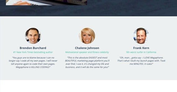
- Use customer testimonials. Don’t just write a generic “I loved it!” from Joe Blow, solicit real testimonials from real, high-profile users. If you could get someone influential, like Rand Fishkin or Neil Patel to review your SEO software, it’s a great boon. The same goes for anyone influential in your industry. A couple sentences, something personal, even a longer paragraph works.
- Take the testimonial concept one step further and solicit case studies out of the people who buy your product. A legitimate user with a business, using your product to boost their sales or increase productivity, says a lot when they’re willing to vouch for you.
- List a raw numerical stat for the number of downloads or the number of users of your product. When users are confident that thousands or millions of others user your product, they’ll feel as though they’re in good hands.
- List logos of trust. If you don’t have a lot of other social proof, it looks like your business is either new or untrustworthy. If you get a BBB accreditation or a TrustE certification, you can leverage that for more trust.
4. Don’t Forget SEO
Landing page SEO is a unique beast, because you don’t have much space to work with. You’ll want to focus on certain keywords, of course, but you can’t over-do it because you have limited space for any sort of keyword density. Try to make sure your keyword appears in your meta title and description, as well as a time or two in your text, but don’t go out of your way to shoehorn it into the copy.
Don’t forget video SEO if you include a video and optimize it on YouTube or another video host. Likewise, optimize your images and include alt text with a proper description and a keyword included.
5. Use an Explainer Video
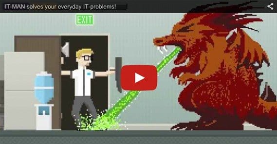
An explainer video is a short video, typically 90-180 seconds in length, that explains your product or service. These are typically animated, though they might include live action elements or be entirely live action if a live product demonstration lends itself well to your landing page. The video will help keep people on your site, it will replace some tedious copy about how your product works, and it will answer common questions about your service.
You can produce these videos on your own, or you can pay freelancers or hire studios to create them. It’s up to you, and it depends on your budget and how complex your video needs to be.
 ContentPowered.com
