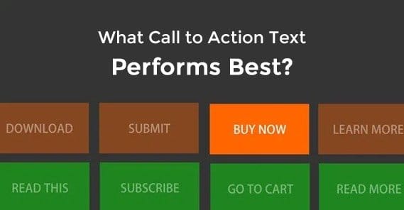
What is The Highest Converting Call to Action Text?
 ContentPowered.com
There is a question posed in the title of this article, but I’ll tell you right now, I’m not going to give you the answer you want if it’s a question you would ask. See, the question of a specific “highest converting text” is invalid. There’s not going to be any one answer, and thinking there will be ignores the entire concept of optimization over time, the importance of context, and the need to adjust your strategies on an ongoing basis.
Remember, something that works for one business might not work for yours. Coca-Cola might be able to use a “drink now” call to action to great success, where a small clothing outlet wouldn’t be able to touch it. The validity of a call to action depends on the business, depends on the action you want the user to perform, and depends on the audience.
The reason I dislike this kind of question is because it betrays a lack of understanding of how to iterate and improve. The people who ask for “the best” are likely just looking for a shortcut to the top, and no such shortcut exists. The best you can get are examples from other people saying what they did, and that won’t always work for you.
Rather than simply tell you a best, or even a list of the best, I’m going to give you some processes you can use to figure out which is the best for you. Yes, it will take a little more work than simply throwing one up there and letting it go, but that’s just the way the modern world of marketing works.
The Prime Characteristics of a Good Call to Action
So what makes a call to action good? What turns a button from bad to mediocre to good to great? You can distill it down to a handful of qualities.
First, a good call to action is pretty much always a button. People are trained to look for buttons to click, and it’s very easy to miss a hyperlink even when it’s a focal point. People look for buttons first, and only when they can’t find one will they look for a prominent link, and many will fail to take that second step. A good call to action is going to be a button, however you happen to place it.
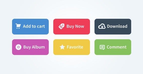
The button, of course, has to be functional. You can’t make a button with a call to action and then rely on users clicking a link right below it. You shouldn’t get tricky with it either; if the button doesn’t look like a traditional CTA button, it’s going to be overlooked.
Second, the button text needs to be compelling. I’ll go into this in greater detail later, since it’s the primary focus of the article, but for now suffice it to say that “click here” is not a good bit of copy. The copy surrounding the button is also important. There has to be a lead up to the button.
Third, the button needs to be in a logical place. Don’t place your CTA at the top of a landing page. Don’t place it in an out of the way corner of the footer. Don’t hide it away behind a form. You could consider making it float along the side of the page, but test to make sure that’s effective.
Fourth, they need to stand out. There’s a lot of talk on the web about the best CTA button color, but the conversation is flawed from the start. The problem is, colors have different contexts. A pale blue CTA button is going to go largely unnoticed on Facebook, where everything is shades of blue and gray. However, orange might stand out with a high level of contrast. Conversely, Hubspot is primarily an orange website, so a blue CTA button is more likely to stand out. Most people choose green in that situation, but green might not work on a website like one of these.
There are a few other aspects to a good CTA, but they all come down to landing page optimization more than optimization of the CTA itself. For example, a good CTA button is alone in its function on the page. A landing page should be focused towards getting the user to perform that one action, so links to side pages, distracting side ads, or other such off-purpose items drive down the performance of the page. That’s outside the scope of this post, though.
A Lesson in Vocabulary
The choice of words you make for your buttons will have a pretty big effect. It can quite literally be the difference between a conversion and a bounce. I’m going to give you a list of words you can test, but that’s the critical word: test. You’re going to have to:
- Determine if the word fits with your landing page’s purpose and the purpose of the CTA.
- Create a button using the word in a phrase to determine if it fits in the layout for your page.
- Run a traffic-limited test to determine the conversion rate of the button using that word.
- Repeat with the next word, so you have a list of words and their conversion rates, which you can then filter to determine the most effective word for your CTA.
Remember, the word you choose should reflect the action you’re trying to get the user to take. You’re not going to tell users to take a drink when you’re offering them a piece of software. You’re not going to use “buy now” when you’re trying to get them to sign up for a mailing list. That’s what I mean by filtering words for the purpose of the page.
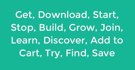
The first category of words are the action verbs. Verbs invite action that, ideally, is beneficial for the user. Tell them to “start here” so they can initiate a process that improves their lives in some way that the landing page expounds upon. Tell them that clicking the button will help them “build a community.” Tell them to “join” your mailing list for exclusive deals and a community they can’t find elsewhere. Tell them if they click, they can “discover” the secret to brand building success.
The second category of words are the negative words. They play on the user’s fear of failure. You’re essentially saying “look, if you don’t click this, you’re going to be worse off.” Words like “sick” work here, as in “sick of wasting time with ads?” Words like “worried” imply that the user might be “worried about missing great links.”
 15 Case Studies of Highly Converting Calls to Action There are two types of marketers in…

A third category is not so much an independent category, as it is a matter of perspective. You have to choose between the “your” or the “my” perspective. Are you telling the user they can “claim your free ebook” by clicking the button, or are you saying they should “claim my free ebook”? The latter tends to work better, because it gives the user a sense of possession. The ebook is already theirs; they just need to take one more step to get it in their hands. The other sounds more like a sales message, and drives some people away. That said, test each variation to see which your audience responds to the most.
For a fourth category, we have words that add urgency to the call to action. After all, your website isn’t going anywhere. What incentive does the user have to click now, rather than click in an hour, or click in a day, or click in a week? The simplest word is “now”, as in “click now to learn how to succeed in webinars.” You can also add on a timely descriptor, like “hurry, this offer expires today!” A similar example is “before”, as in “claim your copy before they’re all gone.” Of course, you have to follow up on the urgency. If you claim that the offer is going to expire in five days, it better not be available 10 days later. It ruins your credibility.
This is just a small selection of words. You can see a few more examples, with longer descriptions and reasoning behind them, here at Wishpond.
As one final note, you should avoid most of the common CTA phrases. “Join now” and “buy here” and, most horribly, “submit” are all bad options. You can still test them, but I’m betting that you’ll see a big difference between the boring options and the creative options almost immediately.
Live Examples
Now let’s take a look at some examples. As of the time of this writing, everything below is accurate. That’s not guaranteed to remain static, however. A lot of these companies are changing and testing new landing pages all the time. Chances are, however, that whatever they change to will still have the same general characteristics, and the same value, so you can see how they’re good examples.
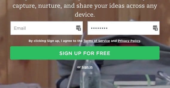
Evernote – Evernote’s homepage right now is a decent example of a CTA text. It uses the basic “sign up” but it adds on “for free”, which tells the user that they’re getting a service for no cost. The button is green on an animated background, so it stands out. That’s probably a side effect of green being their primary color, but that’s not necessarily a bad thing.
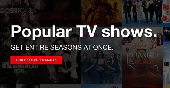
Netflix – the streaming media giant has a bright red button on a very dark page, with “Join free for a month” as their text. Again, this takes a basic, boring “join now” and stitches on additional value. You get a free month of their service when you sign up, and the background is a wide variety of possible shows and movies you might want to watch.
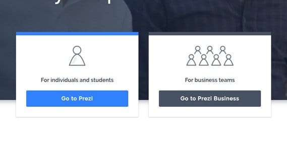
Prezi – I include this one because there are a few bad practices and a few good ones all on the same page. At the top you have “get started” in the corner, but it’s out of the way, so the eye isn’t drawn to it. The core focus of the page is the division between Prezi and Prezi Business, which is good to have, though it doesn’t really entice me to join them. Scroll down a bit and you see another, “See the science,” which is a much better CTA for what it does. They’re telling me their service has science behind it, and that it’s available to be analyzed myself if I want.
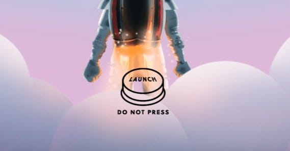
Huemor – This is a design agency, and it really shows in the fancy dynamic site they have going. They tell you they create memorable experiences, and indeed they’re presenting you with one right away. Their CTA button is a literal launch button, complete with “do not press” that just makes you wonder what will happen if you press it. Certainly nothing bad, right? I recommend trying it yourself.
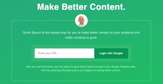
Quick Sprout – Neil Patel’s flagship site throws you into the deep end with an all-green page with very little on it besides a few words and his smiling face. I don’t like that his button is just green on green, but he can get away with it because it’s almost the only thing going on with the page at all. Plus, the button tells you to “login with Google” which informs you immediately that you don’t even need to make an account. As long as you have a Google account, you’re good to go.
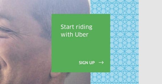
Uber – The ride-sharing app has a website, and it splits between two CTAs. The primary CTA is the “start riding with Uber” box, since you can expect that the majority of the people visiting the site are looking to get a ride. Up at the top, though, is “become a driver.” People who know about Uber and are interested enough to be a driver will recognize that their interest is secondary on the site and will be able to find the button quickly, but it doesn’t get in the way of users looking for the site’s primary purpose. Plus, they’re both green on a white and gray page that has a little blue and not much else.
So you can see, you’re in good company if you get a non-standard CTA going. You’ll notice that all of these examples are companies that very likely test a variety of CTAs, and none of them have ended up with the same content. You, too, will develop a unique CTA of your own.