5 Examples of Successful CTA Marketing Campaigns

Your call to action is an essential part of your marketing. Everything else just leads users to a point where they’re exposed to your CTA. I mean, ideally you’ll have spent their time in the funnel buttering them up and making them more receptive to your push, but in the end, it’s only the push that really matters.
We’ve written before about creating a good call to action. How about we take a minute now to show off some examples of great CTAs?
Crazy Egg
Crazy Egg, that heat mapping software for websites, has an excellent homepage call to action. It’s one large sky-and-hills graphic, the company logo, and a question. What’s making your visitors leave? There’s your value proposition; a method to find out the answer to that question. How do you convert? Well, there’s only one box on the page, so presumably you add your website URL to the box and click to log in.
Users who already pay for the service can, meanwhile, click the little sign in button in the upper corner. It’s small, it’s out of the way, and it doesn’t distract from the main focus of the page.
Meanwhile, users who aren’t sold on what Crazy Egg does, or who just plain don’t know, can click the “tell me more” button below. It doesn’t take you to a new page, though; it just brings up a wealth of information that was formerly hidden below the fold. And by hidden, I really mean hidden; you can’t even scroll down to it without clicking the button. Read the information and, if you’re convinced, there’s another CTA button down at the bottom for you. Great design all around.
Basecamp
I’ve mentioned this one before, but that’s because it’s simply one of my favorite landing pages online. It’s a little more cluttered than the average landing page, but I think it’s worth it for the tradeoff.
First off, when you load the page, a dynamic spin-up number draws your attention to the top of the page. This is an easy guarantee on the part of the developers that everyone starts with their vision in the same place. From there, you can’t move your eyes without looking at the three potent value proposition bullet points at the top.
Then you have your cartoon man pointing to the form where you can fill in your information to start a free trial. The cool part of this graphic is how he looks static until you click from field to field in the form. He moves to point at each field in turn. He even changes expression if you put in an invalid piece of information in a field, like a malformed email.
Then, of course, you have plenty of information below the fold, for any user who isn’t quite sure they want to immediately convert. My only gripe with it is how un-formatted it is; it’s just plain black text on white background. Still, Basecamp has used the same page for over a year; I’d say it’s doing something right.
Uber
The sometimes-controversial ride-sharing app has a lot going on with it for the landing page. At the top, you have the CTA to become a driver, which is mostly invisible to users who don’t know what Uber is or don’t want to be a driver. It’s not glaring or in the way, but it’s also not hidden for those who are interested.
The entire page is designed with mobile in mind, which makes sense because Uber is a mobile app. It has the standard icon for a mobile menu, and it has a large graphical rotating slideshow of various users in various demographics, showcasing how it works for everyone.
Scroll down a little more and you have large panes for links to individual information. The information pops up instantly upon clicking, rather than directing you to another page. It’s a subtle reinforcement that Uber is a fast, convenient service.
My only gripe with this particular landing page is how the “find your city” map pane is all the way at the bottom. I think it’s an awesome CTA and should be focused a little more.
OKCupid
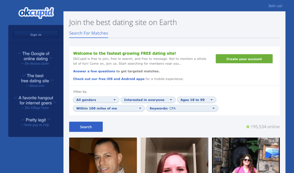
OKCupid is one of the calmer, less maligned dating sites on the web, and it has a pretty good CTA on its homepage to back it up. It reminds me a lot of Crazy Egg, in how it’s a large, simple page with a single focused CTA. In this case, the CTA is to add your gender and orientation, then click continue.
The first bit I like is the use of the word “continue.” It’s great copy, because it makes you feel like you’re already some significant amount of the way through the signup process. This is reinforced with the information in the three graphics below, one of which tells you the signup only takes two minutes.
The other two buttons show a cute little sock metaphor for their matching algorithm, and a smiling cup that indicates their mobile app. I’m not sure I like the cup graphic, but it’s cute and a little off-beat, which is exactly what you hope you’ll find in the people on OKC.
Any of These Email CTAs
It’s pretty hard to show you a specific example of an email I haven’t personally gotten, so you’ll have to make do with a link to another site and their demonstration of some good email campaigns.
One thing you’ll notice each of these messages has in common is the combination of large graphics and minimal copy. These aren’t newsletters, they’re sales pushes. The companies behind them are informing their followers about sales or new events. They aren’t going deep into the whys and wherefores.
Conversely, if you look at the bad examples on that list, you see email messages that look a lot like those spam newspaper inserts full of pricing information for the local grocery store you never visit. Far too much text, far too unfocused and lacking the kind of potent single message you want out of a good CTA.
The point of this fifth example, even if it’s more like a dozen examples in one, is to show you that your CTA doesn’t have to reside on a landing page. It can be the focal point of an email, or the central purpose of off-site advertising, or anything else.
 ContentPowered.com


