Are Scrolling Calls to Action Acceptable for SEO?

 ContentPowered.com
There’s one school of thought that tells you that the vast majority of people visiting your landing page – 80% in fact – don’t read anything below the fold. They don’t scroll down at all. Anything you put below the fold might as well not exist for these people. Therefore, if you’re putting your CTA at the bottom of the page, below the fold, 80% of your visitors won’t see it.
This seems like common sense. After all, you don’t want to put your CTA where people can’t see it. If they can’t see it, they can’t convert. The problem with this school of thought, though, is that it’s wrong.
Here’s the thing; it’s been tested that putting your CTA below the fold actually increases your conversion rates. Multiple studies performed with different sites in different industries in different years have all come to the same conclusion.
Ignore the Fold
I believe that if you think about it a bit more, you’ll see why this all makes sense. It seems like it shouldn’t; if your CTA isn’t visible, people won’t convert. On the other hand, who were those people? The 80% that don’t convert won’t convert whether they scroll or not. The fact that they’re even on your site is a testament to the general interest nature of your ads, not to their interest in your product.
Meanwhile, the users who are actually interested in your product will see your landing page and will see that it’s packed with information. As interested readers, they’ll scroll down to read more. It doesn’t matter that it’s below the fold; they want to read it so they’ll go where the content is. Thus, a CTA at the bottom of the page converts more because the only people reaching it are interested users.
Another factor is the message itself. You don’t start a sales call and push your sales techniques on full blast within 30 seconds. No, you make small talk, you talk about the product, you answer questions, and you turn on the sales talk when they’re more clearly interested.
An Eye to Positioning
So, if you don’t put your CTA at the top, you put it at the bottom, right? Well, that would be a good first step.
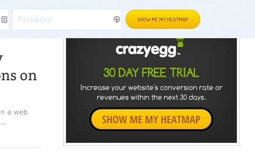
The second step is to take your landing page one step beyond. For example, look at Crazy Egg. Their landing page is almost completely blank. You can convert with their CTA right at the top, if you know why you’re there and you’re interested. If you’re not interested, you can leave. If you’re somewhere in the middle, you can click the “tell me more” button and a whole new section of the page springs to life.
 Which Landing Page Layouts Get the Most Sales? Your landing page is like a mystical…

From there, you scroll down, and you can read more about the software. If that convinces you, there’s another call to action waiting at the bottom for your convenience. You can convert on the spot.
You can also take this theory one step further. Go ahead and make a long landing page. You have plenty of space to put as much information as you want to along the way. Now break up the content with additional instances of your CTA. Position them in different alignments, but make sure they’re all the same CTA, so you’re not diluting your message. In general, make sure you have one CTA visible at all times, no matter how far down the user scrolls. When one CTA scrolls off the page, another should be scrolling on.
This can pack your site full of CTAs, though, and it can start to look cluttered. What’s a decent solution?
One solution is what Inbound Emotion, a Spanish site, does. Their call to action is a form on the side of the page that follows you as you scroll down. You have the CTA above the fold, and as you scroll down to read more, the CTA follows you. You can, at any point, click over and convert, no hassle.
A more subtle version of the same thing can be seen on ConversionLab. Their CTA buttons are spaced out, but when you click them, the form appears from the side of the page. It’s always there, waiting for you to click to convert. Once clicked, it scrolls with you for as long as you’re interested.
Another option is the corner pop, a CTA that rises up out of the corner of the screen like a notification. These follow the page as well, but aren’t as large or as obtrusive as full sidebar forms like the above examples. You can see this one on any Hubspot blog post, just scroll down a bit and it will show up.
The Effect on SEO
So, the real question is, does using one of these slide-in or scrolling CTA scripts hurt your SEO?
I’m fairly certain it does not. As long as your landing page is acceptable within the limits set forth by Google, they aren’t going to care about the CTA. The slide-in CTA on blog posts, for that matter, is also perfectly fine. It’s no different, code-wise, than scrolling social media buttons. Heck, for that matter, those buttons are CTAs of their own; they have the implicit message of “click me to share this post on social media.”
Google isn’t going to penalize you for these small slide-in CTAs. If they were going to, they would penalize you for exit intent pop-ups. Those, too, are perfectly safe. The only way it would hurt your SEO is if the script slows down your page significantly or is broken. Google doesn’t like broken scripts, and users hate pages that take too long to load.
If you’re convinced, you can find the code to implement a slide-in CTA box here. You will need some JavaScript and some CSS editing, as well as a little bit of extra code added to your template. It looks complex, but it’s actually quite simple and easy to implement. The hardest part is designing the CTA in the first place.