5 Tricks to Avoid Ad Blindness from Your Visitors

Ads are tricky to get right. You can have a great ad, but if it’s positioned in the wrong place, users will ignore it. Sometimes it’s a fast process, sometimes it’s slower. It’s all ad blindness, and it’s the bane of every marketer.
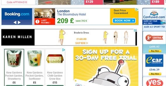
Fast ad blindness is a type of ad blindness that occurs throughout the web. For years, websites always put their ads in the same places; the top of the page beneath the navigation, and in the right hand sidebar. You still find users today who completely ignore the sidebar because they’re so used to everything there being an ad.
Slow ad blindness occurs only on your own site, and can happen to all of your ads no matter where they’re positioned. It typically happens when you use the same ad for too long; people stop paying attention to it and their brains ignore the fact that it’s there at all.
Of course, I just made up these categories. They’re both forms of ad blindness regardless, however, and the solutions to ad blindness are typically the same regardless of ad placement or how quickly blindness occurs.
1. Rotate Ads Often
This is the first and most obvious change to make, but it’s a change that you need to keep making more or less the entire time you’re running ads on your site. It’s a habit you need to get into, not a change you can make once and forget.
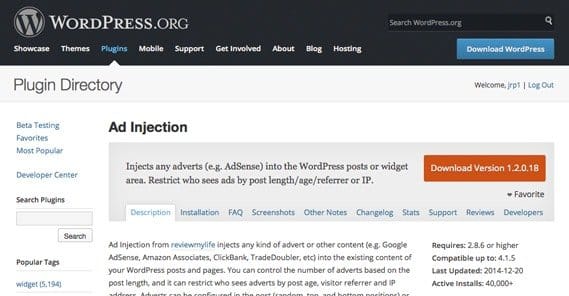
Ideally you will have a selection of ads you can switch through dynamically, whenever a page loads. This means you have a selection to rotate through, which gives you a longer lifespan on any individual ad. You can also swap out one or add one to the rotation to freshen things up, particularly for long-time readers.
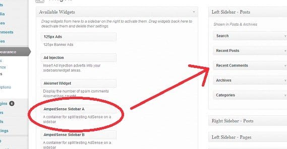
Thankfully, if you’re using a third party ad program like Google, you have access to ad rotations already. All you need to do is set them up. If you’re not using a program that allows you to rotate ads, well, it might be time to find a new program.
2. Place Ads Near High Traffic Areas
Ad placement is perhaps almost as important as ad creative. Poor placement means your ads will receive basically no attention. Infolinks did an eye tracking survey a while back, and they determined that some of the most common ad placements received something like 30% attention at most.
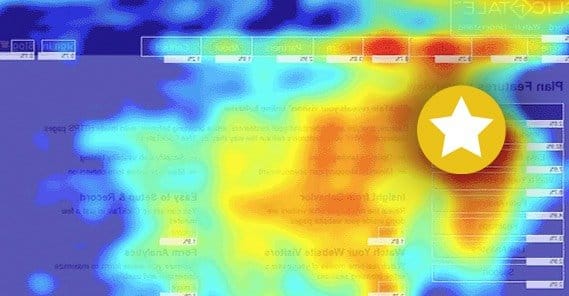
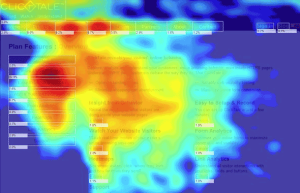
The trick to putting ads near high traffic areas is that you need to know where those high traffic areas are. Typically they’ll be next to “related links” boxes, social sharing buttons, and top bar navigation. To find out the specific places on your site where you get the most traffic, you’ll need to turn to analytics. Specifically, you’ll want to use a heat map, something like Crazy Egg, to track the places your users click most often.
There are two reasons to put ads in high traffic areas. The primary reason is just that those areas get more attention. Users need to look at your navigation in order to click it, and ads in the navigation thus see more attention. The second reason is a little tricky; when a use mis-clicks, they sometimes click your ad. It might not do you much good in terms of conversions, but if you’re running PPC, hey, a free few cents.
3. Use Fewer Ads
This technique is partly a good user experience, and partly good SEO. The fewer ads you have on your site, the more attention those ads receive.
The primary reason for this is simply because of the way spammers used to permeate the web. One ad earned money when it was viewed. To make more money, advertisers would plaster ads all over their sites. It reached a point where you would see sites with more ads than content. Of course, back then content didn’t matter. SEO was hardly a glimmer in the eyes of the masses.
Over the course of the following few years, a dichotomy emerged. Sites with a lot of ads looked spammier and thus received less attention than sites with fewer ads. This made the technique less valid, so only the spammiest of spammers used it. Google cottoned on at some point, and now ad density is a negative factor in search ranking. So, fewer ads means users are more likely to see your ads, and they’re more likely to trust you. At the same time, Google is more likely to send more traffic your way the fewer ads you have.
4. Try the Left Sidebar
Going back to that eye tracking study I mentioned earlier, one of the most innovative and interesting places to put an ad is in the left sidebar. Most websites tend to center their content, and many use right-side bars, but few use a left sidebar. You can center your webpage and occupy the left gutter with ads, even scaling those ads to different size devices like a responsive site.
Additionally, ads above the fold or ads that scroll with the user tend to get more visibility than ads that don’t. Ads below the fold, particularly footer ads or ads in the lower right corner, are virtually invisible. Avoid those locations.
5. Use Native Advertising
Native advertising is a recent buzzword in ads, and it has been coming to the fore in the last few years, particularly now that a phrase has been coined.
Native advertising is essentially advertising that looks native; that is, it looks like part of your site. For example, if you have a sidebar that’s full of links to other posts on your site, and those posts change based on user reading history, it’s not unexpected for those displayed titles to change. Including a title in the rotation that leads out to another site as a paid ad is native advertising.
Essentially, any time the user clicks on a link on your page and thinks that they’re going to another page, that’s a native ad.
One thing to note about native advertising is you have to be very careful with it and affiliate links. Affiliate links need to be disclosed, according to both Google and the government. Other forms of paid links, though, are perfectly fair game.
 ContentPowered.com
