5 of The Highest Earning AdSense Ad Layout Positions

 ContentPowered.com
Where you put your ads on your page is almost as important as the content of those ads. Some positions will annoy users, particularly if they’re interrupting site use or hindering some function of your site. Other positions will fall by the wayside as the user never sees them. How valuable would a banner at be below the footer, do you think? How many users would complain if you had an ad show up in a lightbox over top of your content?
Google encourages you to consider your user experience when implementing ads. They offer you questions to ask yourself. What is the user trying to do on your site? What actions do they take while viewing certain portions of your page? Where is their attention?
These are factors you need to consider before placing your ads. You can’t put your ads too far out of the way, or they’ll never be clicked. You can’t put them right up front, or your users will be distracted and ignore them out of disgust. You can’t clutter your page with ads, or you hurt your user experience.
What sort of positions can you use to place your ads, to maximize their impressions and their clicks, without violating Google’s guidelines?
Before We Begin
The first thing you’ll want to take a look at is this article, published on MonetizePros. It’s a very good beginner’s guide to ad placement, and includes a few graphics and terms I’ll be referring to later.
One concept you’ll want to remember when considering ad placement is the pattern people use when they read. English is a language that reads from left to right. It also displays from top to bottom. Some languages in other parts of the world buck this trend, but we’re primarily talking about English websites, so English is the determining factor.
So people read left to right and top to bottom. In practice, this means an F-shaped pattern, focusing on subheadings, skimming, and more detailed reading in certain sections.
As you might expect, the upper left corner gets the most attention in this scenario. Therefore, placing content on the right side of the page is going to get less attention and less clicks than the same content on the left side. Content above the fold, likewise, gets more attention than content below the fold.
You also have to take into account the gutter of a page. Most standard web design these days has significant space on either side left open for widescreen monitors, while allowing smaller devices to scale down without issue. There’s also almost always top bar navigation, which is generally ignored unless it’s needed. Placing an ad above the navigation means it will be virtually invisible.
Now let’s take a look at five good positions you can use for ads.
1. Ads Within the Content
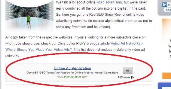
This is becoming increasingly common. You can see an example – from ReelSEO – in the article I linked above. A paragraph or two into your content, you put a horizontal banner or text ad. It gets attention, because it breaks up the user’s ability to read from one paragraph to the next. It’s not intrusive, because it’s not exceptionally tall, and it doesn’t push much more than a few lines below the fold.
The important part of this position is that it’s above the fold, but close to it. The idea is to make it an “artificial footer” if your page didn’t stretch below the fold. The user, if they want to continue reading the post after the first few paragraphs, can scroll down and see it. If they don’t, they still reach the end of the introduction and see the ad.
Always make sure this ad is slim, vertically. Banner ads and other wide-but-short ad formats are ideal here.
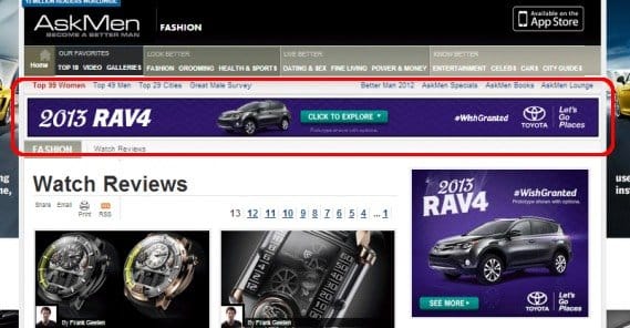
This is a more traditional banner ad position, resting below your navigation, where it won’t be ignored as easily as an ad above navigation. Again, this type of ad should be wide but short. The primary reason for this is because Google can and will penalize your site if the ads push the content entirely below the fold. If you’re displaying more advertising than content on a given page loaded on a normal monitor – not one of those 4K beasts, that is – you’re at risk.
One benefit to this ad position is the accidental click. When a user moves to click your navigation, there’s a chance they’ll click your ads instead. Even if they don’t, when they move to focus their attention on your navigation, the close proximity of your ad will attract their attention.
Be very careful about taking too much advantage of accidental clicks, however. Don’t make a hover-over drop-down navigation menu flaky enough that a user can accidentally click an ad because the nav bar disappeared. I’ll go over that a bit more in a minute, when we discuss Google’s placement guidelines.
3. Left of the Title
As I mentioned before, many sites have fixed-width designs, in a way. That is, they will shrink down to fit smaller devices, but they won’t expand beyond a certain level. There’s a good design reason for this; it’s easier to read a typical page width than it is to read an extra-wide page on a widescreen monitor. It also makes short paragraphs look bulkier. If your page was as wide as a widescreen monitor typically is, even sizable paragraphs can look short and thin.
This means there’s generally a good amount of whitespace to the left of your content. Many sites use this gutter to place social sharing buttons or a scrolling call to action, that follow the user as they scroll. You can use the same techniques to place a vertical banner that follows the user as they scroll.
This placement tends to be more ideal for your own products than for Google ads. That is, you’ll get more attention and less scorn from advertising your consulting or your ebook than you will running Google ads. That said, it’s still a good ad position.
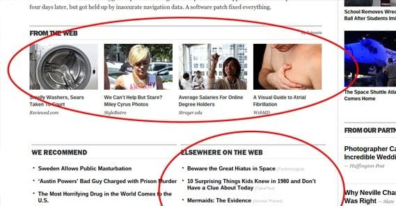
4. Native Ads Beneath the Content
 5 Tricks to Avoid Ad Blindness from Your Visitors Ads are tricky to get right. You…

How often do you scroll down a page and see a block of thumbnails with titles and short descriptions, trying to get you to click on other articles to read now that you’ve finished this one? This site uses it, Forbes uses it, Cracked.com uses it; it’s incredibly widespread.
Here’s a secret; half the time, those related post links are actually sponsored ads. The immediate end of the content is a great place to put an ad, ideally an ad that relates to the content the user just read, so they’re more willing to click to learn more. The more it looks like part of your site design, the better, within limits. Again, this is something I’ll talk about more in the upcoming guidelines section.
Unfortunately, Google ads don’t perform quite as well here as some other ad networks. Outbrain and Taboola, two of the big content marketing networks, specialize in native ads. They’re the companies you most want to use for this position.
5. Using the Gutter Whitespace
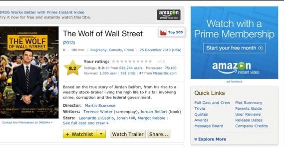
IMDB is a big proponent of this style of ad, though I’ve seen it on many sites around the web. The idea is that all the whitespace above and to the sides of your content can be “skinned” to advertise something. For IMDB, that something is often an upcoming blockbuster movie.
Both the left and right gutters will have mirrored ads that include logos and links, and their design will flow from one to the next. This is a great ad position, if you can pull it off.
Some sites go even deeper with skinning and choose a new color scheme for their site while they run a skinned promotion. This can be cool, but it’s not something every site can pull off.
Interestingly, Google has a readout of their “top performing” ads, and many of them are in the far right gutter. I feel as though these aren’t actually as well performing as they want you to believe. Their primary benefit is their size; they’re large, graphical ads that take up a huge portion of the screen, but they only really work in very wide site layouts. For smaller devices, many of them just don’t work.
Google’s Placement Guidelines
Google has a lot of rules about where you can and cannot place your ads. In general, anything that makes your site look spammy, and anything that gets in the way of the user experience, is going to be a negative placement.
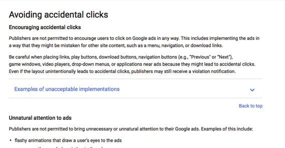
- You need to avoid accidental clicks as much as possible. I know I said they’re good above, and they can be, but that’s only when the ads look clearly like ads. Google’s rule of thumb here is that you cannot encourage a user to click on a link that looks as if it goes to another page on your site, when it’s really an ad. This is considered fraudulent activity. What this really means is that the ads have to look like ads, more than anything else.
- You are not allowed to use elements of site design to draw extra attention to ads. For example, if you have a banner below your navigation, you can’t have a message in your navigation with an arrow pointing at the ad and the words “click this to help us!” or anything of the sort.
- Your ads must be labeled only with “Advertisements” or “Sponsored Links” and nothing else. You cannot, for example, place ad links in a column labeled “resources” or “additional reading.”
- You cannot solicit ad clicks. Any time you ask your users to click an ad in order to support you, it’s technically a violation of the AdSense guidelines.
- You cannot run ads that are tall enough to push your content below the fold. An ad that pushes a couple lines down is fine; one that takes up the majority of the above-the-fold space while pushing most of your content down is not.
- You cannot offer any form of compensation in exchange for ad clicks. At all.
- Your ads are not allowed to refresh themselves and rotate without the user explicitly refreshing the page themselves.
- You cannot place ads on interstitial pages, welcome pages, exit pages, or login pages. You also cannot place ads on error pages or 404 pages. This is the primary reason why I didn’t recommend a welcome page ad above.
- You cannot use AdSense ads within emails or in a web-based email client.
- You cannot use pop-ups on your site and still run Google ads, even if the ads in the pop-ups are not Google ads.
- You cannot use ads in a frame where the primary content comes from another site.
As you can see, these guidelines are very strict about where you can run Google’s ads, and as such, they eliminate many potentially lucrative forms of advertising. If you want to run native ads, pop-under ads, welcome page ads, or email ads, you will have to use a different ad network.
Heatmaps, Hotspots and Experimentation
I have given you five different ad placements, as well as a few other ideas for ads with non-Google platforms, but I do not and cannot guarantee their value. Most websites have unique designs, you see, and that means user behavior varies from website to website. An skin ad will work great for IMDB, but it won’t work as well for a smaller no-name blog. A welcome ad works for Forbes, but it won’t work for other sites.
How can you determine which placements work best for you and your site? That’s where data harvesting and testing come in.
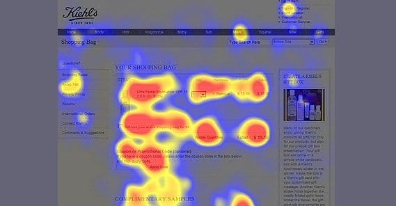
The first thing you want to do is figure out where users are looking and clicking while they’re on your site. The absolute best way to do this would be through a detailed eye-tracking study, but very few businesses are able to afford the costs of setting up and running such a study, primarily because it requires readers in person.
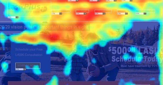
The next best thing is a heatmap application. Heatmaps generate activity reports based on user actions, primarily based on clicks, though some will actively track mouse position. You will get a graphic with colors ranging from blue to red-yellow-white depending on the density of activity in those areas.
Most of the time, what you’ll see is a variation on the F-shaped pattern I mentioned above. What you’ll want to do is look for abnormal hotspots or locations where you might be able to place an ad for more attention.
One of the most prominent heatmap applications is Crazy Egg, and I like to recommend it to most people who ask. However, in the interest of expanding your horizons – and I’m talking about how one solution doesn’t always work for everyone, it would be hypocritical if I didn’t give alternatives – here’s a list of other heatmap programs you can use.
So what about testing? The idea here is simple, and if you’ve ever done split testing for ads or headlines or landing page designs, you’re already familiar with it. Basically, what you’ll be doing is running the same ad in different positions, or in different sizes. Make sure they run for roughly equivalent amounts of time or for equivalent amounts of traffic. That way, you can see which ads perform better.
The goal is to try out ads in different places to see which gets more attention and more clicks. Once you determine that, you can test out other positions and see which is second best. Google allows you several different ads at the same time – three AdSense content units, three link unites, and two search boxes – and you’ll want to test them all. Don’t be afraid to use all of them, but test them when you do! Sometimes, adding an extra ad unit will take away from the other units enough that the return isn’t worth it. One valuable ad is better than two poor ads, in virtually every situation.
Once you’ve figured out a winning position for your ads, you’ll be able to focus on other optimizations, such as the content of those ads, the content on your site, and passive ways to encourage ad clicks that don’t violate Google’s various rules.
Speaking of Google’s rules: when you log in to Google’s AdSense dashboard, in the left navigation column will be an entry labeled “policy violations.” You can click this at any time to see if your site is in violation of any of Google’s various policies. If you see any entries in this section, drop what you’re doing and fix them as soon as possible! You don’t want to risk being penalized or even removed from AdSense over something you could have fixed easily had you only known.

A great article.
Awesome post, thanks, I actually finished the whole thing, you really gave me much to consider. Regards, Nick.
A proper ads placement is really important, its not that you should place too many ads to get the impressions. Place fewer ads but at the right area… that goes well. Thanks for the well explained article and heatmap.
Hi James, I clearly understood what you explained, but my problem is CPC related. I am getting only 0.02$ per click. Can proper ad placement increase my CPC? Please let me know. Thanks!
Hey Biplab! Yes absolutely, if your ad is super close to videos or other clickable elements, you might be getting accidental clicks. This sounds like a good thing, but when someone accidentally clicks an ad, what do they do? They close it right away. Google has something called “Smart Pricing” that will see most of your clicks are just closing the ad right away, and your payment per click will drop dramatically. This is why some sites get paid $2 per click and others get paid $0.01 per click. You want your ads to be away from any content and media so they aren’t clicked accidentally. Your CPC will change from time to time, so definitely experiment with your placements to see what pays the best. Just give it a month or two between each tweak to see what works and what doesn’t. Google doesn’t change anything slowly, so if you’re changing your ad placement every week, you won’t know what is working because you didn’t wait long enough. Lastly, make sure you’re keeping to 3 placements maximum on your site. This should be a total of all your ads. If your page is loaded with ads, you’ll get paid less for your ads and it could even impact your organic search traffic and rankings. Three ad placements should be plenty. I hope this helps!