Pick the Perfect CTA Size, Color, Location, and Text

 ContentPowered.com
I’m going to be up-front with you right now; if you’re looking for a specific answer to the title of this blog post, you’re going to be disappointed. There’s no such thing as a perfect CTA, for any of those factors. I can’t tell you a specific color that works, a specific size, a specific position, or specific text. I can give you general guidelines, and I can give you ideas for testing to make your call to action more effective, but I can’t give you a perfect recipe for success.
The reason is simply the way the web works. Every site has its own design, and thus the elements that blend in and the elements that stand out will be different from site to site. Facebook won’t use a blue CTA if they wanted to stand out against their blue site design, but a red CTA would be near invisible on Pinterest. On top of that, people get used to common techniques and start ignoring them. Banner blindness is a real thing.
So, let’s break down your call to action into four segments. You have the size of the button itself, the color of the button, the text on the button, and the position of the button on the page.
CTA Size
The typical CTA button is a relatively small rectangle, generally with rounded corners, made to look like a soft button in the Web 2.0 style. Drop shadows, highlights, and other such elements are common. However, the size and shape of your button is not limited to the rectangle. Rectangles are simply easiest to make without using an image, and are the easiest to work into the design of a site without designing around the button.

The easiest tip I can give you is to assign a value to the action your CTA represents. The higher the value of the action, the larger the button should be. However, this should be tempered by the cost of taking the action. For example:
- A low value, low cost action might be clicking to read more of a blog post. The CTA for this is typically a “read more” link at the end of the preview, and as such is not very large.
- A low value, high cost action might be purchasing a product you aren’t focused on selling. For example, if you primarily sell cameras, a sticker for a camera bag might count. The value is low because you don’t get much out of the sale of a sticker and it’s not likely to lead into the purchase of a camera, but the cost is high because it’s still a purchase the user has to make. This, likewise, is going to be a small button, likely off to the side of the site somewhere.
- A high value, low cost action might be signing up for your mailing list or opting in to a special list of preorder customers. It’s high value because those are very qualified leads, but it’s lost cost because the user doesn’t need to do more than fill out a form. This is likely going to be a large button in the middle of a landing page, and in fact is one of the most common types of buttons you see.
- A high value, high cost action would be, to use the camera store analogy again, selling the latest DSLR from Nikon. It’s high value, because it’s a flagship product and very valuable to your profit margin. It’s also high cost, because the potential for someone to drop in just to randomly buy a camera is low. These CTAs will be the largest of all and might as well be entire dedicated pages themselves.
As for testing, all you can really do here is increase and decrease the size of the button until you find the sweet spot. Most of the time you won’t have to redesign your page, just shift a few elements around for the largest or smallest button designs, and that’s it. Once you figure out the sweet spot, you can run with it for all CTAs of that level of cost and value, testing occasionally to make sure it still works.
CTA Color
Color can be as complex or as simple as you want it to be.
On the simple end of the spectrum, all you need is something that stands out. I used the Facebook and Pinterest example above, but it works for any site. If your logo, your design, and your graphical elements are all orange, a decent green will stand out enough to make your CTA look exceptional. If your site elements are all blue, an orange or red CTA will stand out.
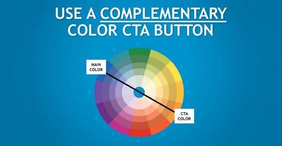
The point is to find a color that draws in attention. If you ignore images that change from blog post to blog post, you’re left with elements of color in your logo, navigation, dividers, social sharing buttons, and links. This can be quite a bit of color, but it’s generally focused in a spectrum. You’ll have blues and grays, or reds and oranges, or greens. Picking a color that stands out while not clashing draws the eye and gets people to read your call to action.
On the other side of the spectrum, you can put a ton of thought into specific color selections. Color theory is as deep as global culture. For example, the color yellow has cultural associations to Hindus as a sacred color, but in Greece it’s the color of sadness, and in France it’s the color of jealousy. In America, green can be a color for money, for jealousy, for springtime, or for the winter holidays. There are whole websites dedicated to listing elements of color theory, and they vary depending on the culture and location of your target audience.
 Color Psychology and Calls to Action With Sales Colors are important. No offense to the…

So, you can pick a color based on what stands out on your site, or you can pick a color based on what emotions you want to express to the people who visit your site. Then you test. Change your colors, go against your intuition, and see what colors attract the most traffic and the most conversions. Color is at least the easiest to optimize. All you’re doing is changing a hex value or two.
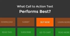
CTA Text
The button text for your call to action is possibly the most covered topic in all of marketing. There is so much hatred for the cliché “click here” button you’re liable to give someone an aneurism if you use it.
As many rules as there are for what not to do, there are an infinite number of ideas of what to do. Neil Patel on his blog uses “get more customers” as a CTA button, so let’s take a look at that. The button in the headline doesn’t have a lot of surrounding context, so it’s generic and meant to stand on its own. It tells you what you can get out of it – more customers – and doesn’t make mention of what specifically you’re getting or what the cost of that will be. Those are elements of information that might turn you off, so they’re left to the landing page behind the CTA.
Your call to action should focus on what the user gets. “Start my free trial” is a way of showing the user they get a free trial of your service out of clicking the button. For some services, a more specific CTA can be more beneficial, like Crazy Egg using “Show me my heatmap.” It doesn’t indicate free, but it tells you that you’re going to get a heatmap out of it, and since you’re already browsing Crazy Egg, you probably already have an idea of how valuable that can be.
You should also avoid generic phrases. The “click here” and “join now” calls are so basic that most people barely even acknowledge them. They have no value proposition, they have no draw, and they rely on context to give the reader an idea of what they’re getting. The trouble is, the point of a CTA button is to be the center of attention, to get that attention first and foremost. If the user doesn’t click it then, the chances of them clicking it later once they’ve read around drop.
Of course, for every rule there is the exception. Hubspot uses “get started” in their top bar navigation, even though it’s a generic CTA and there’s no real context to the CTA on any individual page. That’s because every element of their entire site is pointed in one direction, which is teaching you what Hubspot does and what the benefits are. The “get started” CTA is at the top of every page, and is thus always there for whenever you decide you want to click it.
CTA Location
Location will vary depending on the purpose of the call to action.
Different locations have different pros and cons.
- A CTA in the top navigation bar indicates that it’s something always present on your site. There’s not a lot of room for the CTA up there, but it makes up for it by being in prime visibility territory at all times. This will generally be a mid-tier CTA in terms of both value and cost, because it’s not highly pushing anything, but it’s always present and always there. This will generally be your core “buy something, anything, please” call to action.
- A CTA in the sidebar indicates it’s something you want to push for a short amount of time. Sidebars are traditionally where banners go, and as such are subject to banner blindness. You often see time-sensitive offers for ebooks and other low-cost, low-value calls to action in the sidebar. They also have to compete with social sharing buttons, which themselves are low-tier calls to action, so keep this in mind while balancing your site.
- A CTA in the midst of content indicates it’s something you really, really want to push. Social Media Examiner does this a lot with their conferences; they advertise using a box in the middle of their content, as well as a header, a sidebar, and everything else they feel like they can get away with using.
- A CTA in the footer indicates that it’s not something you really care about. The percentage of people who make it all the way down a post and see a CTA in the foot is small compared to your overall traffic, and by that time many of them have completed their purpose. Footers tend to be more informational and there only as a resource if people need them, not as anything anyone actively reads.
- A CTA that becomes the core focus of a landing page indicates it’s a specialized, typically high value offer that you want people to see and to convert into, but it’s not something for general exposure. Landing pages are a special case, and the call to action on a landing page is going to be different from the one on your blog or your homepage. Rather than advertising your shop in general, it will typically advertise your specific high value products, new products, and new offers.
- A CTA that appears in a pop-over indicates it’s something you want to push to people who are, more than likely, preparing to leave your site. These exit intent pops are valuable, if annoying, but they should always push something with a very low cost. A high cost CTA in an exit pop is going to have a 0 conversion rate at best.
Position, then, is largely determined by purpose, but you can also test the same CTA in different positions to see which purpose is best for your offer. Remember, testing is the name of the game, with each and every aspect of putting together a CTA.
Written by Kenny Novak

Kenny is an SEM and SEO professional. He uses blogging and content marketing as a launchpad for small businesses looking to grow their online presence.