10 Mistakes That Causing Your Low Conversion Rates
I’m going to tell you something that no bad marketer wants to hear, and that every good marketer already knows, but may sometimes forget.
Your conversion funnel is not perfect.
No matter how long you’ve been at it, no matter how many tests and optimizations you’ve done, no matter how much analytics, how much focus grouping, how much iteration you’ve done, you can only reach so close to perfection. There is no perfect conversion funnel, no platonic ideal of the funnel casting shadows on our internet walls.
Every conversion funnel has points of friction where you lose some of the people reaching it. If they didn’t, you would be converting 100% of the people who so much as hear about your brand or product, and that is simply unfeasible.
No matter how big the company, how much money they spend, or how optimized their process, they can’t get rid of these points of friction. All they can do is work to fix mistakes made in their ad campaigns, and improve those points of friction so they lose as few people at each stage as possible.
I’ve compiled ten of the most common mistakes that are creating friction in the typical sales funnel. Ideally, only one or two of them apply to you. Chances are pretty good several will, in any case. If you think none of them do, well, you either need to look deeper or look at variations. There’s always something you can improve.
1. You’re Not Conveying a Solid First Impression
Regardless of where potential customers enter your sales funnel, you need to give them a good first impression. This means you need to optimize your presence around the web and on your website to convey who you are, what you do, what your services are, and what benefits you can provide.
Now, you don’t need to dig in deep to these topics everywhere. The key is to make sure the information is always readily available. Your Facebook posts don’t need it, but your Page does. Your blog doesn’t need it, but your homepage does. Your landing pages are special, in that they can front-load that information and get away with it.
Additionally, customization plays a huge part in this. You have a disparate audience made up of a variety of people coming to you in different stages of life. Some of them will respond to one marketing message while others won’t. Some might want to know how cheap you product is while others don’t care about the cost. Some want to know your social integration features while others only care about customization options.
Rather than try to put all of this information into a one size fits all landing page, typically you want to make more landing pages. Hubspot shows that websites with 40+ landing pages have 12x more leads than websites with under 10 landing pages. The more you have, the deeper you can customize.
2. Your Call to Action is Weak
There are a few different ways in which a call to action can be considered weak. For one thing, if it’s not designed in such a way that it stands out from the page, it’s going to be a significant point of friction. You want it to be immediately visible at a glance, at all times, for anyone who might be interested. Typically, this means it needs to be a color that contrasts from the rest of the page. It needs to be a relatively large button compared to other links and text on the page. Ideally, it will always be visible on the page, no matter how far down a user scrolls.
You should also work to optimize the language of your call to action. You typically want language that operates from the reader’s perspective. “Get my free book” is a more effective call to action than “get a free book” or something as bland and boring as “download.”
Experimentation is going to be the key here. You always need to test variations of your call to action on your landing pages. This is where that 40+ landing pages comes in. Those sites don’t have 40 different audience segments, they might have 10, each of which has 3-4 tests running. They test different CTAs and see which one works best for which audience segment, and iterate from there.
3. You’re Not Following Up On Visits
Most of the time, when a user is exposed to your ads or ends up on a landing page, they aren’t in a position to convert. They might just be checking out your products or services. They might be interested but want to check out some others first. They might want to convert, but they could be on a mobile device and not willing to put their information in through a public network. They might be perfectly willing to convert but wan to think on it a bit more. There are a ton of different reasons why a good conversion slips away.
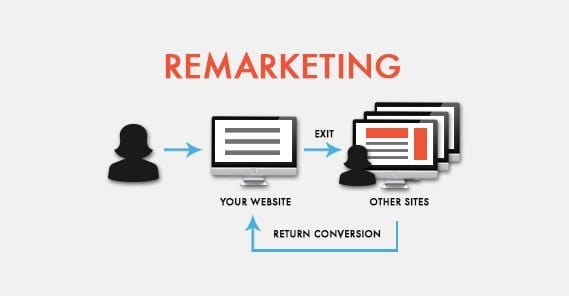
The trick that marketers use to take advantage of this is called remarketing. With remarketing, you track people who have landed on your site, usually via a remarketing cookie. Facebook has a pixel and tracks the information via script, as well.
When you build an audience of people who have visited your site but who have not converted, what you’re doing is building an audience of potential conversions. Marketing to this audience in the future, then, gives you a chance to reach out to them and hook them again, ideally in a situation where they’re more likely to actually convert.
4. You’re Not Following Up On Leads
Similar to how not everyone who visits is willing to convert, not everyone who fills out a form or opts in somehow is willing to convert right away. These people are leads, but they aren’t customers, not yet. In order to take advantage of them, you need to follow up on the opportunity they give you.
There are a bunch of ways you can go about this. For instance, if people are signing up for your mailing list, you can use that list to deliver marketing messages laced with valuable content. The content helps them see that you’re a trustworthy business, and the marketing makes them lean towards converting.
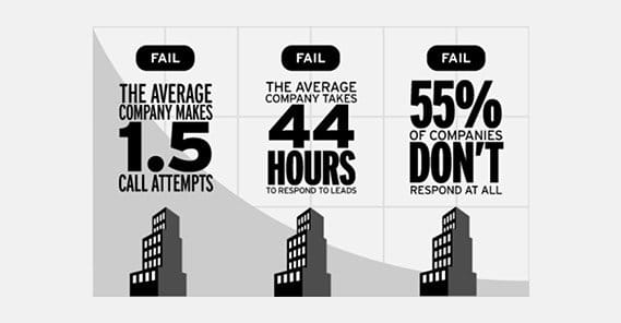
Another example is potential customers giving you their phone number. They expect a marketing contact, and that’s a job for your sales team. They have to follow up quickly, lest the lead go cold.
Above all, though, you need patience. People won’t convert immediately unless they’re really convinced you’re the right product for them. Studies have shown that often times customers need five points of contact – be it a blog post, a newsletter, or a sales call – before they convert.
5. Your Funnel Has No Sense of Progression
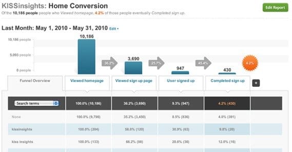
The reason the sales funnel terminology is used is because it’s an adequate metaphor for what your process should look like. At the top open mouth you pull in as many people as possible from a wide variety of streams, like your site, social media, paid advertising, word of mouth, and more. What, then, do those people do?
Put yourself in the shoes of a potential customer, one who has no idea who you are but is somewhat interested in what you do. Start at the outskirts of your funnel, at a paid ad or a social media post. What is that interested user supposed to do next? Do they go to a landing page? Alright, what next? Do they opt in to a newsletter? If so, go to your newsletters and see from there what they can do. This is where things get tangled; often brands simply use newsletters to refer to the site and other landing pages, which doesn’t progress the funnel.
Sooner or later you need to direct people to the next step, that being looking at a purchase page so they can make that vital transition from lead to customer. The trick is optimizing the path with as few loops as possible. Yes, people will go from newsletter to blog to landing page to newsletter in a loop, but you need each step of the way to link to the next tier down, the store page. That’s how the funnel narrows and people convert.
6. You’re Not Split Testing Properly
Testing and iteration is the key to success, and yet it is also fraught with peril.
There are so many ways split testing can go wrong.
- Comparing data from past records to data from the present leads to an invalid test. Seasonality is a big decider for many people, so tests need to be run as close to simultaneously as possible.
- Comparing the singular metric of conversion rate to the exclusion of other metrics is a bad idea. Sometimes a version with a lower conversion rate is lower because it’s dramatically more attractive, and forms a better base for future testing. Be aware of all the variables.
- Running tests and then ignoring the results is depressingly common. People love going with their gut over the data, and it’s pretty much always a bad decision.
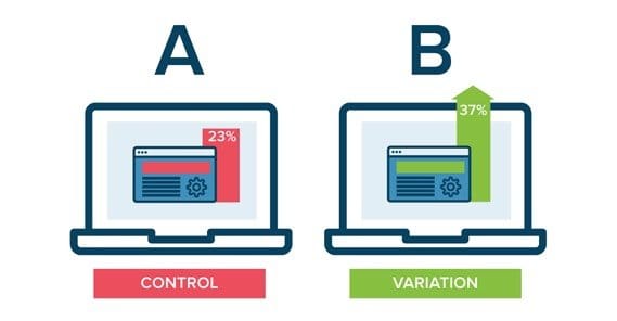
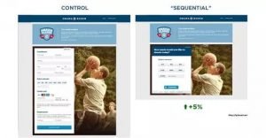
On top of all of that, split testing is called A/B testing for a reason. If you test more than one variable at once, you have on way of knowing which variable had what effect, so your test is invalid.
7. You’re Getting In Your Own Way
There are two impulses that drive marketers, one way or another. One is brevity and one is completion. Some marketers like to keep things short. Say only what is necessary, in short sentences and bullet points, and let users contact you if they need to know more. Some prefer to put all the cards on the table, with every detail up front, so users can research on their own.
Both of these are the right and wrong way to create a page. I see references all the time to sites that cut their landing pages down by 1,000 words and saw a dramatic increase in conversions. At the same time, other sites add 1,000 words of content and see the same rise. The fact is, it depends on your product and your customers. What do the need to know to convert? Figure that out and cut your page down to just that – or add it if need be – and you’re good to go.
8. Your Message Gets Lost
One thing that comes up in advertising is quality score, and one of the factors in quality score is ad relevance. Ad relevance is the concept of unity between the message of the ad and the message of the landing page. If the ad says you’re giving away a free ebook, the landing page had better be giving away a free ebook. Even if the rest of the landing page is pushing people to opt in for other reasons, or trying to get them to visit your store, you still need to provide that ebook.
When you start losing unity between ad messaging, brand presence, and landing page copy, you lose people. They start to notice the disjoint between sites and, in extreme circumstances, wonder why they even opened your tab at all.
9. You Aren’t Available on Mobile Devices
Mobile traffic has surpassed the halfway point in terms of global web traffic. There are people today who don’t have a computer, but browse the web via a phone or tablet just fine. These are people who are perfectly willing to purchase your product, but can’t, if your site isn’t designed to handle mobile traffic. Plus, mobile friendliness is a search ranking factor these days, so it pays to let those phones see your site.
10. Your Marketing Hasn’t Evolved
This is the one that gets most of you. Even if you’ve avoided the rest of these pitfalls, all too many marketers do their testing and then sit on their laurels, feeling accomplished, letting their marketing work. Over time, the messaging degrades. People become inured to your advertising, they start to ignore it, and you end up with fewer and fewer people coming in. Every campaign needs to change over time to spice it up.

 ContentPowered.com
