How to Increase Opt-In Rates on Your Squeeze Pages
Back in my days as a novice marketer I had a bit of confusion around the difference between a landing page and a squeeze page. It seems like they’re the same thing, right? They both exist to capture leads, and they tend to be singular, stand-alone pages.
The difference, as it turns out, is just that a squeeze page is a subset of the general landing page category. A squeeze page is just a landing page attempting to get users to sign up for your mailing list. It’s a matter of purpose more than design.
So, with that in mind, what are the key elements of a good squeeze page? What can you do to improve those elements, and make a better page with a higher opt-in rate?
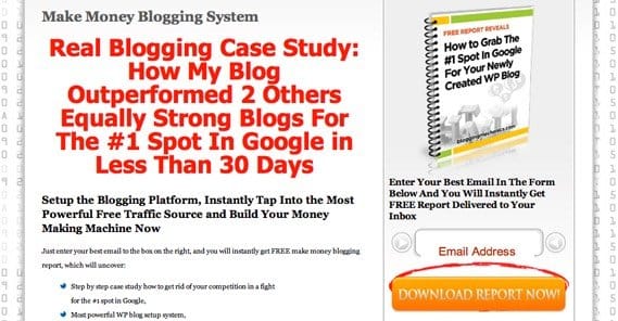
Squeeze pages in general work like landing pages, in that they’re “traps” at the end of your funnel. Once a user reaches one, they have two means of escape, ideally; one being to fill in the form, and the other being their browser back button. Squeeze pages are hyper-focused on the opt-in form and the offer associated with it, which means you should generally have as little content above the fold as possible. Convince and convert immediately, and use the length of the page to further convince.
One thing to keep in mind is that when you’re asking for an email address, you should make sure that email address is actually going to be used. Kissmetrics suggests making it clear that you’re using email to distribute whatever you’re offering, be it a theme, an ebook, or whatever else. The idea is that you’re using the email as a means of completing the transaction, rather than as a payment. If the user has to put in their email but all they’re getting is a download link, they feel like you’re just harvesting their email for other purposes. Even if you are, it’s bad form to reveal the illusion like that.
So, how can you build and improve your squeeze page and take it to soaring new heights?
Less is More
Another tip from Kissmetrics: offer less. The more you offer, the more work it requires to absorb and put to use. The thing is, most people are busy. They don’t have the time or the mental energy to absorb a massive course or series of videos. They don’t want a feature-length film about how to put your app to use. They want 5-page ebooks, they want infographics, they want very easy to use and quick to learn chunks of information. They want statistics they can quote, they want sayings they can parrot, they want knowledge they can take and immediately use.
Surprisingly, the more “value” you offer, the less actual value a user gets out of it, because it takes more and more work to absorb that value. People know that intuitively. They see a course offered for free and they don’t take it. They see an ebook and they think sure, why not? There’s a sweet spot of value, and you’ll need to play around with different offers to find it.
Ask For Less
Sensing a theme? Don’t worry, I’m not here to push for a minimalist approach to life in general, or even to the content of your squeeze page. In fact, sometimes having more content on the page is better, but we’ll get to that later. For now, I’m talking specifically about the sign up form itself.
At the most basic level, in order to get a user to sign up for your email newsletter, all you need is their email address. You don’t need anything more. However, that gets very impersonal very quickly, so it’s generally a good idea to ask for their name as well.
While you’re at it, why not ask for even more? Well, look at it this way. Every time a user has to put in a piece of information, they have to do two things. First, they have to think of what that information is. That’s simple for email address and name, but it’s harder for things like job title or size of company. The second thing they have to do is decide whether or not they want you – a company that they may not know or trust – to have that information.
Every field you ask for, whether or not it’s required, is a potential stopping point for an opt-in. It’s a point of friction between their information and you. The more fields you ask them to fill out, the more likely they are to stop and leave the process entirely. You get nothing, where you might have gotten an email address and name before.
Push the CTA
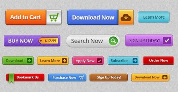
There are a ton of different sorts of calls to action you can use on your website, for all sorts of purposes. What we and others have found over the last few years, though, is that it’s generally most effective to use user-focused payoff language.
What do I mean by this? Just rephrase what you’re asking them to do into what they are getting out of it.
- Don’t say “submit this form,” say “Send me my free book.”
- Don’t say “sign up now,” say “Sign me up.”
- Don’t say “join now,” say “Get access instantly.”
Whatever the offer, whatever the variation, what you’re doing is simple; you’re converting the language into a display of what the user is getting from the transaction. It’s not about what you’re making them do; it’s about what they’re receiving in return.
Create a Top-Tier Headline
Your headline – which appears at the top of your page, in other pages linking to your squeeze page, and in your organic search results – needs to be highly optimized for conversions.
There are a lot of ways you can do this, though, so let’s dig right in.
- Try to focus on one thing at a time. Your squeeze page is going to be very narrow and specific, and that’s fine. You can always have more than one squeeze page active at a time, to capture different segments of your audience. Make sure your headline is focused on the same topic as the rest of your page, too.
- Make sure your headline presents the value your users are getting out of signing up. I see a lot of sites using questions these days, like “Do you want more social media followers?” or “Is your dream to have more traffic?” These are then followed with subtitles that clarify that you’re indeed offering a solution to help them achieve that goal.
- Make certain your headline stands out from the rest of your page. This isn’t difficult on low-copy pages, but we’re probably going to be making a page with plenty of copy, so it’s something you need to keep an eye on.Make sure no one can get a headline, sub-heading, or subtitle confused.
- Keep your headline simple and easy to parse. It should be a matter of milliseconds for users to identify exactly what you’re offering and how it can benefit them. If there’s lingering confusion or details to be covered, that’s what the rest of your page copy is for.
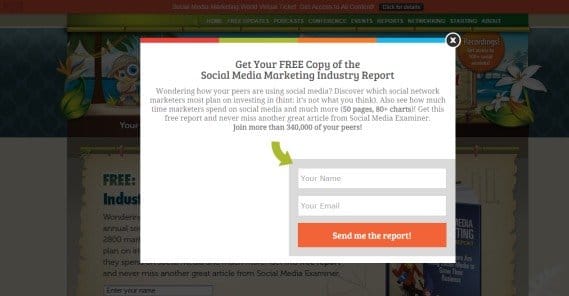
One of the common squeeze page formats these days is the exit intent pop-up, which is a little less focused and doesn’t give you a lot of room to work. Still, next time you see one, pay attention to the copy on it. You won’t see more than a headline and a subtitle, so study those to see what other people are doing. Apply those techniques to your own page.
Include More Copy Below the Fold
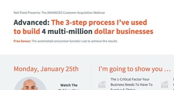
There’s a lot of contention whether you should have a lot of copy on your squeeze pages or not. What I’ve found is that it’s highly variable. Some businesses benefit from taking the time to explain their product or service in great detail, to convince users who visit that they should sign up for their mailing list. Others don’t need much space, because what they do is simple.
I like the best of both worlds. Essentially, it comes down to something like this. First, determine what the common screen resolution is for most of your users. Then, design your page such that the top 90% of that resolution is taken up with what looks like a stand-alone squeeze page. It’ll have a little copy, maybe some graphics or a video, and your opt-in form.
Then, below the fold, you have an expanded page. This is where your more detailed copy will go. It’s where people can scroll to see clarification on anything they may be confused about, or to see expanded data on the bullet points you have above the fold.
One trick I like to use is to have the opt-in form scroll with the user as they scroll down the page. I find that the presence of a submission field at all times allows a user to convert whenever they feel ready. They don’t have to scroll down or all the way back up to find another button to take them to the form; it’s right there at all times.
Be aware that the more copy you include, the easier it is to lose people in technical details. Even if you’re providing a lot of information, strive to keep it as simple as possible. You’re just looking to get an email address, after all, not an entire business lead.
Consider Including a Video
Explainer videos can be great, but there are a lot of pitfalls with including a video on a landing page or squeeze page. For one thing, you’re not asking for a lot, so you don’t necessarily need to be spending a ton of time and energy on convincing them to give it to you. Backlinko loves the video, and I’m not about to argue that it’s not working out for them. I just don’t think it’s the right option for everyone.
Essentially, you need to make sure that your content can be portrayed quickly and easily in a short video. I’m not a fan of his 10-minute videos, but 3-4 minutes is fine. Again, it goes back to the “less is more” approach. A 10 minute video is overkill; I don’t have 10 minutes, and if you’re taking more than 2 minutes to convince me, I’m already gone. Then again, I’m not necessarily typical of your audience, so you’ll have to determine whether or not a longer video works for the people who are.
Include User Testimonials
By contrast, user testimonials are almost always excellent to have. Someone else, particularly someone prominent, vouching for your business? Now that’s something I can get behind.
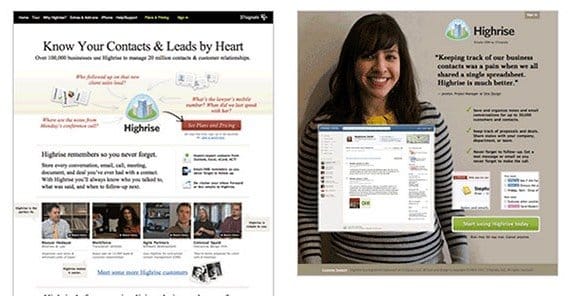
The key to a good testimonial is specifics. You don’t want a generic name attached to a “this is awesome!” quote. You want a more detailed, specific quote, from a person who has a headshot and a brand name attached to their name. You want real testimonials from real people who have influence. The trouble, of course, is getting them. There’s a whole process for that, but now’s not the time to discuss it. You’ll have to read elsewhere.
Be Graphical, Carefully
Graphics should be used according to your design and branding, and it can vary wildly from site to site how best to use them. Some sites I’ve seen don’t do anything more than slightly graphical bullet points, while others will have full sized graphics or even minor animations to entice you.
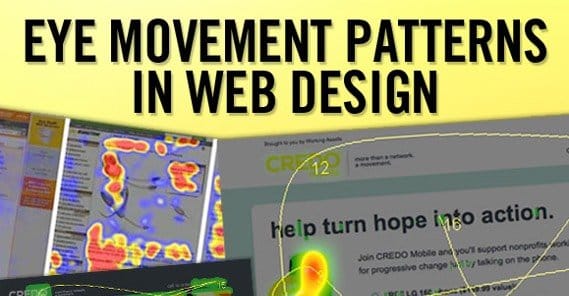
When I say use graphics carefully, what I mean is pay attention to the graphical flow of a page. People naturally start at the top left of a page, but most squeeze pages have a central focus in the middle, either through a video or through centered text. Thus, you have an established upper-left to middle flow of vision. Graphics should enhance and guide that, rather than go counter to it.
The ideal graphical flow of a page should start at the headline and trace through the key salient points, be it a video or a few bullet points, before pointing the user in the direction of a form to fill out. A U-shaped pattern can be inefficient at this, which is why so many put the form in the lower right corner; a natural extension of the \ flow.
Use Social Proof When Relevant
Social proof in general is great, and there are two forms I see most often. The first is social media numbers. People love to post X number of followers on Facebook, Y number of Twitter followers, and so forth. The second is the number of people already registered for your mailing list. If you have 200,000 people on your mailing list, by all means, tell people they’re joining a group of people who already have proven how great your list is. They don’t have to know if you have a sub-10% open rate; that’s not important.
The key with social proof is it only works if it’s large. If you have 150 followers on Facebook, I don’t really care. I’m not joining illustrious company, I’m just one of a handful of suckers conned into following a boring page. The same goes with any other social proof number, including your mailing list enrollment.
Test Everything
Every single point I’ve listed above is open to testing, and then some. Test different lengths of copy. Test different testimonials, or whether or not you have them. Test social proof. Test videos. Pick what works and make your squeeze page a chimera pieced together out of those successful pieces.
As if that wasn’t enough, here are a bunch more ideas of things you can test on your squeeze page.
- Test different amounts of content above and below the fold. Make sure that one of the test versions is small enough and light enough that you have no fold at all; Dropbox and others like it have proven a lightweight landing page can work wonders sometimes.
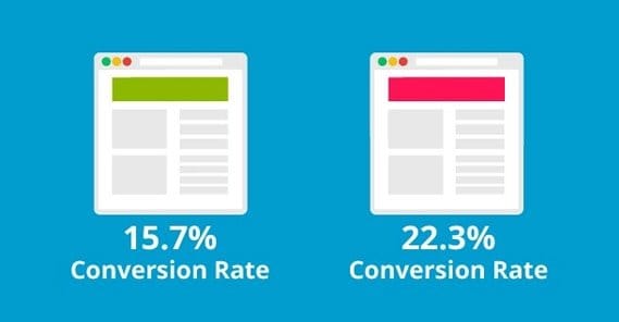
- Test different colors, sizes, and positions for your CTA and your opt-in form. Make sure it stands out in different ways, and test to see which ways stand out the most and get the most attention.
- Test different graphical indicators of visual flow. They can even be simple and otherwise pointless, like a basic arrow pointing from your last bullet point over to where the opt-in form sits.
- Test copy variations until the end of time. There are millions of ways to phrase everything on your page in different combinations. You can test overarching copy like what you do and don’t include, as well as underlying copy issues like phrasing, voice, and tone.
- Test different images. If you have a picture, try to make sure it’s a real picture and not a stock photo, and test different similar pictures.
- Test whether or not you want to include a video, as well as what is in the video and what the preview image for the video before it plays is. Never have an autoplay video, though; that’s a sure-fire way to tank your opt-in rate.
There’s more, of course, but those are some of the most important. Through testing these options, you should have a good idea of how to make major improvements to your squeeze pages and get more mailing list subscribers in no time flat.
How have you increased your landing page or squeeze page opt-in rates? Share with us below!
 ContentPowered.com
