6 Ways to Maximize Your Conversion Rate Like a Pro
Conversion rate is super important, but it’s a bit of a disingenuous number. You can have a high conversion rate and still make less money than you were before you made whatever change you made. How?
Here’s one example: you have 1,000 weekly visitors with a 10% conversion rate, for 100 conversions per week. You make a change and find that you still have 100 conversions per week, but now you only have 500 weekly visitors. Your conversion rate doubled, but you’re making the same amount.
Here’s another example: you double your conversion rate by offering a deal that slashes prices. You have the same number of visitors and a higher conversion rate, but due to the lower prices, you make less profit on each unit sold, for a lower overall profit.
So, before reading forward, keep this in mind; your conversion rate is only one of several interactive factors that you need to keep in mind.
A Note on Testing
The number one key to successful conversion rate optimization is split testing. No matter how convincing I make any of the following tips sound, you need to test any change you make before you implement it on a site-wide basis. This is because what works for me, or even what works for everyone else in the world, might not work for you. You never know with your unique situation whether or not a given piece of advice will be as beneficial as others claim.
Split testing, if you don’t know, is the art of making one single change between two otherwise identical pages, running a 50/50 split of traffic to each, and monitoring which performs better. With enough time and enough people, you can get a reasonably accurate view of which version is better, and you can implement that change.
Split testing often fails when inexperienced people try to use it, and it always fails in the same ways:
- You weren’t measuring specific goals. You can’t just go into it thinking “oh I’ll just pick the better one.” You need to know what precisely makes a version better. In this case, it’s probably going to be conversion rate.
- You didn’t test long enough. If you run a test for less than a week, you’re missing the natural ups and downs of a weekday-weekend cycle. If you test for too short a time, as well, you might not have a statistically relevant volume of users for each side of the page. Give it time for accurate results.
- You’re testing more than one variable. If you make more than one change, you don’t know which change was responsible for your success. What if one change effectively increased your conversion rate by 10%, but the other dropped it by 15%? You would discard both changes because of the net loss, never realizing the one change would have been beneficial to make.
You also need to be wary of Split Test Tunnel Vision. This is the phenomenon where you make a few major changes, pick the best one, and slowly refine it more and more for minor returns. You might be missing another major change that has a much more dramatic effect, but you’re either too scared of change or don’t realize there are alternatives, so you let it slip away.
Alright, with all of that out of the way, let’s go on with the six tests you can run to boost your conversion rates.
1. Test Your Value Proposition
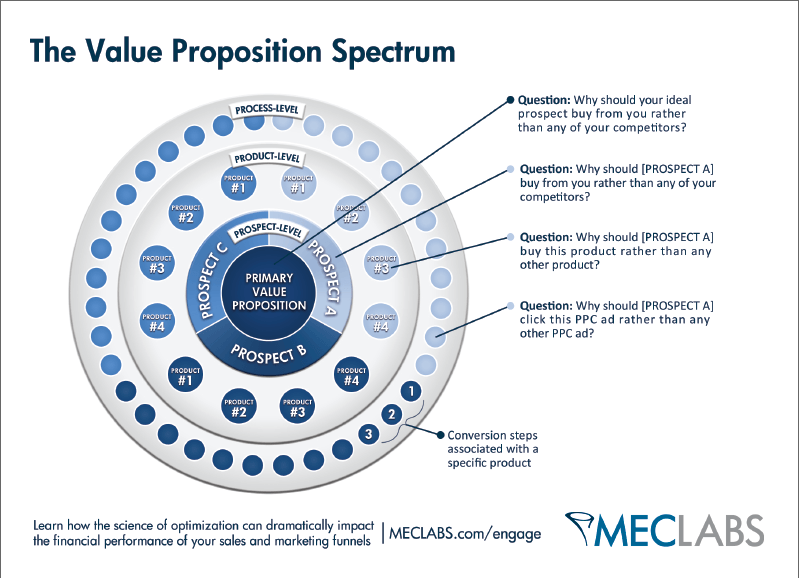
What makes a user want to buy your products rather than those of your competitors? Are you lower priced? Do you have better service? Do you have a better reputation? Do you offer free shipping or a money back guarantee?
A good value proposition needs to be put front and center, just below the primary benefits of your product. The ideal flow of a landing page is something like this: Introduction of a problem > Ways your product solves that problem > Why your product is the best choice to solve that problem.
Your value proposition also needs to be different – and better – than what your competitors offer. You can match them point for point in every way, but in one way you need to be exceedingly better. Test out different ways of phrasing your benefits to emphasize your value over your competitors.
2. Test Your Language
I get it, you don’t want to talk down on your users. I don’t either. It’s never a good idea to be condescending or make your readers feel like you’re treating them as completely ignorant. On the other hand, you can’t just leap into your product pitch by spouting jargon that sounds like something generated by Cipsum.
Try to write the copy on your landing page in a few different ways, for different levels of users. Consider a beginner, an intermediate, and an advanced user, and write copy for each of them. By testing this, you can find out the skill levels of your users and tailor your support as well.
3. Anticipate Problems
Your sales funnel is going to have friction. There are going to be roadblocks between you and converting your users. Testing can only alleviate so much of this. What you should be doing is studying the drop-off in your funnel and figuring out what the sticking point is. Figure out just what is driving users away, and address that problem immediately and up-front. Solve it whenever possible, and offer that solution front and center, so users have their fears addressed before they realized they were fears.
4. Test Indicators of Trust
There are a bunch of ways you can add trust or social proof to a landing page. You can use testimonials and reviews, you can use corporate logos of clients, you can use Facebook verification. Test different ways of presenting social proof, test different iterations of the same proof, and figure out what works best. You might find more use out of testimonials, or you might find corporate logos work better.
5. Streamline the Purchase Process
Consider this: every additional step a user has to take between landing on your page and checking out is a step that includes a drop-off in conversion rate. How many clicks does a user need to make, how many forms do they need to fill out, in order to purchase? Do everything you can to ease these roadblocks.
You should consider saving payment and shipping information in order to make it easier for repeat customers, but you also have to worry about the account creation issue. Making users create accounts before they purchase is detrimental for new customers, but it helps repeat customers. Test which works better, in the long term.
6. Minimize Distraction
One mistake I see on landing pages fairly often is multiple ways to leave the page. Ideally, a landing page is almost a trap; there’s only one way to get out, other than hitting the back button or closing the window, and that’s to fill out a form or convert in some form or another. If you have navigation links, footer links, links to studies or information, anything else, it’s a potential location a user can go that’s not a conversion. Minimize these.
 ContentPowered.com
