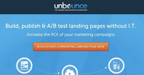
23 Hacks and Tweaks to Increase Landing Page Conversions
 ContentPowered.com
Landing pages are the heart of any good marketing strategy. Sooner or later, every path through your marketing scheme should lead to a landing page. Your social posts, your blog posts, your ads; they all hint at the value to come, but the landing page is where it’s laid on thick. It’s where you turn the sales pressure up to 11, and close the deal. Even if that deal is just “sign up for my mailing list”, it’s something you need to take seriously.
Optimizing your landing page for a higher level of conversions is, of course, the day to day work for many of us. There are dozens of tweaks we can make to, hopefully, convince more people to buy. I’ve listed some of my favorites here.
1. A Change of Color
Color is a strange subject when it comes to landing pages. I’ve seen some people swear by the stereotypical green CTA button, and I’ve seen others test a whole range of different colors and find almost no tangible difference. I think focusing on color is a bit of a red herring.
There are two things you need to understand to realize why picking the exact shade of orange is a waste of time. The first is color theory, and the second is contrast.
Color theory you can read about in detail here. I don’t have the space to cover it in detail. Suffice it to say that different colors have different cultural and emotional significance, and you should pick colors that compliment the tone you’re trying to achieve.
Contrast applies to your CTA button. It doesn’t matter so much what the color of the button is, so much as the requirement that it stands out from the rest of our design. If your whole landing page is blue and gray, you don’t want a blue or gray CTA button, it’ll just get lost in the details. You need something that stands out, like red or orange.
2. The Jitterbug Button
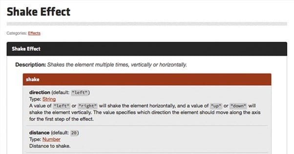
This is a fun little strategy that we employ on this blog, and it’s worked pretty well so far. If you look off to the right, you’ll see the orange button encouraging you to build a campaign. If you watch, that button will occasionally shake a little. If you’re reading – which you are right now, to see these words – you catch it out of the corner of your vision, and it draws your attention. Now, you might think this would distract readers from the blog, and you’re right in a sense. The thing is, the people just here for information will keep reading, while the people who have an inclination to convert will take notice and give it more thought than they otherwise might. It’s no net loss.
You can find a sample jQuery script to implement the shake button here.
3. Hovering Sidebars
When you’re scrolling through or moving through something, a static element – something that doesn’t move while the rest of the page moves – catches your eye. It’s why dead pixels on TVs and monitors are so annoying. It’s also why a hovering or “sticky” sidebar is so effective on a blog. The user scrolls down, and everything moves up accordingly, except the one sidebar element you want to stay in focus. Usually, that’ll be your CTA or an opt-in form. You can read about installing that functionality here.
4. Free eBooks
People love free stuff. Some people will claim free stuff even if they’re not really interested in it, just on the off chance that it accumulates value over time and they can leverage it later. Other people will actually be interested in the free content you give away, particularly if you claim it’s going to be limited in duration. That’s what a free ebook is; a limited time offer of some great free content.
The trick to using this to increase your conversions is to include an offer in the book as well. I like to include a coupon code that can be redeemed for a discount later.
5. Opt-In Incentives
A simple concept, used everywhere; when you sign up, you get something. What do you get? Who knows! Offer an ebook. Offer a coupon. Offer a free trial. Offer a chance to win a gift card to Chipotle. It doesn’t even matter what it is, the incentive alone will get people to sign up simply because it’s added value.
6. Exit Intent Popup
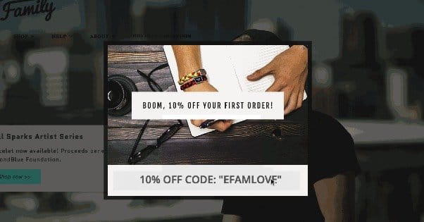
A while back these were new, but by now I guarantee you’ve seen them, even if you didn’t know what they were called. An exit intent popup is a lightbox in-page popup that is triggered when the user performs some action that indicates they want to leave. The usual triggers are things like the browser window losing focus – as if they tabbed out – or their mouse cursor moving off the screen, like they’re moving towards the X to close it. It won’t trigger if they use keyboard shortcuts like alt-F4 or ctrl-W to close the page, though.
Exit intent popups are highly variable in terms of potential content. You can have a sign up form, an offer, a coupon code, or anything else you choose to put there. They’re also super easy to set up.
7. Buff Up Copy
There is a LOT you can do to change up the copy on your landing page. Entire posts have covered the subject. I’ll summarize some of the salient points here, but I strongly suggest you read that detailed article.
- Work to evoke an emotion in your users, typically something positive, or feelings of negativity followed by the assurance that your product can alleviate those feelings.
- Try to meet the same sort of language used by your readers. Don’t be stuffy and formal if they aren’t, but don’t be too casual if you’re trying to reach CEOs.
- Try to use language in creative, unconventional ways. “Click here” isn’t good anchor text because it’s too generic; the same goes for CTAs.
- Minimize options and decisions the user has to make; they’re roadblocks to conversion.
8. Include a Video
A simple, short, well-produced video can go a long way towards explaining your product or service in a way that a thousand words of copy can’t. It allows you to get the benefits of a deep, informative landing page while also keeping the details of the page itself minimal. The key is that the video needs to be slick and high quality. You won’t get away with something that looks like it was filmed with a webcam and sounds like it was recorded in a hailstorm.
Oh, and never make your video auto-play. Seriously. Whoever invented the autoplay feature needs to be punched in the face.
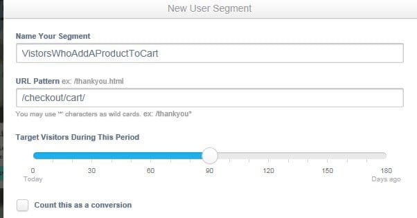
9. Track and Remarket
 6 Ways to Maximize Your Conversion Rate Like a Pro Conversion rate is super important, but it’s…

With both Google and Facebook, you can track people who come in from clicking your ads, but who leave before converting. Essentially, clicking the ad link adds a cookie to their computer and reaching your “thanks for buying” confirmation page changes the cookie. With Facebook, this is accomplished by adding users to individual lists instead.
With this tracking, you can create ads that specifically target the people who were interested enough to click your link but not enough to buy. You can then give these people more reasons to convert, and incentives to come back and take another look. This process is called retargeting or remarketing, and it’s insanely useful.
10. Include Social Proof
Social proof comes in a number of forms. I’m not just talking about Facebook like boxes and Twitter follower counts here, though those are one component.
- Social media boxes tend to be distractions and are only valuable if the numbers attached are very high.
- Testimonials can be great, but you need to make sure they’re as legitimate as possible, and include names, pictures, and real stories whenever possible.
- Company logos can be great, as long as they’re potentially recognizable companies. Logos of businesses no one has ever heard of – or of businesses you own – don’t work.
- Reviews are like testimonials, but even better.
11. Minimize Roadblocks to Conversion
Conversion roadblocks are a anything that gets between the user and clicking “buy now.” Clicking a link to get from a blog post to your store page is a conversion roadblock. Having to fill out a form is a roadblock, with longer forms being larger blocks. The more you ask of a user to go from the entry point in your funnel to the conversion, the more people will drop out along the way. I can’t even count the number of times I’ve almost bought something, only to decide not to when I realized I had to make an account or fill out a lengthy form.
To figure out where the points of friction are, pick several entry points to your site and measure every action a user has to take to get to the conversion point. Every link, every form, every button, every ad; make directions, and see how you can eliminate steps.
12. Include Signs of Urgency
Hurry! Act now! Offer only valid for 10 minutes! Only 150 copies left! This kind of language, this sort of urgency, helps drive people to decide to convert now rather than later. You just have to hold to it. You can’t give people a new 10 minute offer every time they land on your page; no one will ever convert without leaving and coming back to refresh it. You can’t offer a limited number of copies of your book but give out ten times that many.
13. Ditch the Slider
Image sliders, carousels, and auto-rotating banners, as it turns out, are really bad for your conversion rate. Sliders tend to induce banner blindness. Worse, they also only show your relevant offer to a handful of people. If I open your page in a tab and don’t tab over until the third slide, I’m missing your two most prominent offers, and I’ll be ignoring the carousel as I scroll down. Just don’t use them.
14. Adjust the Layout to Improve Flow
This is kind of a bad tip to include, because it’s not really a hack, it’s an entire process in itself. User experience optimization and website flow go hand in hand. You might have to do some pretty deep user action tracking, heat mapping, and even eye tracking studies to get the most out of a landing page design. Alternatively, you can simulate those things and try to make a page that minimizes clutter and directs the eye from place to place on the page naturally.
15. Avoid Rounded Numbers
This one is a lot more like a hack. If you have 1,973 active clients, don’t round it to “over 1,900” or “2,000” clients. Keep the number as accurate and as precise as possible. When you round, your numbers look more made up, more fictionalized, and less trustworthy. No matter how true they are, you lose trust.
16. Ditch the Badges
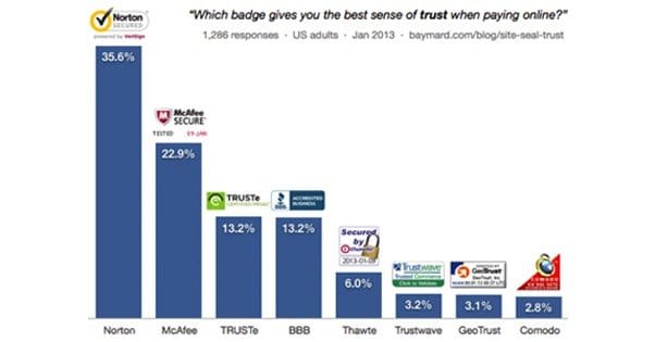
A lot of websites put trust badges on their site to try to get people to trust them more. These badges are issued by companies like Norton, McAfee, TrustE, TrustWave, and other such businesses. Some of these companies exist solely to charge you for the right to use their trust seal, after they verify your page is free of malicious code. Most of them just aren’t recognized or valuable. Instead of a third party trust seal, just make your own assurance and use SSL encryption for your checkout process, or your whole site.
17. Test Varied Copy Levels
I have seen studies go both ways on this. Some businesses have run tests and found that increasing the length of their landing page and packing it full of tons of information had a dramatic and beneficial effect on conversions. Others have trimmed their landing pages down to nothing more than the Dropbox Special and seen an improvement. Some might just be improving based on the change, rather than the length itself. The trick is, you need to test different amounts of copy on your landing pages
18. Offer Easy Support
An easy source of reliable support is a good way to passively increase conversions. Even if a user doesn’t need the support, the knowledge that it’s there will help them feel comfortable in the process. You can provide this support through easy contact emails or phone numbers, as well as more technologically advanced methods. One I like is Olark, which is a live chat system that hovers in a sidebar, available if a user needs to make contact. It’s as instant as Skype but passive and not pushy.
19. Offer a Price Match Guarantee

Price matching is an interesting and risky strategy. The guarantee allows you to make sure that price isn’t the deciding factor in a conversion, because if you have side benefits and another company with a lower price doesn’t, you will offer the lower price and the side benefits. On the other hand, you can very easily be run out by a competitor with more resources and the ability to sustain a lower price until the expenses drive you out. It’s a very double-edged sword, and some big companies have been burned before.
20. Match Marketing to Landing Page
One of the things that will penalize your quality score with both Facebook and Google ads is a disconnect between the information in the ad and the information on your landing page. If your branding is different, if the title is different, if the offer is different, it’s all going to hurt you.
In addition to hurting your ad quality scores, though, that disconnect will confuse and anger readers. If you’re telling them they can get 10 items for $5, and when they arrive on your site they see it’s a deal for 4 items for $6, it doesn’t matter how good of a value that deal is. They came for one deal and are given another, which is a bait and switch, and they don’t like it.
21. Chase Opt-Ins with Immediate Follow-Up
When a user opts in to your mailing list, you should have a whole plan of action, ideally automated. Send an immediate welcome message, subscribe them to your normal mailing list, and set a plan of specific escalating sales messages over the course of the following months.
22. Implement and Study a Heat Map
A heat map, like Crazy Egg, will give you a good indication of what your users are seeing and clicking on in your landing page. Ideally, the only clicks they’re making are to expand informative sections and to progress with the conversion. Sometimes, though, you’ll find that they click on pictures or icons that they feel should be buttons, but aren’t. These are opportunities to make those buttons do something relevant, or reorganize the page so that those locations are positions for your CTA.
23. Split Test Different Landing Pages
Finally, test everything. By now, you should know what split testing is and how it works. Implement it. Do it methodically, do it scientifically, and do it properly. Testing is the true path to optimization, and it’s the foundation of how you make every last one of the improvements on this page. You won’t know if any of these tips and hacks will help unless you test.