25+ Landing Page Templates You Can Download for Free
 ContentPowered.com
Your landing page is an important part of your marketing efforts. When you think of sales as a funnel, it’s one of the broad openings at the top. It’s a wide hole where users can fall into your grasp. It’s a gateway to the rest of your marketing, and it’s the central fixture of your PPC.
A landing page is a source of traffic independent of organic search. Most people won’t find it because of SEO, they find it because they clicked an ad. It already has targeted traffic coming in, so you don’t need to worry about educating users and getting them interested in your brand or product. All you have to do is convince them to buy.
Making a good landing page is hard work. As you’ll see as you read, there’s a lot you have to keep in mind. I’m going to explain what goes into a good landing page, both so you know what to do if you make your own, and so you know how to pick a template.
Why a template? Well, when it takes so much effort to make a landing page, it’s not an investment many businesses can make. It’s better to use a template than to make something half-assed, or not have a landing page at all.
What Makes a Good Landing Page
A landing page should look professional. There’s nothing that kills the desire to convert faster than seeing an unprofessional landing page. This includes a page that has code errors, a page that doesn’t render properly, a page that looks like it was coded a decade ago, and many other errors. Make sure your copy is in line with your marketing, and that it is free of typos and clear in meaning. Finally, avoid being too obviously a thin affiliate template, and avoid autoplay videos; both of which are signs of spam.
A landing page should be consistent in visual design, to match both your advertising and your branding. If a user clicks on your ad expecting one thing, and the page they reach is promoting something else, that disconnect is going to drive them away. The people who would convert on your landing page won’t reach it, and the people who are interested by your ad don’t like your landing page. You also need to make sure your landing page matches your branding, so people don’t think you’re an imposter of yourself.
A landing page should be minimal on the fluff. It needs to get straight to the point and stay there, rather than beat around the bush. You only have a few seconds to convince the user to take the next step, regardless of what that step is; do it as efficiently as possible. Sometimes this is actually a lot of copy. There have been landing page studies showing that much longer landing pages work. Remember; it can be as long as it needs to be, but it shouldn’t be longer.
A landing page needs to understand the target audience and speak their language. If you’re selling advanced SEO services to large corporations, you don’t want to talk as though you’re in a casual meeting with a small business owner over lunch. Conversely, you don’t want to talk about the benefits of huge multi-team management tools and corporate syndication solutions when you’re marketing towards small businesses and individual entrepreneurs.
A landing page cannot be overly broad so as to appeal to everyone. This rides on the back of the previous point. One landing page does not fit all. Many, specialized landing pages work better. If your product can appeal to both small businesses and large corporations, good! Make different landing pages for businesses of different sizes and in different industries. Target different people with those ads. Optimize for small audience segments, not humanity as a whole.
A landing page should not demand more information than is necessary. Your opt-in form should have exactly what information you need, and nothing else. Every form field is a chance for the user to say “you know what, I don’t really feel like this,” and quit. That’s not to say you can’t harvest more than you ask for. You just need to minimize the number of forms you ask users to fill out manually.
A landing page should be tracked, tested, tweaked, and optimized over time. Harvesting data, analyzing it, and making changes to your landing page based on that data is the key to growth. Measure your metrics for a week, make a single change, and measure for another week. Split your audience and send them to two different landing pages, identical except for one image, one paragraph, one theme. Monitor how people interact with the page via heat map, and adjust problematic areas in the design.
A landing page should not be alone; you can have as many landing pages as you need to reach every segment of your audience on their terms. The beauty of a landing page template is that you can customize it uniquely in so many different ways, while still maintaining a consistent base from which all landing pages stem. You have a family tree of changes and iterations you can trace from the template to the current product.
A landing page should be unique, rather than directly copied from a successful business or template. The key to using a template is to adjust it to fit your brand in a unique way. That’s why using a plain, unchanged template is a bad idea. It’s also why you don’t want to copy another business; they did something unique and it works for them, but it won’t work for you as a shallow copy.
A landing page does not need to keep everything above the fold. You should have one instance of your CTA above the fold, but that’s minor all things considered. Your landing page can be as long as necessary to include all of the information users want in order to convert. Just try to make sure there’s a CTA visible at any point along the page.
A landing page should include elements of trust and verification, but not to an excessive degree. Adjust your level of trust presentation for the information you’re asking for. If you’re asking for sensitive personal information, seals from security companies and the BBB might be a good idea. If you’re just asking for email addresses, you don’t need to make users worry by reminding them of security issues. Instead, present your trust in the form of testimonials, client logos and social validation.
 Which Landing Page Layouts Get the Most Sales? Your landing page is like a mystical…

A landing page does not need to be overly concerned with specific colors. All too often, people assume one specific color is the secret to success on a landing page, usually by making a CTA button red or orange. This is a flaw of looking at the surface of a problem, without analyzing it deeper. Your colors need to contrast in a pleasing way. No purple on green on yellow. The reason a red button works is because it stands out from largely non-red pages. Contrast is important, but the specific colors generally are not.
A landing page should have one and only one goal. You cannot ask for an email and then try to sell a product lower on the page. By splitting your goals, you’re splitting your message and diluting your copy. Make a second landing page, instead.
Why a Template is a Good Idea
When you read all the above, it’s quite easy to see why a landing page template is a good idea. A lot of what goes into a landing page comes down to subtle elements of design, and that design can be finicky to create. A template gives you a place to start. The key, of course, is to properly customize the template to match your goals and your site. Try to avoid templates that encourage plug and play – that is, filling in some text like a mad lib gone wrong, upload the design unchanged, and hope it works. It won’t.
Templates save you time. They save you the fees associated with hiring a developer to make a single page for your site. They give you the ability to have something functional and useful without many of the drawbacks of completely custom design. You just need to use the properly.
How to Properly Use a Template
First, find a template that works for your goals. If you’re trying to get people to sign up for a mailing list, you’re not going to do well using an app-focused landing page. If you’re targeting primarily mobile users, you’re not going to do well with a landing page template that doesn’t work on mobile.
Second, make sure that template can be customized. Some free landing pages will include a license that restricts your ability to edit it. Others will require that you include credit for the designer. Both take away from your ability to properly use the template, so I advise leaving those templates behind.
Third, customize the template. Make sure the colors match your branding, or at least work to contrast your CTA with the rest of your page. The primary reason so many people recommend red as a CTA button color is because the rest of the typical CTA page is white, gray, blue, or another color that makes red stand out. You can completely shift the colors around, so long as the CTA is still a unique element that stands out.
Fourth, customize the copy. Include the information your users will need, cut out information they won’t, and focus everything on getting them to convert. You do need to make sure, however, that your language is consistent with the text of the ads that bring users to the page. When you can have dozens of landing pages for ad campaigns around the web, it’s up to you to decide which is easier; customizing the landing page or changing the ads.
At this point, you can upload the landing page and direct ads at it, making it live. From there, you need to track everything you can about it. Conversion rate is the big metric everyone loves to track, but it’s not the only piece of data worth knowing. If your landing page is just to get mailing list subscribers, for example, you may want to also track how many of those subscribers convert into customers. You might discover a page that gets a lot of opt-ins doesn’t get many customers, but the opposite is also true.
The Big List
What I’m going to provide here is a rundown of a few big lists of landing page templates, with examples pulled from them. The lists tend to have a focus on a certain style of landing page, though not always; I hope to provide a representative sample of what you can find at each location.
20 Free Landing Page Templates from Leadpages.com
These landing page designs are collected from around the web, and they all have one thing in common; they’re designed with a combination of HTML5 and CSS3, the most modern web codes available. Whenever you see one of those fancy landing pages that has elements slide in dynamically as you scroll, this is the set of code used to design it. Examples:
- This heavy product-centric landing page, designed for showing off a selection of similar products.
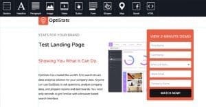
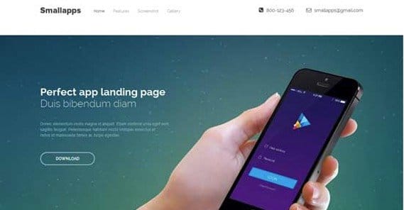
- This dynamic page template showing off a hypothetical analytics suite with animations.
- This flat-designed landing page that works well for a product launch teaser page.
15 PSD Landing Page Templates from DesignSave.net
This site has a lot of lists of templates and themes, ranging from free to paid premium designs, all accumulated in various categories. You can see some of their other lists at the top of this list. This list, though, is the focus of my attention. All of the templates on this list are made in Photoshop rather than live code, so they will take a bit more work to convert into something usable on the web. That said, they can give you a lot of freedom to tweak and iterate through Photoshop wireframes prior to turning the final design into live code. Examples:
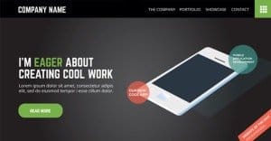
- This app-centric landing page design that includes both social proof and verification, as well as pricing information.
- This stylish photography landing page designed as a one-page portfolio, that works as a graphic showcase as well.
- This flat and simple landing page that works for just about anything you could sell.
80+ Best Collection of PSD Landing Page Templates from Template.net
This site also has many lists of landing page templates, though many of the other lists they offer include both free and premium themes, so I’m not including them on this list. I want to give you resources full of free templates, not templates you need to spend $10-$30 to use. Examples:
- This graphic-heavy landing page designed for both desktop and mobile sites.
- This very yellow landing page initially designed to promote a new app.
- This green and gray, visually directed landing page with a clear goal for users.
25+ Trendy New Landing Page PSD Templates from 365WebResources.com
This list is unique in that it is not a long list written at one time, which leads to issues with formerly free templates being moved to paid locations, or templates simply disappearing. Instead, it is updated sporadically, usually two or three times per month. The templates included are, again, Photoshop design files, allowing you to make a wide range of changes before you begin coding. Examples:
- This modular landing page design that allows you to add and remove entire sections, like local contact information or pricing, to suit your goals.
- This large, stylish landing page created to promote a finance company, but suited for just about any corporate industry.
- This long, blue landing page with a very stylish sense of design.
15+ Free HTML Landing Page Templates from DesignMaz
This list was updated as recently as six months ago, so you know that the templates included are at the very least still available. The site also has other lists available, including one for responsive design landing pages, which is very useful if you have a mixed audience of mobile and desktop users. Examples:
- This easy scrolling landing page with a simple email conversion form at the bottom.
- This bright and colorful landing page featuring drink products, but perfectly replaceable with any product that has different colorful iterations.
- This short, dark page with a slick purple color scheme.
I have no doubt you can find something that resonates for you in one of these lists, but if not, there are several other lists linked on any one of those lists, and I’m sure any linked list also has other lists to explore. Follow the rabbit hole and see how deep you can get into templates to find one that works for your business and brand.