15 Guerilla Marketing Techniques for Bootstrapped Companies

Rome wasn’t built in a day, but neither did it cost even a single dollar. Okay, so the reason for that is because it was built centuries before the dollar was invented, and it certainly required some form of currency, but that’s beside the point. The point is, your business is Rome, and you can build it cheap; all you need is some savvy, some time and some guerilla marketing. I’ll give you plenty of tips, but you have to promise not to harp on about the poor metaphor before you read on.
1. Use a Scrolling Sign-Up Bar
You want to make it as easy as possible to acquire new customers. Do this by making it as easy as possible to sign up from any place on your web page. This means going beyond just having a signup page in your top navigation or footer; make the thing follow users as they scroll. A nice, thin, colored bar across the top with a signup form is just the thing. Make sure it only displays for users who aren’t already members. Something like Hellobar would work well for this.
2. Add an Exit Intent Pop-Up
In the old days, pop-ups were frowned upon. Separate window pop-ups still are. An exit intent pop-up is a script lightbox, code that dims the screen to draw attention to a new window. The important part is, it only appears when the user moves their cursor towards the top of the screen, as if to close the tab or window. The dramatic change in the site below distracts them and encourages them to consider your offer.
3. Fully Optimize Your Call to Action Button
Did you know that the simple act of adding “>>” to the end of your call to action, as a “read more” indication, increases the chances of the user clicking through? How about writing it in first person? You might be surprised at the variations you can make that seem counter-intuitive but dramatically increase your chances of a click.
4. Hijack Lists
Whatever your product is, there’s generally something similar that has existed for some time. If there isn’t, there are probably other products in the same industry, that can and have been compiled into resource lists. Your job would be to locate those lists, identify products that have died or been discontinued, and convince the list creator to substitute your product. If you can’t find an appropriate substitution, ask them if you can be added to the list.
5. Personal Customer Support
Instead of funneling your customer support to an impersonal email address, give it a personal touch. Live chat, Skype or Google Hangouts sessions can give you a unique personal edge that other businesses just don’t have. Make sure you can handle your customer service workload, though, otherwise your users will fault you for your poor service.
6. Send a Personalized Email After Signup
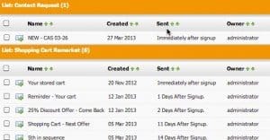
Once the user has clicked to sign up, they’re going to be particularly receptive to a message. A quick or immediate message from you upon submission can be a great source of information and engagement. You can ask them what made them decide to convert, among other things. Plus, users are conditioned to opening their email shortly after registration, to confirm via link.
7. Offer to Extend Free Trials
If your product or service lends itself to a free trial, a time-limited trial works wonders. When the duration is expiring but the user hasn’t bought the full version, message them with an offer to extend their trial, perhaps in exchange for some feedback. You can use the extra time and newly opened communication channel to attempt to upsell them. People love free trials, if you can make them work.
8. Front-Load the Positive
When you’re communicating with your users, typically through an email newsletter, you’re going to have the opportunity to discuss both positive and negative information. Whenever you have something negative to share, downplay it later in your mail. Front-load the positive, so your users have something positive to see when they open your message. Too much negative will drive users away.
9. Coddle Your Users
Every so often, choose a random selection of users and send them a gift that other users don’t get. This unusual, unexpected gift will make them feel special, which in fact they are. Word will get around that signing up for your list is a good way to get free stuff, and you’ll see a dramatic increase in users.
10. Turn it into a Game
It doesn’t matter what “it” is. Gamify it! The easiest way to gamify your process is to allow users to earn badges for various actions, whether these are filling out forms, or submitting a profile, or commenting on a forum. It works better if you make these badges publicly visible, so there’s incentive to earn them all.
11. Boost Referrals By Rewarding the Referred
Dropbox and other services offer incentives for users to refer other users. The thing that makes them stand apart is when they offer incentives to being referred. If you can sign up normally and receive X, or you can sign up under someone else and receive X + Y, why would you ever not want to be a referral?
No matter what form of communication you’re using – except maybe customer service responses for major issues – include a line about asking for tweets, shares, reposts, reblogs or whatever other social metric you want. Even if it seems like begging, it works.
13. Offer Retention Incentives
If a user goes through the process to cancel their account, offer to sell them on a cheaper, lower-featured version. Ask them what features they find critical and why they’re cancelling. It’s possible that you can work out a personalized deal to get them the service they want without sacrificing their subscription altogether.
14. Track Cancellation Signals
Most users who cancel their subscriptions will exhibit certain signs well in advance. They might stop opening your emails. They might stop logging in to your website. They might just drop their engagement. Take the time to monitor for these signals and try to cut them off in advance with a special re-engagement campaign.
15. Offer an Annual Subscription
You see many subscription services today offering for users to pay for a year in advance. The full year’s worth of the service is worth a cheaper price point than the monthly service. Make sure to set the price as something you’d feel comfortable selling at, of course.
 ContentPowered.com


