11 Hacks to Increase Your Email Open Rates

The grim reality of email marketing is that very few people actually pay attention to the messages they receive. Email is the primary mode of communication for so many businesses that an opt-in just doesn’t have the value it once did. 100 people might claim they want your newsletter, but when it comes time for the mental investment of opening it and reading what’s inside, maybe 5-10 of them actually do.
Thankfully, as a marketer, you’re not powerless. You can tweak aspects of your email messages to increase your open rate.
The idea behind this hack is that, when a user signs up for your mailing list, they’re going to open the first message you send. If they open that message and they discover a newsletter that looks broken or skewed, they’ll figure your message is broken in some way. Maybe they’ll let you know, maybe they’ll just delete the message. Either way, that bad experience lingers, and the next time a newsletter comes by it languishes in their inbox.
You can test your newsletters using Litmus, to see how it will look on various platforms, including mobile. Litmus will also tell you if something in your message or subject line will trip spam filters.
2. Keep your subject lines short.
According to a survey presented by Salesforce, your email open rates will almost definitely be much higher when your subject line is short. A subject line under 10 characters is enticing enough to give you a nearly 60% open rate on average. Chances are this is well above what you typically experience.
What can you do in ten characters? You only have two or three short words to play with. Fortunately, short language is enticing on its own. In a world of subject lines that run long enough to be truncated, a short subject line stands out. It almost doesn’t matter what you write.
3. Use title case capitalization in your subject line.
It’s much more attention-grabbing to use title case – that is, Capitalization of the First Letter of Each Major Word – in your subject line than it is to use a standard sentence. Treat your email subject line in the same way you might treat the title of a blog post for your rich snippet. While a subject line should be short, it doesn’t have to be, and a compelling question can break the length rule and maintain a high open rate.
4. Send and send and send again.
Whenever you send out a message, track who opens it and who doesn’t. Anyone who doesn’t open it should be added to a new list of people you can target again. If they don’t open your message, it’s as though they never saw it in the first place. It might be buried in their inbox, they might have deleted it without thinking or it might have ended up in an archive. In any case, you can safely send the email a second time, potentially drawing quite a bit of additional attention. You may not want to send a third time, however; the rule of threes lends extra potency to a third dismissal.
5. Proof your message, and have someone else do it.
When you spend a lengthy amount of time working on a single project, you grow a sort of mental blindness to its flaws. Your mind fills with the concepts and thoughts behind each word you write, rather than what you write itself. In the end, you might end up with a message you think is perfect, with a prominent typo you keep missing. Enlist the aid of someone, it doesn’t matter who; just someone who will put a second pair of eyes on the piece and proofread it for you.
6. Satisfy the subject line.
The point of a subject line, at least a good one, is to stir thoughts in the reader. Your goal is to make them ask what could possibly come as a follow-up from that subject line, with the promise that the answer is inside the email.
That means you need to live up to your promise and follow up on your subject line in the message itself. You can’t draw in attention with one concept, only to disregard it in the body; it’s a bait and switch that leaves users disappointed.
7. Invite replies.
Here’s one thing you don’t see every day; “If you have any questions, feel free to respond to this message.” Most emails from large companies are sent from automated accounts that no one checks. Users are used to needing to find your contact information on your site if they have a question, and that’s too much work. It means a lot of questions go unanswered. Instead, open up your newletter as a two-way communication. Even if you then forward the replies you get to your customer service email address, you’re still giving users a direct route back to you.
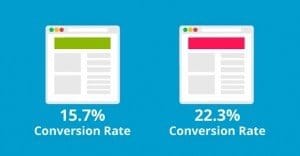
Your call to action should be preceded by a question, and it should take the form of a bright colored button. Users tend to gloss over plain text links in their emails, just as they do on your landing page. And, just like your landing page, you need to optimize your CTA in the newsletter. After all, it’s the newsletter that helps funnel traffic to your landing page.
Split testing isn’t just for ads or landing pages; you can split test your newsletters as well. Segment your audience into groups and send variations on your message to each. Try to keep representative groups if you’re testing general changes, like tweaks to your subject line or the color of your CTA button. You might skew your results if you segment by demographics to run your tests.
10. Don’t forget the other messages you send.
When a user decides to download your white paper or ebook, do you send them a confirmation email and thank-you letter? If so, you might be missing out on a great opportunity. Consider that content delivery message as a chance to include more hooks for future actions, both in the immediate short term and the long term. There’s always something you can encourage the user to do to support your brand.
11. Maintain a consistent voice.
Users feel like they’re interacting with an impersonal, robotic corporate face if they receive drastically different messages from different marketing channels. If their experience with customer service is much more casual, how are they to trust that it’s not some outsourced company doing the work? A consistent voice allows them to trust your business that much more.
 ContentPowered.com


