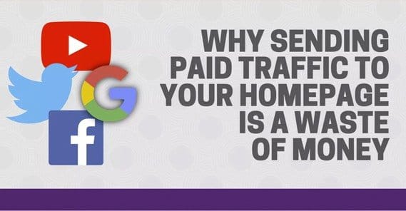
Should You Send Ad Traffic Directly to Your Homepage?

 ContentPowered.com
When you’re researching paid advertising, be it on Facebook, Google, or a third party network, you’ll come across a lot of different guides. Some will be aimed at amateurs, some will be focused on pro-level tips, and many will cover everything in between.
Advice in General
Most of the time, the advice in these guides is wholly correct. You generally want to avoid sending traffic to your home page instead of to a landing page. However, one thing these guides rarely discuss is exactly why. Or, rather, why it can sometimes be okay to send traffic to your home page.
The fact is, it’s not about your home page at all; it’s about the style of content on the typical webpage versus the content on a landing page.
It’s all about clarity of purpose. It’s all about intent, and the goal of your ads. You have to give a lot of careful thought to what the experience is when a user lands on your page. What do you want them to do, and what options are you giving them?
One common piece of advice throughout all of these tips is to never drive traffic to your home page. I’ve cited one example here, but there are dozens more. Without fail, every one of these guides will tell you to drive traffic to specific landing pages.
What You Want
When you’re running ads, you have a purpose in mind for them. That purpose might be to get them to read a specific piece of content, in which case that content is the landing page. The purpose might be to get more followers on social media, which means the landing page is your social media profile itself. The purpose might be to get them to purchase your product, in which case the landing page should be a squeeze page aimed at getting the user to convert into a customer.
Every ad has a purpose, and thus the page the user lands on needs to be aimed at serving that purpose.
Now look at a home page for a site like Forbes. After their welcome screen, you’re presented with what is basically a newspaper. You have headlines, you have a table of contents – the navigation links – pointing at various sections, and you have dozens of pieces of content to choose from.
This can be effective for Forbes to give something pretty much any reader could want to read. However, there are dozens – possibly over 100 – different links just from the home page, if you could the broad navigation categories, each headline and each author bio, and all the stuff in their footer and the sub-footer below that.
When a user clicks on an ad, if they landed on that page, what would they do? You have no way of knowing. They might click one of the top few promoted pieces of content. They might scroll down to find something that interests them. They might click through to a category of content they prefer.
It’s not a carefully curated user experience. It gives users a lot of choice, but at the same time, choice isn’t always a good thing. There is, after all, the concept of decision paralysis.
Decision Paralysis
What is decision paralysis? Also known as analysis paralysis, it’s a paradox where giving a person more choices actually diminishes the chances of them finding something they’ll be satisfied to pick.

If I give you a slice of toast and give you the option between butter and strawberry jam, you have a clear choice; opt for the one you prefer. If you’re thinking outside the box, you might realize you actually have four choices; nothing, butter, jam, or both butter and jam.
Now if I add the choice of three different jams – say strawberry, apple, and apricot – you now have more options. You could choose any one, or any combination thereof. Even if I limit you to just one choice, you still have to pick. Maybe you like both strawberry and apple, but it’s hard to pick between them.
Now say I add a time limit to this process. You have to choose which you want within one minute of me presenting the choices to you. Which do you pick? With four options present, you might forget about the “nothing” option, and you might spur of the moment pick apple. Then when you get your apple jam, you find yourself dissatisfied. What if you had gone strawberry instead? Maybe you’d prefer the tang, in retrospect. Maybe the apple jam isn’t really that good, or you expected apple butter instead.
Now say that instead of giving you four choices, I present to you 20 different jams to choose from. You have a full on jelly bar here. Strawberry, apple, apricot, orange, mixed berry, fig, the list goes on and on. Yet you still have this time limit, so you still have to pick. What’s your choice?
The more options I present to you, the less likely you are to be able to make a choice in the given amount of time. Even if there’s not a time limit, you feel bad for taking up so much time. Many people, presented with a situation like this, might forego a topping altogether, or decide not to have toast after all.
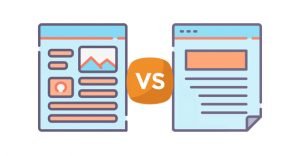
 Landing Page vs Homepage: Which One Should You Promote? If you want people to visit your…

Now convert this whole scenario to a website. The user arrives and is presented with a pallet-load of choices like the Forbes homepage. They don’t actually have a time limit beyond their own attention span, but we know the attention span of the average web user is very short. When presented with too many choices, the user is more likely to simply close out of the tab rather than make a choice at all.
The Home Page Problem
The problem with using your home page as a landing page is the same as the extreme toast scenario. You give people far too many options, and thus many users will pick nothing at all. Even those that choose something have a very low chance of choosing something that matches the goal you had in mind. If Forbes was, say, selling a single product, what are the chances you would click the product link on their home page as opposed to one of the many content links?
The crucial thought you need to have comes back down to the key to good SEO: relevance.
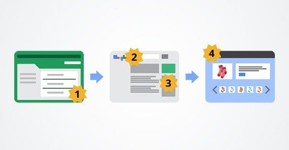
Imagine a scenario where you’re running a large general pet store like Petco. You run ads for a specific kind of dog food, say the Merrick brand. A user clicks on that ad. Which of these pages is best for them to land on?
- The Petco home page.
- The Petco category page for dog products.
- The Petco category page for dry dog foods.
- The Petco product listing for Merrick brand foods.
- The Petco product page for a specific Merrick dog food.
Number 1 is obviously not a good choice. The user might have dog food in mind, and might be able to navigate their way to that section of the site, but they also might get distracted by a goofy cat toy and forget why they’re on the site at all.
Number 2 is a bit better; it points users in the direction of dog food, but still has a lot of other options they could explore instead, reducing the chances that they’ll actually make the purchase of that specific food.
Number 3 is better, because it brings users to a specific section with options for them when they wanted a dog food. You might not sell the Merrick brand in bulk because of the ad, but most people looking for dog food are going to purchase dog food of some kind.
Number 4 is arguably the best. The user might not want one specific type of Merrick brand dog food, but with all of the Merrick food products on display, they’ll be fairly likely to pick one of them.
Number 5 might be good, or it might be too narrow. You might drive people away when they realize that one product doesn’t fit what they specifically need. Maybe they don’t like the price of that single bag of food, or maybe they don’t want one with sweet potato in it, or whatever.
Of course, this is all for a general storefront. None of those options are a landing page. A landing page is even more focused on one specific goal. Take, for example, this landing page from Unbounce. You’ll notice that it’s mostly focused on one thing: getting people to start their course. They have a lot of links, but only a couple actually stand out. That’s what you want from a landing page.
Optimized Home Pages
There’s one scenario where linking people to a home page instead of a specific landing page is better. Or, rather, where a home page can be as optimized as a landing page for one specific purpose.
Imagine you’re a company with one specific product to sell. You don’t need to worry about category pages. You can have a pricing page with different options, but they don’t matter; you give everyone the same free trial to start anyways. You have a blog, but your website is centered around your business, not your blog.
In that kind of situation, you can optimize your home page to be a landing page for your product. You can present some information about your product with an opt-in form, and you have a great focused landing page to anyone who shows up. Dropbox is a great example of this. Plus, if they decide to run ads that focus on something different, like their Dropbox for Business service, they have a page for that too.
When people give you the advice that you should never link to your home page, they’re assuming that you have a home page that looks a lot more like a general storefront or a blog home page, like Forbes or Petco. When you’re a smaller business focused on one specific offering, you have the luxury of being able to link to your home page, because you have the luxury of being able to optimize your home page as a landing page.
Relevance is Crucial
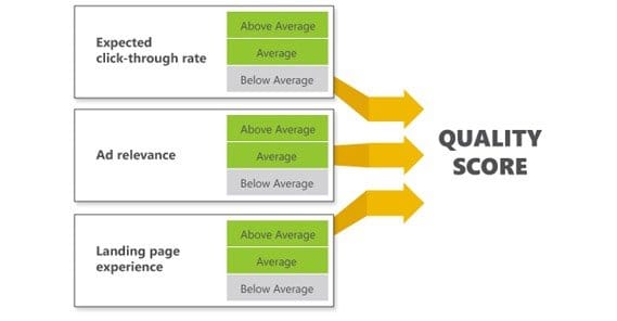
Even with a landing page home page, you still need to maintain relevance with your advertising. Google won’t penalize you for having a landing page as a home page, and if your ads are relevant you’ll maintain a higher quality score on networks that maintain one, like AdWords and Facebook.
It all comes down to clarity of purpose. If you have one product and you want to sell users that one product, it makes sense to focus your site around selling that one product. Your ads should talk about that product and should direct users to the page where they can purchase that product.
When you have more than one offering, you should use individual landing pages for different purposes. Even a business like Dropbox can use different landing pages. For example, they can have ads aimed at getting you to follow them on Twitter; those ads wouldn’t point to their home page, but rather to their Twitter profile. They can run ads for their business service pointed at a business specific landing page. They can run ads aimed at getting you to subscribe to their mailing list, which would have a different opt-in page with different reasons why you would want to do it.
As long as your landing page is focused on the single type of conversion you want the user to make with your ads, it doesn’t matter whether it’s a separate page or your home page. Just make the flow clear, and focus on relevance, and optimization will do the rest.