5 Alternatives to Hello Bar That You Can Download for Free

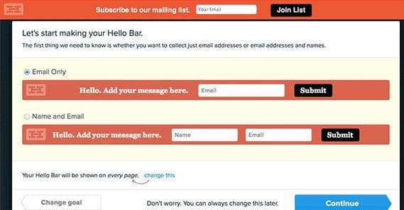
What is Hello Bar? I’m sure you’ve seen it. It’s a bar that drops down from the top of the screen, generally including a message with a call to action on it. It’s one of several ways to include a dynamic CTA on your site, along with pop-over light boxes and slide-in scroll-triggered CTA boxes.
The official Hello Bar can be found here. They pitch it as a way to get more subscribers by linking it directly to your email campaign manager, with integrations into Aweber, MailChimp, and Campaign Monitor. They have built-in social integration as well, if you want it to get you more followers or more engagement on Buffer, Facebook, Google+, LinkedIn, Pinterest, or Twitter. Additionally, the bar can dynamically serve different messages to different people, for adequate traffic-segmented split tests. All in all, it’s a very good little plugin.
If it’s so good, though, why look for alternatives? Well, the primary reason is simple economics. Hello Bar needs to stay in business, so they monetized their bar. You can use the free version of the bar, and that’s fine, but it includes their own advertising. You’ll be showing ads on your site that aren’t earning you any money and, worse, are right up in the premium real estate you’re trying to use for your own CTA. It’s very unfortunate placement, and it’s designed to get you to pay for their pro plans.
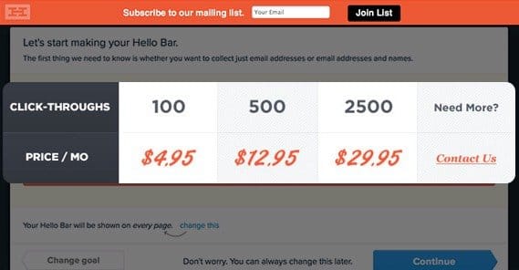
The pro plans do two things; they remove the Hello Bar logo and they remove the ads. However, pricing is tiered based on the number of people who click through your CTA. It’s a catch-22; the more effective your CTA, the more expensive the tool. Pricing starts at about $5 for 100 clicks. From there it goes up to 500 clicks for $13 and then to 2,500 clicks for $30. At least, this is the old pricing information. Pricing may have changed, but is no longer publicly available on their website; you’ll have to install it and check in their upgrade section to see if it’s lower or if there are any special deals.
The fact is, for huge sites or for small sites, Hello Bar is an excellent concept with a spotty execution. It works very well for what it does, but the pricing is enough to make some companies balk, and running the free version dramatically reduces the effectiveness of the bar itself. It makes sense to look for alternatives, so that’s just what I’ve done. Here I’ve listed five potential alternatives for you to check out.
Option 1: WP Notification Bar
You can find this free plugin in the WordPress.org plugins directory using the link above. It’s the free version of a paid plugin published by MyThemeShop. It’s semi-recently updated – five months ago as of this writing – and has around 8,000 active installs, with a five-star rating.
What benefits does this plugin have? It’s fast and easy to install and use. It doesn’t slow down your site. It’s customizable and doesn’t have limitations on the number of clicks that can funnel through it. It’s responsive, so it works on even mobile devices. You can choose any color you like, so it always matches your site. You can add custom code to it if you want to expand it – the whole thing is open source. You can also choose to only show it to certain types of traffic, like only to Facebook visitors or only to organic visitors from Google. It’s entirely possible to have different messages for different audiences display on different parts of your site.
With all of this, why bother buying it? What does the free version stick you with, or what does the paid version get you, that you can’t get for free?
The paid version of the plugin, found here, is $30. Don’t believe the website that says it’s on sale from the original price of $40; it’s always on sale. It comes with a bunch of additional features, including post content and link bars, countdown clocks, embedded social media feeds, and even video pop overlays.
Option 2: Sumo
Sumo is one of the premier CTA powerhouses on the web today. This free plugin has been updated very recently – one week ago as if this writing – and has over 100,000 active installations. It has a 4.5 star rating overall. It comes with a Hello Bar alternative, as well as a bunch of other CTA features.
First of all, they have a lightbox pop-over that links to your email list. You can link it to a couple dozen different email management programs, including the big names like MailChimp, Aweber, Constant Contact, Mad Mimi, and GetResponse. It also works with smaller or more niche managers like Inbox First, Klaviyo, Pardot, and ConvertKit. You can even add it to part of a recipe on Zapier.
They also have full-screen CTAs that can appear upon the visitor landing on your site, which they label the Welcome Mat. I’m not a huge fan – I prefer exit intent – but it’s there for you to test using.
Sumo includes heat map data, though it’s somewhat rudimentary unless you go convert to their full service. This is very much like Hello Bar, which is owned by Crazy Egg, a heat map company.
The Hello Bar alternative, their Smart Bar, is even more flexible.
It floats over top of content and carries along with scrolling, with newsletter CTAs, links to specific pages you want to promote, or social sharing buttons. It can also be positioned to hover over the bottom of the page instead of the top, if you so desire.
Additional features of the Sumo plugin include a highlighter, an image sharer, and a scroll box. The highlighter is a variation of the Click to Tweet style plugin, where a user can highlight part of your content and immediately share it on Twitter. The image sharer is an overlay for your images so when a user hovers on them, they can click to share the image with a link to your post on Pinterest, Facebook, or Twitter. Finally, the scroll box is a scroll-triggered CTA slide-in box, like you see all over the web.
Option 3: WordPress Notification Bar
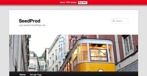
This plugin is very similar to the first option on this list, but they are different. You can see so in the names. This one is produced by SeedProd and was most recently updated eight months ago. It has around 8,000 active installs and a 4.5 star rating.
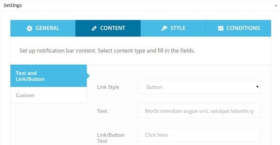
This is a very limited free version of a plugin with a premium option. It’s designed for people who want a simple Hello Bar alternative, and don’t need all of the other CTA options or ridiculously robust configuration. It’s quick and easy to set up, it allows you to customize your message and button text, it allows you to choose your color, and it supports multisites. It’s other primary feature is that it has a ton of international language translations and is compliant with i18n, one of the easy standards for translation.
The premium version can be found here. It allows you to create multiple notification bars, and gives you the ability to set rules for where, when, and how long those bars display on different parts of your site. It’s responsive, of course, and uses Google Fonts so it’s always compliant. You also get the ability to add animations and opening effects to it.
On top of all of that, you can add countdowns, social profile links, custom CSS, and a bunch of other customization options to the pro version. All of this is fairly standard across premium Hello Bar options, other than the animation effects.
Total cost for the premium version of this plugin is $29 for a single site with a year of support and updates. They also have a $49 package for 5 sites and one year, and a discounted $49 package for unlimited sites with one year of support. Finally, there’s a lifetime license for unlimited sites and lifetime support and updates, for $200.
Option 4: Fluid Notification Bar
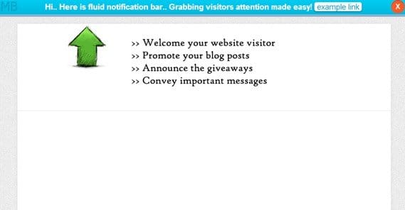
Produced by Shrinivas Naik, this plugin was last updated eight months ago and only has a meager 200 installs. I figure this deserves to change, because it’s a pretty good lightweight and free option for a notification bar.
When I say free, I actually mean free. This is one case where it’s not just a free teaser for a premium plugin. The bar is lightweight and low on features, but it has some elements other plugins reserve as paid accessories, so it’s alright in my book.
In addition to the standard Hello Bar style of top-bar CTA display, this plugin has a catchy animation to draw attention when it slides in. You can customize the animation among several options provided. You can include social media buttons if you like, and set a delay for display if you don’t want it disrupting users who have just arrived.
On top of all of this, you have complete customization of font, font size, font color, and background color. You can customize the link as well.
This bar doesn’t have some features you might consider standard, however. For example, it can only link to another page, it can’t be used as a form itself. You can add social media buttons, but no countdown or fancy graphics. It is, in many ways, the simple and free alternative to the Hello Bar.
Option 5: Easy Heads Up Bar
This bar is produced by Greenweb and has around 2,000 active installs. It was most recently updated nine months ago and has a 4.5 star rating.
This bar come with the general suite of standard features. You can customize the color scheme, and you can create as many individual bars as you want. If you have more than one bar created, however, the site will choose a random bar to display when a user visits. You don’t really have control over audience segmentation, it’s purely a random display. This is good if you have, say, a handful of different social networks or blog posts you want to promote, but it doesn’t help with more advanced and precise targeting. You are also given the option of putting the bar in your footer as well as your header.
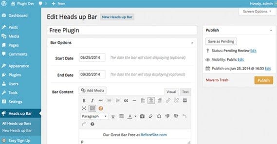
You can choose some simple display rules for your bars. You can choose to only have the bar display on your home page, only on sub-pages, or on both. You can also set start and end dates for the bar to display, like ad campaigns, and can in fact sync them up with your ad campaigns to add synchronicity to your marketing.
There is no technical limit to the amount of text or number of links you can put into this particular bar. This is in contrast to most others, which display one single line, however, much you’re able to put in that line. However, I caution against using lengthy paragraphs or sentences in your CTA. It’s likely to be disruptive if you’re writing more than 100 characters or so, plus a button.
One quirk of development is that this bar is not a floating bar. If the user scrolls down while the bar is active, it simply hides the bar. You can customize it to make it float by using your own CSS using the ID #ehu-bar, but that’s a little more work than most people are likely to want to do. After all, we don’t go for free plugins because we want to code.
These five alternatives to the Hello Bar are all pretty good, even if some of them are freemium. You don’t really need all of the advanced paid features, unless you’re big into audience targeting or strange uses like a countdown. Even then, I bet you could find a free version to do what you need; it’s only when it bundles everything that it gets expensive. What’s your favorite Hello Bar alternative?
 ContentPowered.com
