How to Dominate at Lead Generation Without Using a Phone
The modern world of business has changed. The advent of smartphones and tablets has made us more connected than ever. There are a thousand means of messaging people, from Skype and Google Hangouts to IRC and the old standby messengers of yore. You can Facetime and Snapchat your way to sales if you have the right audience and the right charisma.
For some people, this is an absolute godsend. A surprising number of Millennials – those young entrepreneurs only just now starting businesses – actively dislike using the phone. It’s an antiquated form of communication, with a lot of limitations and a lot of stress that isn’t necessary to the process of running a business.
The old guard still considers phone communication to be essential for business, and it really is. We’re not quite to the point where we can do away with it entirely. However, we can certainly eliminate it from our lead generation.
Here’s the thing; even if you as a businessman don’t mind making phone calls, who are you calling? The Millennial generation is not precisely phone-averse – mobile apps and chat programs make it their number one means of communicating – but they are very averse to unsolicited phone calls trying to sell them products. If you want to reach them, you need to reach them through a means other than a phone call.
Most lead generation today is done online. Sometimes it leads to sales calls, particularly in high-end niches or in business-to-business sales, but otherwise it can be done entirely through online means. By all means, post your phone number visibly, but don’t rely on phone communication to make your sales. Instead, let the interested people call you.
You can focus your efforts elsewhere:
Post Contact Forms on Every Site Page
Usually, businesses limit their opt-in forms, free quote forms, and other registration forms to landing pages. It’s a good idea to have them there, after all; landing pages are hyper-focused tunnels geared towards pushing users from visit to conversion. Most good landing pages don’t have any way for the user to leave the page without either filling out the form or backing out of the page.
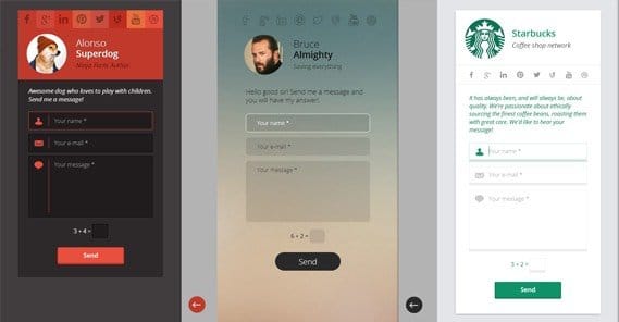
I advocate having a contact form on the rest of the pages on your site as well. It doesn’t need to be as heavy or as omnipresent – that is, it doesn’t need to dominate a sidebar and push your content aside – but it should be there. The two most successful such forms are the corner pop-in and the exit intent pop-up.
Hubspot’s blog is a good example of the first, the corner pop-in. Click that link and scroll down. About a third of the way down the page, you’ll see a box appear to slide in from the bottom right corner. As of this writing, it’s a box advocating downloading an ebook relevant to the content of the post I linked.
The other example is found all over the web.
When you move your mouse to the corner of the screen, off of the browser window, or you tab away from the page, it will trigger a pop-up within that page. It’s not a new window, it doesn’t violate rules against pop-ups, but it acts the same way. It’s intended to disrupt your intent to leave and get you to focus on one more thing, which in this case would be whatever offer the site in question is offering. For an extreme example, you can see Neil Patel’s Quicksprout version, which blanks out the screen entirely and encourages you to like him on Facebook.
In both cases, you can make those pops incorporate elements of the form or the offer you want the user to claim. Lead them towards a form or a landing page, and get them to fill out the form from there.
Ask For Less, Harvest More
It’s a well-documented fact amongst the marketing community that the more information you ask for up-front with a contact form, the fewer people will take the time to fill it out and continue with the process. I, personally, am a lot less likely to fill out a form that asks for my company, role, income, number of employees, or any of that. If all you want is my name and email address, sure; that takes half a second to type out.
I know that asking for a lot of information makes it easier to analyze the customer and determine how likely they are to convert, and more over, what approach to use to convert them. It’s up to you, then, to make the value judgment; which is more important, one more lead with a bit less information, or one less lead but more information on the leads you get.
One common alternative is the two-step form. Many sites are using it these days. The way it works is that you ask for simple information up-front, like name and email address, and that’s it. When the user fills that information out and clicks submit, a second form appears asking for more information. Typically it includes some encouragement, a progress bar or “You’re almost done!” Something of the sort, in any case.
You’ll find that some users drop off, but fewer than you might expect if you had asked for all of the information in the first form. Users feel that you already have some of their information – even if the submission isn’t complete until they fill out the second form – and that they might as well finish the process.
Another trick you can use is harvesting hidden data along with the submission form. By analyzing the IP and user agent of the user, as well as the page they filled out the form on, you can get a bunch of information. For example:
- The country from which the user is browsing. This can help you filter out unqualified leads or identify new areas you can expand into.
- The page the user came from when they filled out the form, which can tell you which sales funnels are operating better or worse than the rest.
- The IP address of the user, which allows you to identify duplicate entries, filter out spam, and identify interesting user sources.
Ask for less information up-front, balance out what you ask in a secondary form with how many users don’t want to provide more information, and harvest what you can from the user in other ways.
Build Trust
The two strongest roadblocks between you and a lead are the user not needing what you have to sell, and the user not trusting you. There’s not much you can do to alleviate the first one. Unless you’re going around creating problems your product can solve – which is kind of poor form – the best you can do is just try to convince the user they really do have that problem.
The second one, though, you can help alleviate. There are a few types of trust-building proof you can add.
At the basic level, you have indicators of your success. If you have a mailing list or subscriber count in the hundreds of thousands, you can display that. People will recognize that no business is going to have 100,000 subscribers and still be a scam. A similar form of social proof would be follower counts on social media, which you can display with easy widgets. You just have to be careful not to display low follower counts, which make it look as though no one follows you and has the opposite of your intended effect.
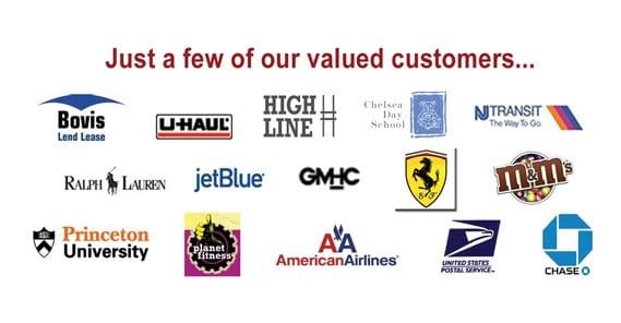
The next step up is the client list. If you’re selling a product that businesses might be interested in, you can showcase logos of business clients you’ve worked with. What small business is going to see a Sony logo under the clients list and still think you’re not worth using?
At the top level are user testimonials. Lengthy – two to three sentences – quotes from satisfied users, along with links to the site of origin of those users if applicable, is potent social proof. It also helps users trust in your product by giving them a different way of looking at your service.
You can spruce up your testimonials by adding images. Video is even better, but most companies don’t have the ability to create real video testimonials, so they can look fake. It’s up to you to test whether or not they work for you.
You can also use trust seals, but if you do, make sure they’re legitimate. Trust seals are seals from companies like Verisign. They’re little images that tell the user that a third party has reviewed your business and found it safe. Typically you’ll see them most during payment, but you can display them in other locations if they help.
Have a Unique Site Design
There are a lot of easy, template-based ways to build a website. Pretty much every web host brings along some basic website builder tools. Wix is a website builder and self-hosted site solution. There are many more like it. Heck, even the basic un-themed WordPress is a generic template. Same with Tumblr and other blogging platforms.
The reason so many people use these services is because of how easy it makes web design. You can put your vision into action and host it live, regardless of whether or not you can code it properly or have an eye for design. For every well-designed template-based site, there’s a dozen that look fresh out of Geocities.
There are a few reasons to avoid using these. For one thing, web users have been around the block enough to recognize them. They associate templates with one of three things. They’re low-effort, which says you don’t have the time, money, or energy to devote to running a good business. They’re representative of free website tools, which says you don’t have the budget to create a quality product. And, they’re the favored tool of low-cost affiliates and scammers, who don’t want to put effort into a site because they know it’s going to drop out sooner rather than later.
It pays to hire a web designer to develop a custom site design for you, or at the very least, pay for an infrequently used theme. Users are going to trust you a lot more when your site design is unique, even if it shares much of its source with other sites.
Compare the Difference Between Leads and Converts
The sales funnel has users that become leads, and it has users that convert. What you need to do is look at all of the information you have about the people who convert. What are their demographics? Where are they located? What sort of income levels do they have? What other products are they interested in? Figure out who they are, in as intimate detail as you can without getting too personal.
Now take all of this information and compare it with the people who are becoming leads. You’re not converting 100% of your leads. No one ever does. However, you might be able to convert more of them.
The demographics of your conversions tell you who is attracted to your product enough to convert. The demographics of your leads tell you who you are advertising yourself to. Sometimes, you’ll find that there’s a disconnect there. You’re advertising to the wrong audience. Maybe you started a product geared towards Latino women, but it turns out to be much more popular among male students. That’s when you make a dramatic shift in your marketing to target a different demographic.
It’s rare that you’ll encounter such a hugely different group of people on either side. Most of the time, it will be little things. You’re targeting a younger age group than who is actually attracted, you’re targeting a lower income level, or something of the sort.
Broaden Your Foundation
Many businesses start off with little more than a website and some print advertising, or a basic mailing list, or something of the sort. That’s fine, but you can do better. You can gain leads from other sources, all around the web. Look into various communities, sites, and networks in your industry to find potential sources of new leads. For example:
- Big name social media sites like Facebook, LinkedIn, and Pinterest.
- Smaller or niche social networks like Vine or Ello.
- Major sites with small communities, like Reddit or Tumblr.
- Industry, hobby, or niche forums and discussion boards.
- Groups on social networks like Facebook and LinkedIn.
The more sources you have for incoming traffic, the more potential leads you have. The more leads you have, the more you can convert those leads into customers.
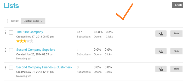
Maintain Multiple Mailing Lists
When you’re filling out a mailing list, who is signing up? If you’re giving out an ebook or a free resource, or even a free product, you’re getting a specific type of person. You’re getting people who are interested in free stuff. Some of them will consider anything free something they can potentially leverage for profit later. Others may be interested in what you have, but don’t have the budget to convert and thus have to rely on your free handouts.
The result of this is that your mailing list, even though it’s full of leads, might not be full of conversions. These people have limited interests and ability to convert, so spending a lot of time marketing to them might not be very valuable.
What about if you have an opt-in form for a mailing list on a landing page specifically about “contact us to learn more about our product”? These people are much more likely to convert. They’re already interested, you just need to convince them with the final sale.
It doesn’t make sense to funnel both groups of users to the same mailing list. They are participating in different points of your sales funnel. You can always move users from the first to the second when they exhibit behavior that suggests they’re interested in converting. Leave the rest for a content digest newsletter.
Move Fast
Most people will only sign up for a mailing list or reach out to contact you because they’re interested in buying. The longer you make them wait, either through a delayed marketing process or just a lengthy turnaround time, the less likely they are to convert. Many of them may have gone out and found a different source, likely your competitors. Move fast and capitalize on your leads while they’re fresh.
 ContentPowered.com
