15 Case Studies of Highly Converting Calls to Action
 ContentPowered.com
There are two types of marketers in the world. There are the high concept marketers and the detail-oriented marketers. Neither is a truly robust approach, but it’s hard for any one person to focus on both the forest and the trees. One of the best marketing partnerships you can make is with a person of the other category.
High concept marketers tend to have the brilliant, innovative ideas for campaigns and messaging. These are the Mad Men style advertisers, the people putting their ideas into the world and letting their employees sort them out. These sorts of high concept thinkers exist in every area of life, though many of them struggle with finding a way to implement their ideas.
Detail-oriented marketers exist at the other end of the spectrum. They dig into the nitty gritty. They understand the importance of color, shape, and language in marketing. They know the processes, they know the fluidity of design, and they know how to make things work. Their primary drawback is the risk of stagnation, the chance that they will never strike upon the core ideas that bring them from mechanical success to widespread success.
Combined, these two types of people can make one brilliant marketer. The high concept thinker needs the detail-oriented mechanic to put their ideas into effect in a way that makes sure they work.
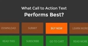
This post is more about the details side of things. It’s about calls to action; a small button, a small sentence, that makes all the difference for conversions. Those detail-oriented thinkers out there already know the importance of a good CTA. Those of you who tend to be more high concept thinkers may be surprised and how much of an effect a simple change can have.
In the world of marketing, Unbounce is one of the premier authorities in CTAs. That’s why many of the case studies I’m about to reference come from them. You’ll also find others from ContentVerve. I’ll cite other sources as necessary throughout the list.
1. Prominent Positioning
This first case study comes from Nature Air, via BlastAM. The company, Nature Air, had a total of 17 various landing pages. The change they tested on each of those landing pages was moving the CTA from a small link to a prominent box in the content area, visible at the top of the page. With this one simple change, they increased conversions from 2.78% to 19%. That was the only change; there was no better offer, no color change, no language change.
The takeaway here is that your CTA needs to be visible and prominent if you want users to click on it. As an experiment, go to your landing page and look at it as though you’ve never seen it before. How long does it take the design of the page to lead you to the CTA? If it’s not almost immediately apparent, it’s too hidden. Make it more obvious, either through positioning or another change.
2. Colored Urgency
This second case study comes from Performable, via Hubspot. In it, the company performed a test relating to the color of their CTA button. They changed the color of their button from green to red, and found that 21% more people converted.
For another example of red becoming the go-to conversion color, you have the example of the airline BMI. Their urgent “limited seats remaining” CTA proved to convert 2.5% more when the background was changed to red.
Now, one detail to note with the Performable example is that their landing page was largely gray, black and white. However, the other prominent color – featured in their landing page screenshot, their logo, and the icons in their text copy – was green. This means the red CTA stood out more, which accounts for the higher increase in conversions.
I’m not advocating blindly changing your button colors to red; the lesson here is to test color and see what works. Often, it’s the contrast with your landing page, not the color itself, that makes the difference.
3. Value Propositions
This next case study comes from VisualWebsiteOptimizer, and covers the company SafeSoft Solutions. SafeSoft, a company providing MarketDialer, kept the entirety of their landing page – including CTA – the same. The change they made was to add a price to their page, specifically, $75 per seat for their seminar.
The result here was an amazing 100% boost in leads generated by the landing page. The reason for this is the mentality widespread around the world that “if you have to ask how much, it’s more than you can afford.” It applies to restaurants, it applies to high end technology, and it applies to seminars delivered online. Too many people had the impression, from their landing page, that their service was expensive. When the price was promoted publicly – and it was reasonable – leads shot through the roof.
4. Large Size Buttons
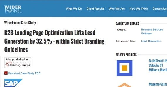
Next up is a CTA from SAP BusinessObjects, as presented by WiderFunnel. SAP’s software page had all the information you might expect on a software page, ranging from system requirements to usage examples. Off to the right side, they had a “how to buy” section with blue text links sending users to the purchase locations.
The change SAP made was to add a large orange button with the text “Download Now” linking to the purchase page. This large, obvious call to action increased their conversions by 32%.
This, again, goes back to the idea of a prominent CTA. In this case, I doubt it was the orange color or the text that had the main effect; it was the fact that it was a large button that stood out, rather than a small text link that blended in.
5. Streamlined Forms
This next case study comes from Expedia, courtesy of Conversion Voodoo. In this case, it’s not referring to the CTA itself, but rather the form that it led to. Users have to fill out a form on almost every landing page, unless the call to action is to buy an item directly. In any situation where you’re trying to generate leads or form fills, the form itself requires quite a bit of scrutiny. The way I look at it, every field you add is a chance for the user to say “you know what? Nevermind.”
In Expedia’s case, their form required the user to fill out first name, last name, company name, and billing address. The company name field, even though it was not required, left many users in confusion. They didn’t know what to do with the field, and rather than leave it blank, they left the page. By removing that field, Expedia’s profits soared. The number they cite is $12 million.
The lesson to take away here is that any piece of information you require on your form that isn’t within the normal name/address/contact information, is a stumbling block keeping you from conversions. Make it easier and faster for users to register, and more will do just that.
6. Positive Pre-Verification
This CTA case study relates to an unnamed mortgage company and again comes from Conversion Voodoo. You can find more details here.
The company in question had a long and daunting form to fill out for their mortgage refinance process. It makes sense, of course; such a serious financial decision requires a lot of information.
The change the company made was, then, called a commitment checkbox. They added a button in the form of a checkbox that said “YES! I am ready for a better rate today!” If the user clicked the box, they would be taken to the first part of the application form. The presence of this box increased their conversions by 11%.
The positive verification of the checkbox is important. It’s a psychological technique to make the user feel more invested in what they’re doing. This makes them more likely to continue filling out the form.
A modern equivalent to this is the two-step form for a conversion. Many websites today have a single button for a CTA, and when the user clicks it, they will be asked to complete the second part of the conversion process. They’re pretty effective.
 How to Increase Your Landing Page Conversion Rates Your organic SEO drives people to more…

7. Possessive Language
This is one of the case studies found on ContentVerve. On a single landing page, the company in question changed the button text from “Start your free 30 day trial” to “Start my free 30 day trial”. It’s a simple change, going from your to my, but it had a huge impact. The click rate of the button increased by 90%. The same change, in the opposite direction on a different website, dropped conversions by nearly 25%.
The reason this works is because of the purpose of a landing page. Everything exists just to facilitate the decision process for customers. The “my” language shifts perspective for the customer. No longer is it a company offering some enticement. Now, it’s the user taking advantage of the company offer. It makes the user feel better about making the choice, and thus leads to more users making that choice.
8. Another Color Button
This is a case study that proves what I was talking about before with button colors needing to stand out, and again it’s from ContentVerve. The company is anonymous, but it was a major European company. Their “add to cart” button was a deep blue, on a gray field with a gradient. The text on that field was also deep blue, making everything match.
The change the company made was to make the button, rather than a small blue rectangle, a larger green rectangle with rounded corners. This change resulted in a 35.81% increase in conversions.
This is proof that the color matters, but it matters more in terms of contrast than it does in terms of the specific color. Maybe red would have served this company even better; I don’t know, I didn’t run the test. Green worked well for them, though, and it might work well for you.
9. Another Look at Language
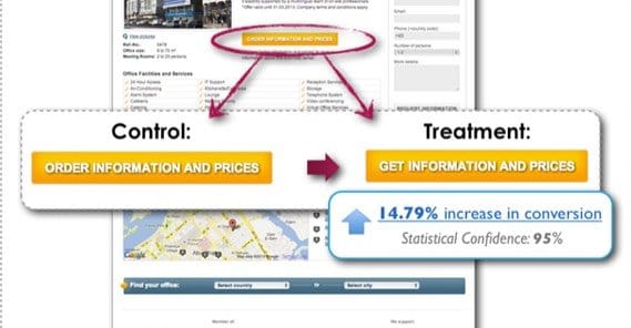
Another ContentVerve case study. This one relates to the language of the CTA button for MatchOffice, a company that helps businesses find offices available for rent. The change was to adjust the wording of their CTA button. The previous wording was “order information and prices” while the new version was “get information and prices.”
ContentVerve attributes this to a change in value. The “order” language emphasizes what you have to do to get the information. The “get” language emphasizes what you get when you perform the action. While true, I think there’s more to the story than just that; I think the word “order” has a connotation that wasn’t considered. Order typically means just that; placing an order. It implies things about the process, like having to pay for the information, and having it take some time for delivery. In either case, changing the language changed the conversions for the better by 14.79%.
10. Less Generic Language
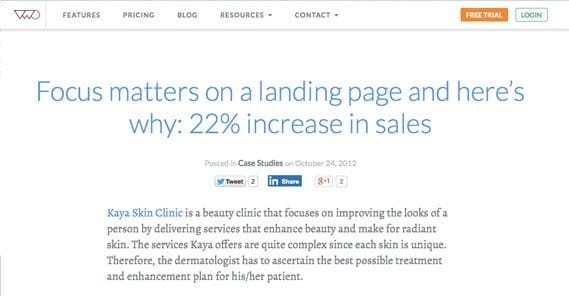
This change is another from VisualWebsiteOptimizer, this time referring to the Kaya Skin Clinic. In their original landing page, their CTA hovers directly above a short form the user must fill out to proceed. The CTA itself said “For Skin Consultation, Register Here.”
The change was to make the language much less generic and a lot more personal. The new language was “I want an expert opinion. Sign me up!” This variation produced an increase of sales by 22%. Additionally, the company then added social proof, though I personal consider it a little oddly placed, above the CTA. I don’t think the landing page as a whole is very well designed, but that’s neither here nor there. Adding the social proof further increased conversions by 70%.
11. Seriously, Make Your Button Stand Out
If you didn’t have enough proof already, this one is more icing on the cake. The hotel Vineyard in London has a landing page for rooms in their hotel, with a large and beautiful image topping the page and a bunch of detailed text below it. Originally, their call to action was a text link at the bottom of all of that copy, standing out only because it was maroon on the sea of gray.
The change they made was, you guessed it; making a CTA button and placing it higher above the copy. The new button, in the same tasteful maroon color, increased conversions by 32.12%. As always, the result is clear; make sure you have a prominent, visible CTA button.
12. Don’t Discount Details
This case study is another from ContentVerve. In this one, the primary test was changing a detail on the button for the CTA on the site. The original button was orange with a green arrow embedded in it, pointing at the text. The changed version had no arrow and was slightly smaller. The change resulted in 12.29% FEWER conversions, and was primarily done to prove to the business owner that the details matter.
My one grip with this case study is the lack of surrounding data. I don’t know if the rest of the site had a lot of orange, and thus the green arrow was the contrast necessary to make the button stand out. All I know is that the details – minor details as small as an arrow on a button – matter quite a bit for conversions. Test small graphical elements, and see if arrows or the like can work for you.
13. Context for Social Proof
This case study is going to bust the myth that you always need to have social proof on your landing page. Social proof can be great; the skin care study above showed that social proof by way of a Facebook button certainly worked for them.
This study follows Calpont in removing social proof and sharing buttons from their landing page. They had been positioned above their copy, but below navigation, giving them a lot of prominence and some whitespace to boot.
Removing the social buttons had a beneficial effect, which they attribute to a low number of shares on each site listed. What good is social proof, after all, when there’s no one actually using social? If you have <100 shares, you might consider not showing off how little you have.
14. CTA Below the Fold
This case study comes from ContentVerve again, and is again smashing a myth. A prominent CTA button is very important, as I’ve mentioned above. What a lot of people believe, however, is that this means the button needs to be above the fold. When this site moved theirs to below the fold, at the bottom of the landing page, their conversions increased by 304%.
Think of it in terms of sales. You don’t start off a sales call by asking the listener to convert. No, you take time to build a relationship, establish rapport, present value and explain what the listener gets if they buy. Only then do you provide the option. The landing page works the same way; you want to present the CTA at a point where the user has read enough to have decided to buy. Sometimes, that’s at the bottom of the page.
Note that the button is still large and green, in contrast to the mostly orange site. It’s still prominent, it’s just lower on the page.
15. The Long and the Short of it
Some businesses thrive with short landing pages. Dropbox had a landing page with less than a dozen words on it, and it was incredibly effective. Some companies have much longer pages. Check out test number 45 on this post for an extreme example. The page, CrazyEgg, went from a short, ~150 word page with a button to a landing page with several thousand words of content and a video. The new, longer page increased conversions by 30%.
Every business has a unique audience, and you’ll have to figure out what your audience likes. None of the changes in this post are meant to be direct advice. I’m not telling you to change your CTA buttons to red; I’m telling you to test color. I’m not telling you a long landing page is more effective; I’m telling you to test content. What works for one site might not work for yours.
What have you learned from these case studies? If nothing else, you’ll have learned that minor details matter. You can draw inspiration from those case studies and test changes. You can also get some more ideas for tests from this Hubspot post. Let me know what changes you’ve made, and how they’ve worked out! I’m always interested in more data.
Written by Kenny Novak

Kenny is an SEM and SEO professional. He uses blogging and content marketing as a launchpad for small businesses looking to grow their online presence.