Why Is My Landing Page Bounce Rate so High?

 ContentPowered.com
The eyes are the windows to the soul. Your landing page, then, is like the eyes of your website. They’re the window users take to go from disinterested to converted. In a sense, you want your landing page eyes to be like Jehovah’s Witnesses, converting everyone they can.
Okay, so that was a mess. If you made it through that metaphor, you deserve a reward. That reward, my friends, is me telling you what causes a high bounce rate on your landing page, and what you can do about it.
Already, someone out there is probably thinking “but a high bounce rate isn’t always bad!” It’s true, it’s not; for pages that want to provide one quick piece of information or assistance. A landing page isn’t that kind of page. It’s a specialized kind of page designed to hook the reader into getting more interested in the product you’re selling, investigating it further, and dragging those users into conversion. You don’t want them leaving before you’ve hooked them.
Anyways, here are a bunch of reasons users might bounce from your site.
Your Page Loads Slowly

The average user gets frustrated and leaves a site if it takes anything longer than four and a half picoseconds to load.
Okay, so I’m probably exaggerating there a bit, but only a bit. The point is, if your site isn’t loading in a second or two, you’re losing users. There’s a very steep drop-off around four seconds, but I recommend trying to get your load time under one second. Anything below that and you’re going to see diminishing returns, though.
You can test your load times using sites like Pingdom, and while you should get your entire site under a second if possible, your landing page is the important part for this discussion. It should be easier to get under control, because you don’t have additional code widgets like a related posts box dragging out your load times.
Your Message is Diluted

A landing page should be a hyper-focused piece of marketing. Any navigation link that leads away from the page is going to dilute your message. Any offer other than your primary offer is going to distract users. Any opportunity for the user to do something other than fill out your opt-in form is a chance for a bounce rather than a conversion. Minimize distractions, eliminate ads, remove navigation links, and keep everything on the one page as much as possible.
Your Video Autoplays
An explainer video is a great piece of tech to add to your site to explain your service and get users hooked. It also drops bounce rate because it takes time for the user to watch the video, and that time is valuable.
 5 Ways to Increase the Sales From Your Landing Page Your landing page is the lifeblood link…

The only thing is, if you’re setting your video to play automatically upon page load, you’re being a gigantic jerk. Autoplay videos are the single worst invention in the history of mankind. They’re disruptive, they’re annoying, and they don’t help you do anything other than rack up video plays.
Your Page Doesn’t Match Your Ad
When a user sees and ad and they are interested in it enough to click it, they expect the landing page to be very closely related to that ad. If it’s not close, if it’s about a different product or service, or even if the branding doesn’t match, they’ll feel as though they ended up in the wrong place. They’ll wonder about browser hijacking or hacked sites, and they’ll leave before they give you a chance. Make sure your marketing message is coherent across multiple platforms.
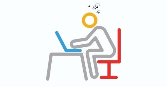
Your Content is Too Dense
A landing page is all about getting the most important, more critical information to the reader as quickly and easily as possible. This means you want short sentences, bullet points, graphics and explainer videos. It means, likewise, that you do not want long dense paragraphs or deep statistics to parse. If the user can’t explain your product back to you after spending a minute reading your page, you’re too dense.
What you need to do is examine the people you’re selling to and figure out what questions they have. Figure out what they already know and remove that from your landing page. Figure out what they want to know and add that to the page. Use hidden fields that expand to explain the reasoning behind those tidbits of information for those who want to know more. Don’t link to other pages; it sends users elsewhere.
Your Ads Target the Wrong People
Ad targeting is just as important as the coherence between your ad and your landing page. You need to be targeting the people who are going to buy. See, people who aren’t interested are still going to click your ads if they’re sufficiently compelling. It wastes your ad dollars to target the wrong people.
Your Text is Hard to Read
This one is just common sense. If you have a light gray background to your page, don’t make your text a slightly darker gray. You need contrast to stand out and keep user attention focused. If it’s hard to read your content, either because of color or because of formatting, they’ll turn away.
This goes double for your CTA. Your call to action needs to stand out no matter what, and it ideally should be the only element in its particular color and format on your page, so it’s as obvious as possible what the user has to do to proceed.
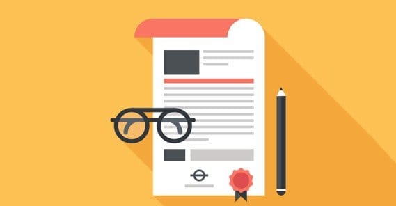
You Don’t Have Social Proof
If a user doesn’t know your brand, they’re going to be skeptical. There are simply too many scams and too many shady companies on the Internet to blindly trust anyone. That’s why you need social proof on your landing page. Show them that other companies, companies they recognize, trust you. Show them that other people just like them trust you.
You’re Demanding Too Much
How often have you thought you might be interested in a free eBook, only to turn back at the last minute when the author asks for your name, your address, your business name, your annual income, your family dog’s name, your mother’s eye color, and the mileage on your car? Ask as little as possible to get as many results as possible.
You Don’t Cater to Mobile Users
Mobile is not the future. Mobile is the present. If you don’t cater to mobile by using a responsive design, you’re in the past.
Written by James Parsons