Best Practices for Creating and Optimizing Registration Forms

 ContentPowered.com
A conversion funnel starts wide, with broad spectrum advertising and awareness campaigns. These campaigns feed into more targeted advertising, where the user might think “hey, I’ve heard this name before. This is interesting, maybe I should check it out.” That tier of advertising then leads to landing pages, blog posts, and other properties where you have one all-important goal: getting the sign-up.
A form, be it for registration, for mailing list opt-in, or any other form of data harvesting, is what your entire funnel leads up to. It’s the tip of the inverted pyramid. If your users reach the point where they could fill out the form and don’t – or worse, fill out part of the form and stop before submission – you need to optimize your forms.
I’m not going to beat around the bush. Here’s a bunch of tips, in no particular order. Take the ones you can, make use of the optimizations available to you, and rake in those extra conversions.
Customize This Advice
Before I get into the specific advice, I need to say one thing. Not every tip here will fit every brand. Some of them are changes that, if you made them, would hurt your conversions. Others might have no effect. Some might not even apply to your specific situation.
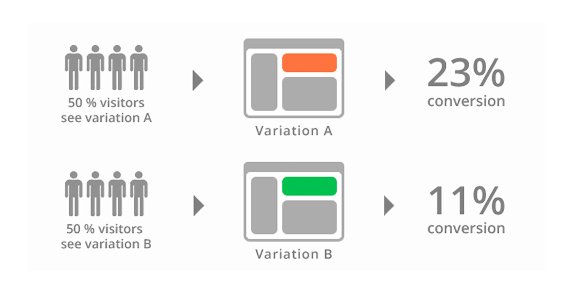
Always test your changes using traditional A/B testing. If a change you make hurts your conversions, revert it and try something else. Remember: you can always change back if something doesn’t work out. The key is to accumulate a representative sample of data to test any change and choose which is objectively superior.
Remember, also, that not all tips are aimed specifically at increasing the volume of sign-ups you get. That’s what a list like this one is for. Some of the tips I’m listing today are aimed at getting better sign-ups, rather than MORE sign-ups.
Remember, if you have 100 sign-ups with a 1% conversion rate after the fact, you only have 1 conversion. If you have 50 sign-ups with a 10% conversion rate, you have 5 conversions. Even if the second scenario looks worse on paper initially, the conversion profits are better in the end.
Now, on with the tips!
Keep It Short
Shorter is better when it comes to a registration form. The less a person needs to read, the better. Include just the information you need the user to know – like what each box is for and what each requires – and minimize other information. Users don’t need a 100-word-long paragraph about the virtues of signing up at the top of the registration form.

Each box should have a simple label, which is often a single word. You generally need your legal disclaimers, like “we do not sell personal information.” Anything required by the new GDPR rules is good to have as well. Beyond that, you don’t need much of anything.
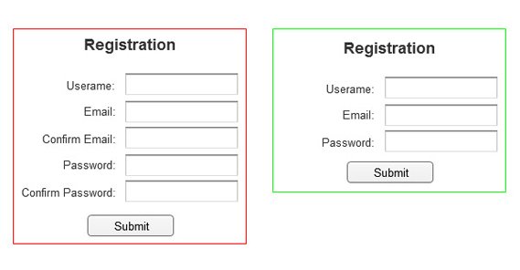
Minimize Fields
The less a user has to plug in to register, the better. You generally need a Name field, an Email Address field, and a Password field for account registration. Anything else can be added to the user profile once the user has registered. For something like a mailing list, you don’t even need a password field.
If you’re using a registration form to collect qualified leads for future sales messages or calls, you’ll need extra information. Company name/size/employee count are useful to your sales team, but some users balk at giving that information.
In some cases, you might be operating a software beta or other test where you might want information about the user’s computer. There are automatic scanners you can use to harvest that information without the user needing to know it, but this is a double-edged sword. One way, you lose the people who don’t know the information you’re asking for and don’t care to find out. The other way, you’re losing the people who don’t trust your scanner or don’t want to give you ALL of that information. You have to weigh the options.
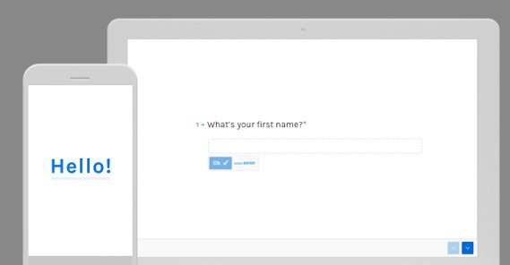
You should also minimize the fields you ask for at a time. If you need to ask for 10 pieces of information, it’s better to ask for 1 page of 5 pieces, and then a second page of 5 pieces, than it is to ask for 10.
What you’re doing is taking advantage of sunk costs. If a user plugs in five pieces of information and clicks to the next page, they feel more likely to add in five more pieces of information and hit submit. You’ll lose some people, sure, but not as many as you would lose by presenting them with a dauntingly large form right off the bat.
Make Progress Visible
If you have a simple registration form, chances are it’s just a single page. This is great, because the user can fill out four or five informational boxes, check a confirmation button, and hit “register” to finish the process.
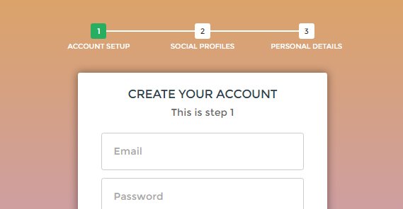
In other cases, you might be asking for more information. If you split your form into multiple pages like I mentioned in the previous tip, make sure you have a progress bar. Lay out the exact number of pages, and include labels for them. Even something as simple as a percentage progress bar can make users feel more comfortable, rather than unsure about how deep they have to go to finish submitting the form.
Minimize Distractions
Many modern sign-up forms today work either as an overlay that covers the screen, or as their own landing page that has no other elements on the page. There’s a good reason for this: it minimizes other options.
If a user is presented with a form in the middle of a blog post, they have a bunch of other potential distractions on the page. They could at any time click one of your other calls to action, or an ad, or even just abandon the form to keep reading the post. Like a good landing page, you want your registration form to have as few other options for the user as possible. Ideally, they only have four: fill out the form, hit the back button on their browser, navigate to another page via bookmarks or the URL bar, or close their browser altogether.
 15 Ways to Spot and Reduce Your Landing Page Friction The first impression matters. In many ways,…

Indicate Signs of Trust
Trust signals are an important part of any conversion process. Depending on the kind of information you’re asking for, you should include those signs of trust.

Here are some options:
- Include enough branding that the user knows they aren’t signing up for some random site mimicking you.
- Include a statement verifying that you’re not selling their information, with a link to a privacy policy.
- Include a trust seal, like the Norton Secured (VeriSign) seal.
- If asking for sensitive information, like bank details or a password, use SSL so the user has the browser-based lock of trust.
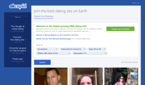
- Consider a numerical indication of other users who have signed up. 100,000 others can’t be wrong!
- If there may be a question, verify up-front that you handle other countries or languages, if applicable.
Don’t go overboard, though. Avoid layering on half a dozen trust sigils like some kind of magic seal that will make people love you. It won’t work, and wraps around into “what are they hiding?” territory.
Remember Mobile
Mobile users exist. Half of all web traffic today is mobile. You’re going to have a lot of people viewing your forms that are using mobile devices. This means you need to put a lot of effort into making sure your forms work and are easy to fill out via mobile.
Asking for as little information as possible is a big part of this. You also want to make each field easy to select and fill out. Minimize typing. Make it easy for a mobile user to scroll through options if necessary, to select fields like State or Country.
One big convenience is to set specific fields to numerical inputs, which triggers mobile devices to use the number keyboard rather than the full keyboard. It’s a pain to have to type in a phone number using a normal qwerty layout on a phone, but easy if the number pad is given right up front.
Validate Errors
Form validation is a dying art, sometimes. A lot of users fill out a form, hit submit, and expect it to work. If they are presented with an error message telling them some field is improperly filled out, a lot of them will drop it in frustration rather than try to troubleshoot whatever the error is.
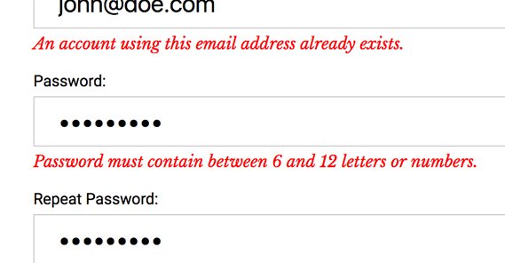
You can perform field validation as soon as users are typing. Many modern forms do this, and you’ve no doubt seen it. Plugging in a username and being told it’s taken before you even proceed to the next field, filling out a phone number and being told it’s not a phone number because it has too many or too few digits, filling out a password and being told it doesn’t meet security criteria because it doesn’t have a special character, and so on.
These are all aspects of form validation. If you can use an active script to read what’s in the form and validate it – without having to send it to a server, to keep passwords and the like secure – do so. Form validation makes it a lot easier to fill out a form in one pass, which in turn makes it easier to submit.
Don’t Mask Passwords
One of the “best practices” from the 90s was that every password field should be a series of dots or *s when you type it in. After all, anyone could be looking over your shoulder, right?
Well, how often is a password stolen from looking over a shoulder? I would venture to guess it’s a lot, lot less often than the number of times someone plugs in a password incorrectly. It’s frustrating to plug in a password and have it be wrong, preventing you from logging into something.
You know what’s worse? Plugging in a password you think is correct, but it’s actually wrong, when you register. Then, when you go to log in later, your password won’t work. If the user could see what they were typing when they typed it, they wouldn’t run into this problem.
Harvest Background Information
There are a bunch of different ways you can harvest information about a user when they submit a form, without them needing to plug in the information themselves. For example, you can harvest their IP address and use a lookup tool to guess at their general location. You can harvest their user agent to get information about their browser or device. You can even in some cases use mobile device access to harvest more precise location or other factors, though this often requires the user to authorize some action and might not be ideal.
This ties into minimizing form fields and asking for less. The more you can harvest in the background, the less you have to ask for. Just don’t make use of that information in a creepy way, otherwise users will lose trust in you.
Use One Column
Studies have shown that using a single column is more readable and more likely to be filled out than splitting your form over multiple columns.
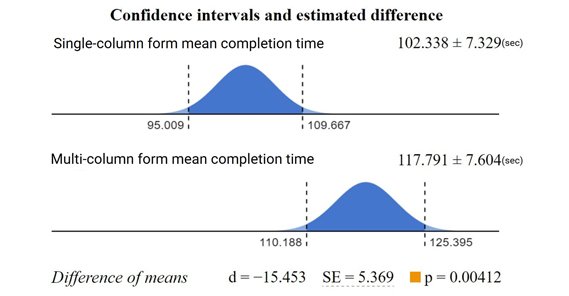
It’s also better formatted for mobile, though a responsive design solves that issue regardless.
Indicate Required Fields
Most of the time, a user won’t want to fill out information they don’t need to. Unless every field in your form is required, mark the required forms with some kind of marking, either color or the traditional asterisk.
Drop the Clear Field Option
Many traditional forms have a “clear” button to reset the form. It’s a sort of emergency button for fringe cases. Maybe a previous user filled each form with gibberish. Maybe the user got two thirds of the way through and decided to change the information they’re giving you.
99% of the time, the user will not want to clear a form, and when they do they can just as easily refresh the window, since most browsers don’t save partially completed forms without intentional configuration. Instead, they hit the clear button instead of the submit button, and it destroys their desire to convert. Just drop the button.