Why Your Infographic Isn’t Getting Any New Links

 ContentPowered.com
Infographics are great for marketing, because they’re one of the easiest forms of content to get to go viral. They’re easy to share, they’re easy to embed, they present potentially complex information in a simple and intuitive way; they have just about everything going for them that you could want from a good piece of content.
The trouble is, everyone realized this about five years ago, and since then, the internet has been positively flooded with infographics. It seems like everyone is making them, and they’re getting fancier and more complex with time. These days you have interactive infographics, animated infographics, infographics using kinetic typography in video form; the basic infographic is the bread and butter of many brands.
So, if you’re producing an infographic, you want it to succeed. When it doesn’t, you have a problem. Why isn’t your infographic getting the views, links, and shares it deserves?
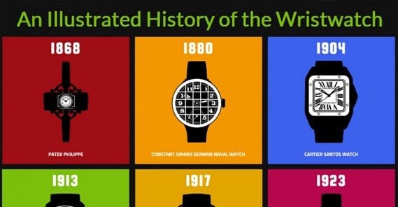
Your Subject Has Been Covered Already
This is a flaw with not doing enough research before you start making a graphic. It’s easy to get an idea, run with it, implement it, and start trying to share it only to find that someone else made a graphic on the same topic, six months ago, and covered it in greater detail and with a better graphic design.
That’s not to say that you can’t compete on the same topic; you just need to be aware of the fact that the topic has been covered before, so that you can step up and make sure your graphic out-does theirs in every possible way. Make your design prettier, make your data more recent, make your point stronger, cite more sources, cover more data, and share with more sites.
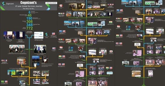
Your Subject is Primarily Yourself
This is a flaw with your intention. When you’re making an infographic, what you’re doing is presenting information in a way that makes it easy to digest. It’s the presentation that makes the topic shine, but it’s the topic that carries the graphic. If you’re making a graphic and the topic is something to do with yourself or your business, well, you had better have a lot of people interested in your business beforehand.

I’ve seen companies make infographics based on their company history, a timeline of sorts, and sure; that’s interesting. It’s only interesting to a small subset of people, though, and it has virtually no chance of going viral.
What you really want in a self-focused infographic is real data that other people could use. Talk about your marketing strategy and make a case study out of yourself. Talk about the good and the bad. Make your graphic – and the data that goes along with it – something that people will cite as a source for future posts of their own.
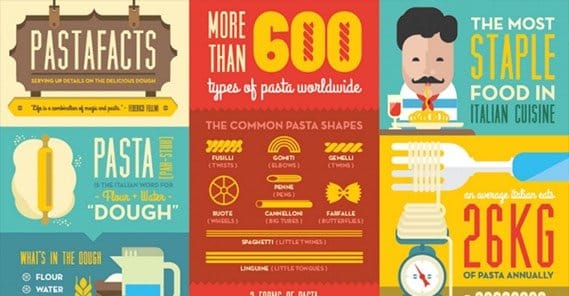
Your Subject Isn’t Interesting
This is a flaw with perspective. I know a few mathematicians, and they are incredibly interested in the complex mathematics of the world around them. I also know a few statisticians, and while both sets of friends are keenly interested in data and math, they are in different arenas. If the stats guy comes to deliver a presentation, most people aren’t going to be interested, no matter how much he is. He has to do a lot of work to make a graphic that presents his case in an interesting way.

This, by the way, is why some popular scientists like Neil DeGrasse Tyson, Bill Nye, and Michio Kaku are all so popular; they present the complex topics of science in interesting, intuitive ways. They aren’t making infographics, per se, but again; an infographic is all about presentation.
Your Idea is Too Complex for a Simple Graphic
Some ideas simply take a lot of background information to explain. I can’t dive into quantum mechanics without exploring physics and giving you a certain level of baseline information to help you get started. I can’t tell you about the mechanics of affiliate marketing strategies without you knowing what affiliate marketing is in the first place.

Some topics simply require too much specialized knowledge to make a good graphic. You’ll get a lot of interest from people a little lower on the knowledge totem pole than you; people who have the background but need the intuitive way of presenting the information to get it. People who don’t have the background – or people who already have the intuitive knowledge – won’t be interested in it and won’t share it.
Your Implementation is Too Simple
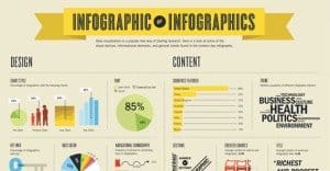
This is the number one flaw with newbies to the infographic space. It’s a flaw with implementation, and it comes from the assumption that any graphic is good enough to make an infographic. It’s how you get bland graphics that work out to be nothing more than a series of pie charts in a grid, or a handful of bar graphs with a bit of copy between them.
Look at it this way; if you could chop up the graphic and it would work fine as a blog post without edits, your implementation is too simple. If you could chop it up and make it a PowerPoint presentation you would otherwise find in a corporate board room, you’re going way too simple. You need something with pizzazz, with a kick, with a twist. Unfortunately, that takes inspiration and significant graphic design experience.
Your Infographic Has No Message
Infographics need more than just data to present; they need a point to that data. If the user gets done reading it and just thinks “well, that was neat” you’re not doing your job. Your graphic needs to make them think. It needs to present the data in such a way as to lead the user to a conclusion. Present data, present arguments, and let them draw their own conclusions.
The hard part about this is making sure your data logically leads to that conclusion, and it means you’ll probably have to cherry-pick some data preferentially over other data. If you’re presenting everything without bias, you’re liable to run into issues with logic. If a reader can spot a loophole or is left with a question you didn’t answer, you have to refine your graphic.
Your Graphic is Too Long
Some infographics just go on for far too long. There are a few reasons why you won’t want to do this. For one, longer graphics are larger and take more time to load. They’re also impossible to display on a site like Facebook; they need to be embedded at full size, and many social networks don’t allow that. They’re difficult to manage and, often times, your readers will lose their attention span before they get to the end.
 20 Legitimate Ways to Get More Links to an Infographic Infographics are an amazing way to present…

A general upper limit for the height of an infographic is around 8,000 pixels. Anything longer and it’s getting to the point where you’re trying to cram in more than is necessary. As for width, don’t make it wider than half of a typical monitor, or the width of a standard blog layout. That’s where it will be embedded, after all.
Your Font is Unreadable
For the sake of your readers, consult someone who is into typography. Some fonts may look good to you but are unreadable to many people. Some fonts look good on your smaller than average monitor but are tiny on an average screen. Some fonts are too thin to show up well on mobile devices. Some are too squished to make out individual letters easily. A clear, sans-serif font is generally the way to go, though you can vary it up if you’re being especially stylish.
Your Design is Too Scattered
One mistake I see a lot of novice graphic designers making is using bright primary colors or a limited palette of the same color too often. If you choose a different primary color for each element, you’re doing it wrong. If every element is a different shade of green, you’re doing it wrong. Mixed palettes with varied colors take some balance to achieve, which his why I like to use tools to find an appealing color palette.
One tool I particularly like is Paletton. It lets you choose a specific primary color, and it creates a palette of variant colors to go along with it. You can change modes to choose more varied colors that tend to work well together, according to color theory. Play with it to find something you like, then pull the colors to use in your graphic.
Your Copy Doesn’t Grab Attention
You’re not writing a blog post, here. You’re writing an infographic, and an infographic can’t be primarily text. The point of the infographic is to present the data you want to present in a visual way, with a minimum of explanation. When in doubt, cut the copy down to the punchiest, shortest possible line. You can always explain later in a companion blog post or in the sources for your data.
To a certain extent, you’ll have this problem with the data itself. Unfortunately, there’s not always a lot you can do to make your data more interesting in and of itself. You need to figure out how to present it in a good way.
You’re Writing Too Much
Again, a flaw with your copy; you’re producing too much of it on the graphic itself. This tends to come when you’re trying to rush out a graphic and don’t have a convenient way to present your data, so you just write it out. I’ve also seen it happen when you’re trying to make a simple graphic and all of your “graphics” are just charts. The point of an infographic is to find an innovative way to present your information, and sometimes that just takes time.

Fortunately, there are services that can help design a graphic for you, and they have actual graphic designers used to working with varied data sets and presenting them in an innovative way. Unfortunately, these companies tend to be pretty expensive. It’s up to you if you can afford the service or if you can afford to take the time to do it yourself.
Your Graphic Isn’t Subdivided
Like a blog post, an infographic should flow from one point to the next. A good infographic generally has the graphical equivalent of subheadings along the way. When you design a graphic, start with the logical flow you want to make. Figure out where the starting point is, where the conclusion is, and what points you need to make along the way to connect them logically. Then dedicate a section of the graphic to each point. This logical flow will make your graphic that much easier to read, and will hook people faster. That’s how you get them to like and share your graphics, to link to them, and to embed them in their own sites.
You’re Not Submitting to Aggregators
There are a lot of different sites out there you can use to submit your graphic.
I’m talking about more than the simple social media sites and the few influencer blogs you like to target. I’m talking about aggregators, both of infographics and of blogs in your niche. There are literally hundreds of sites you can submit your graphic to, which will go a long way in getting extra exposure. You won’t be able to attach a post to most of them, though, so make sure you have your link prominently displayed for the original source.
You’re Not Targeting Your Audience
Always keep in mind the people who will be viewing this graphic. They are your initial seed audience. If you aren’t presenting your graphic in a way that is attractive to them, you’re not going to earn links. Sure, there’s going to be an audience that will find your graphic attractive, no matter what it is. The problem is, when you can’t reach that audience, your graphic stalls out. It doesn’t go anywhere.
One of the biggest mistakes I see people make here is targeting business customers with B2B information. These people aren’t businesses, they don’t care about your B2B information, yet they are your primary audience.
You’re Not Encouraging Sharing
Is your graphic surrounded by social media sharing links when you post it? If not, you’re missing out on a lot of quick and easy shares.
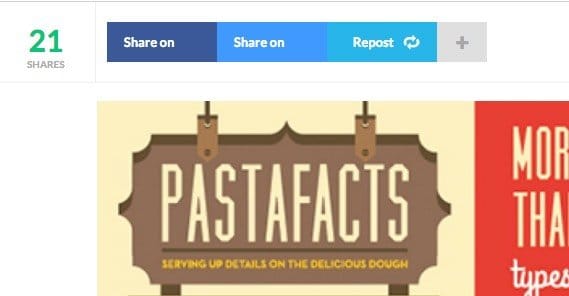
Likewise, you can use individual techniques to get more shares. Twitter, for example, tends to share more if you include “please retweet” in the tweet.
Your Data is Incorrect
This one comes up a lot in infographics in the political arena or graphics that are trying to prove a point on contentious issues. Gun control is a big one; statistics are notoriously out of whack, displayed on a skewed surface, or somehow not presented properly. This makes your graphic lose credibility regardless of your subject, and while you’ll still get plenty of blind links and shares, anyone who actually fact-checks you will poke holes in your data and will call you out on it. In fact, it’s one thing I love doing; when you can be the one poking holes in someone else, you’re the one that gets the fame.
You’re Not Citing Your Data
Every time you find a piece of data to use in your graphic, the first thing you should do is verify that the data is legitimate and was measured in an appropriate way. Using faulty data should never happen in a widely promoted infographic. The second thing you should do is make sure the source is someone you want to associate with. If they aren’t, find another similar piece of data you can use. The third thing you should do is make sure you cite the data when you use it. This allows you to poke the originator of the data and inform them that you used their data, and they will probably share your graphic as a result.
There are a lot of possible flaws with infographics, but if you fix them before you publish, you’re well on your way to a much more successful circulation, and possibly even a viral post.