How to Install an Exit Popup or Bounce Window on a Site
 ContentPowered.com
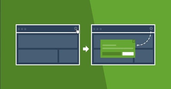
A bounce pop window is a pop-up lightbox that triggers on your own page, but doesn’t create a new browser window in the same way that a malicious pop-up or pop-under would. I guarantee you’ve seen these; in fact, you can go to any of a million websites to see one in action. They work when your mouse cursor leaves the window, you minimize the window, you change tabs, or even just when you let the window sit long enough or scroll far enough down the page:

These bounce conversion plugins work in one of two ways. One of them is the exit intent, which detects when you’re about to leave the page and triggers the pop-up window. The other is by less sophisticated methods, such as a time delay, scroll trigger, or instant pop. Exit intent is perhaps by far the most useful, but it’s not widely used because it’s a trademark of OptinMonster. For reference, you can click that link and then move your cursor outside of the window to see it in action.
Now, exit pop-up overlays or lightboxes are some very effective tools, as much as some people don’t like them. Heck, as a web user, I don’t like them, but as a marketer I love them. There’s just something pure about a technique that doesn’t interrupt the user’s experience but increases your conversions as if by interruption.
So, how can you implement one of these pop notifications to boost your conversions without driving away users, making a big change, or spending a lot of time in development?
Here’s how.
Step 1: Determine the Content of your Pop
Imagine you’re in a face to face conversation with someone you’re trying to sell a product to. That someone is not convinced. They have listened to your sales pitch, they have taken a business card and brochure, and they are about to leave to go home and think about it. They’re walking out the door. You say “oh, and one last thing before you go.” They stop, turn, and wait expectantly.
What do you say?
That’s the physical equivalent of an exit pop-up. The digital difference is that the user is “going home” by closing your site out of a tab or browser window. You don’t have a sound clip to play – you damn well better not be trying to autoplay a sound in your pop-windows – but you get a visual change to the site they’re leaving, to draw their attention. That’s how these pop-ups work. They disrupt the intent of the user to leave, by drawing their attention momentarily back to the page. The animation of a pop-up, the lightbox, the drop down; whatever way they take to come onto the screen, it’s enough to draw attention.
So the first thing you need to do is determine what it is you’re going to say in the pop-up window. This means you need a goal. One thing you should not do is just use it as informational content. The pop-up appears and tells the user that by the way you have other blog posts? Whatever, who cares? They’ll say “good for you” and leave.
Here are some examples of goals you can offer in your exit pop-up window:
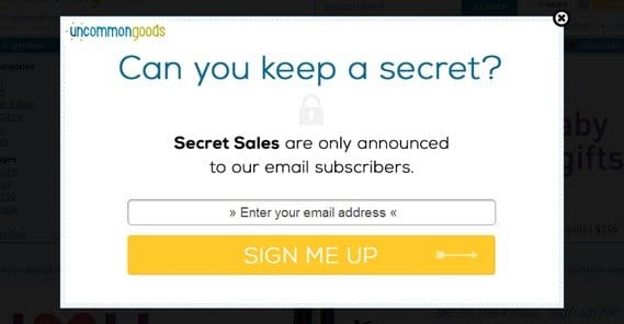
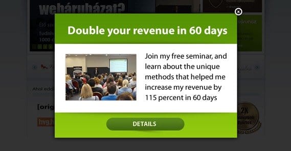
- “If you liked this post, consider subscribing to our mailing list for regular updates.”
- “Find out 1,700 tips for how to boost your search ranking by claiming our new ebook here.”
- “Try our product for one week risk-free, no contract or strings attached.”
- “On the fence? Buy now to receive 10% off your order instantly.”
- “Like our site? Support us by following us on Facebook!”
- “Do you like living in the dark? Click the X if you don’t want relevant page insights.”
You can see some examples of pop-ups covered here. Wishpond even critiques their design, so you can take their advice and use one of the designs as a base for a custom creation of your own. That is, if you’re using an app that allows for such customization.
You might notice something unique about the last one. It’s called a negative ask, and it’s a way of using reverse psychology to get people to do what you want. No one wants to click a button that says they’re okay with operating at less than 100%, but that’s exactly what the pop-up does. Some people don’t like the technique, but honestly it’s been a common staple of marketing for centuries, it’s not going away now.
Step 2: Determine How to Trigger the Pop
This is a simple step, thankfully enough, and you can do it on an ongoing basis as you implement your pop-up. I listed some methods above, but I’ll go over them in more detail here.
- Exit intent. This is the best of the options, but is harder to find, because it’s harder to implement. It triggers when the window loses focus from a change of tab or window, as well as mouse motion when the cursor leaves the active area and moves towards the X in the corner.
- Timed. This option is best used on a lengthy timer when you know you won’t be disruptive. Otherwise, you catch people mid-reading of a post, and the interruption drives them away.
- Scroll-triggered. This triggers when the user scrolls far enough down the page, typically at a flag tripped when they reach a point where they would be ending the post they’re reading. Be careful not to make this too low, or no one will trigger it because it’s down in the middle of the comments.
- On action. These are rare, and are user-triggered via actions like clicking an external link or clicking away from a landing page.
Typically, I prefer exit intent, as it is the least disruptive. I consider it a good baseline, but you can test each of the variations when you implement it. Rotate through several sets of code and see which has the best conversion rates.
Step 3: Find a Relevant Pop Plugin or Code
There are a lot of different options to choose out there, with various marketing agencies providing their own pop-up builders or plugins. Some will work on any site, some will be WordPress plugins, and others will be open source. Some require a monthly fee, some are one-time payments, and some are completely free. I’m going to list off a bunch of them here, but keep in mind they aren’t a completely exhaustive list. You may very well find several you like more than any I mention.
 Are Ad Popups and Modal Windows Bad for SEO? Pop-ups in the traditional sense are a…

Wishpond Forms – These come in a wide variety of templates and allow you to customize colors, data entry, and CTA to a broad degree. You get the forms with the free version of the service, but you have a limit of 200 signups per month before it stops working. You also don’t get split testing internally. For split testing, custom CSS, and up to 1,000 monthly leads, it costs $44 per month.
Mojo Wheel – A unique option that gameifies your exit pop. It provides a wheel with different incentives and asks the user to opt in to your form in order to get a spin. The spin can have whatever it is you want to provide, like a 10% discount, free shipping on an order, a free ebook, or whatever else you like. It’s also completely free.
Kickoff Labs Bounce – This one is powered by a huge form builder engine, with a whole lot of extra features on the side. It’s frankly overkill if all you want is an exit intent pop-up, but it’s still one of the best ones available if that’s what you do want. Their pricing page is deceptive, by the way; they make it seem like their cheapest plan is $104 monthly, but they just have the plans in reverse order. For $27 per month, you get unlimited access to their pop-up forms for up to 10,000 unique visitors per month.
Optin Monster – The originator of the exit intent pop-up, Optin Monster’s offering is one of the most widespread and widely used pop-ups out there. You get their pop-ups for any paid tier, but for the exit intent technology, you need to buy the pro tier, which is $29 per month. You also get a whole lot of other features, if you’re into exploring what you’re paying for.
Hold on, Stranger – Another of the better but lesser known names in exit intent technology, this one ups all the numbers. For $29 per month you get a license for a single website with up to 45,000 monthly page loads. This can be more or less effective depending on whether or not you have a ton of returning visitors, so keep that in mind. It’s also not white label unless you pay for the higher tiers, starting at $69 per month.
Yeloni – This one is free for a basic WordPress plugin, but if you want to use it on non-WP sites or if you want to expand the functionality with extensions like page specific targeting, custom HTML, or mobile pops, you need to pay for those features.
Speaking of WordPress plugins, there are a bunch of those too.
Facebook Page Promoter Lightbox – limited in that it only works to display a Facebook page like box, so you don’t have a bunch of different CTAs or customizations you can pick through. On the other hand, it’s good at what it does.
OptiMonk Exit-Intent Popups – Includes unlimited pop-ups through a pile of different templates and customization with a simple editor. Set through exit intent, on scroll, entry, or timed. Integrates with email systems like MailChimp and AWeber. The advanced features even include segmentation, mobile and responsive pops, delayed X display, geotargeting, and split testing.
WP Popup – Pretty much the same as the above. The only difference is that a lot of the advanced features, like category sorts, custom themes, and page targeting are limited behind the premium version.
PopUp by Supsystic – This one is noteworthy because it includes over 30 different animations you can use when the pop triggers. It also includes special pops that you don’t find elsewhere, like one integrating an iframe and one using Google Maps.
WBounce – This one is open-source and can be found on GitHub as well as through the link I’ve provided to the WordPress plugin directory. As such, it might take a little effort to configure it in a way you like, but it can be configured in any way you want, because you can change any and all of the code associated with it.
Again, this is just some of the many options available to you. If you have one you prefer but that I haven’t listed, feel free to list it in the comments.
Step 4: Monitor Statistics to Determine Success
Before you implement your exit pop-up, determine what the key performance indicators are for your goal. For example, if you’re running a Facebook lightbox, you’re looking for followers. If you’re giving away an ebook, you’re looking for book downloads. If you’re giving a product discount, you want offer claims.
Spend a few weeks monitoring the current rates of the KPI you chose. Then, once you have a baseline, implement the pop-up of your choice. Monitor those same metrics over the same period of time, so you can see how they grow. And they will grow; very, very rarely will the people you drive away hurt more than the people you add via your pop-up.
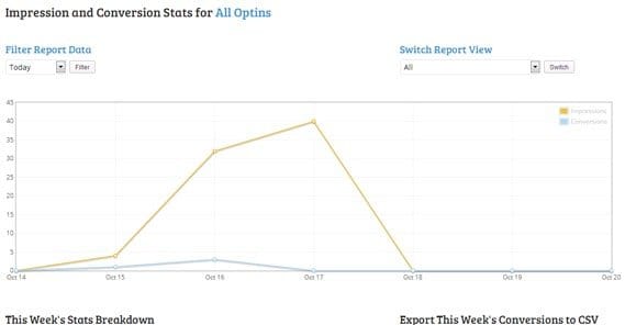
Once you have your new grown baseline, you can change up the pop-up the same way you would split-test pretty much anything. Change up colors, designs, copy, size, delay, lightbox shade, and anything else you want to change. Change, test, iterate, change, and repeat.
Tips for Exit Pop Success
The remainder of this post is an assortment of tips you can use to make your exit pop-ups more effective. They stem from anecdotal evidence, though, so make sure to do your own testing before you implement them just on my advice alone.
- Make the pop big enough to draw attention. A tiny pop in the corner is not an effective exit intent pop. On the other hand, there’s nothing wrong with a full-screen takeover. Neil Patel uses it to great effect via a Hello Bar, though his is on page load, not on exit.
- Use color and branding, avoid the black and white blandness. The same can be said for any page element, though; the more minimal your design, the more bland and less attractive it is.
- Use real statistics to support your goals. One common technique to illustrate this point is for mailing list opt-ins; “Join 47,038 successful marketers in conversation,” as an opt-in CTA, indicates that they will be in exclusive company.
- Place your CTA button in a logical position. My favorite “whiff” of this one was an old PostPlanner pop that had a nice graphic of a paper airplane with a trail showing where it had flown. The only problem was, if your eye followed the trail, the airplane formed an arrow right to the X to close the pop.
- Make sure it’s clear how a user can exit the pop if they want to keep reading or browsing. See, exit pops are common enough that a normal closing procedure is fine, but when it’s hard to close it, the disruption makes the “close site” button more effective, and that’s something returning visitors remember.
- Rotate your pop-ups every few months. Even the best pop-up goes stale after a while. The same logic applies to PPC ads, so it should be nothing new.
- Notify users when they have left something in their cart. Cart abandonment is one primary use for exit pops I didn’t cover above. It’s a great idea.
- Couple with re-marketing to avoid showing the same pop twice. If you’re showing the same pop to a user every time they load a page during a session, they’ll swiftly grow annoyed at it.
And, above all, test. It cannot be overstated how important testing is to all forms of marketing. Test everything about your pop-up, and make it the best it can be.