How to Increase User Signups on Your Website

Facebook ads are really a case of “you get what you pay for” with one kicker; you can do a lot to optimize what you pay for. There’s no reason any business shouldn’t be spending at least a little bit of money on the platform, because it’s so cheap and easy to use.
The problems come when businesses don’t know how to optimize their ads, don’t try, and end up throwing away hundreds of dollars a week on ads that just don’t work. This is where the negative reviews and anti-Facebook advice comes from. If you know how to use the platform, you can make your ads incredibly effective and keep your costs down at the same time.
The Basic Minimum
There is a good argument to be made that you should spend a minimum of one dollar every day – a total of $365 per year – on Facebook ads. Moz, in fact, has made that argument. I’ll go ahead and summarize it here before we continue.
- Facebook ads have perhaps the lowest cost in both time and money to reach 1,000 people out of any advertising method in the history of humanity. Maybe free word of mouth is cheaper monetarily, but with the time involved, it’s worse in calculation.
- With an average cost of just a quarter per thousand people, you can reach four thousand new, highly targeted users every day for a single dollar. Imagine doing that when your competitor isn’t. Conversely, imaging fighting against a competitor that does that when you don’t.
- $30 monthly is an incredibly minor fee. Most businesses will be able to cover that in a single conversion. If your business can’t afford $30 in a month, it’s not a very successful business. Moreover, if your business can’t achieve a 1/4000 conversion rate (that’s a conversion rate of .00025%) what are you doing trying to run a business?
- Facebook conversion tracking makes it easy to gather loads of data on the people who don’t convert, which serves as additional lasting benefit even after the ad has run its course. $1 for a wealth of information on site usability, demographics, interests and more? How can you say no?
- You have a massive range of targeting options to make your ads as targeted or as open as you want. You can balance the open-ended ads with the highly-focused ads to keep costs down and reach the exact people you need to reach.
Expanding Budgets
So, here’s the thing. That Moz-argued $1 a day? That’s a great minimum. For small businesses, companies with follower counts in the hundreds or low thousands, it’s probably quite enough. If you only have 500 followers, reaching 4,000 in a day is a great boost. If you have 10,000, it’s still a great boost. When you’re up to 50,000 or 100,000 followers, or even a million, you’re reaching a point where a mere dollar won’t do you any more. Even running an ad to reach the people who follow you isn’t going to work. You just won’t reach enough of them.
So, how much should you spend on Facebook ads?
There’s just one problem; there’s no right answer. You need to know a lot about your own business, and a lot about what you’re trying to do with your ads, to determine how much money you need to use in order to be effective. If you have 1,000 followers and you want to reach all of them with a promoted post, it won’t cost you much. If you have 100,000 followers and you want all of them to click through to a website, it will cost quite a bit more.
What do you need to know?
- Your goals. Different goals will have different prices. Furthermore, different goals will have different prices with different pages behind them. So, the first thing you need to determine are your goals. Do you want new fans? Do you want email subscribers? Are you looking for clicks to your website or actual conversions?
- Your presence. You need to know the raw nuWhen you’re running a business, sooner or later you’re going to want to get your users to sign up for something. That something could be anything; email lists, product reminders, service orders, premium memberships or something more obscure.At the core, a sign up is a sign up. Some are just harder to get than others, typically when the act of signing up requires something more than a username, password and email confirmation. No matter what the goal, a sign up is mechanically the same. Therefore, any method to use to increase signups will be the same.
Whenever you’re considering a change to your signup process, ask yourself two questions.
- Does this change make it easier for a user to sign up?
- Does this change make signing up more attractive?
If the answer to either one is yes, the change is potentially valuable to make. Make it, split test the results, and see where you stand. That’s the process; now what are the changes you might make?
Enhance your Call to Action
Your CTA is the button users have to click in order to proceed with the signup. There’s a lot that can be said about optimizing it, ranging from changing the positioning, the color, the size and the language, but it all boils down to making it more obvious and more attractive. For further reading, look up anything involving CTA optimization. For now, some guidelines:
- Don’t make the button too big. If it’s large and wastes space, it’s less attractive.
- Don’t fret too much about colors. If you’re poking into exact hex values, you’re way beyond the point where diminishing returns have made it no longer worth the effort. Just make sure the color is high-contrast compared to the rest of your page, that it stands out, and that it’s the only element on the page using that color.
- For God’s sake, make sure the button actually looks like a button. You’d be amazed at how often a site CTA button just looks like an unrelated background element.
- Test variations in language. Make it personal, make it attractive, make it sell.
The rest of the CTA’s success comes from the landing page, if you’re using a specific landing page rather than a generic form on every page.
Make it Easier
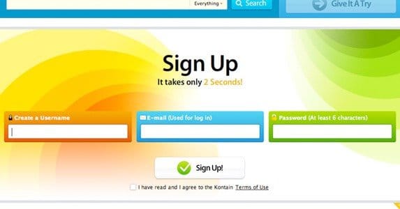
How many fields does the user need to fill out when they sign up? The more you require, the harder it is to make a user want to sign up. In fact, it’s a great idea to cut it down to one on the first click. Rather than front-loading everything, consider two-phase registrations.
A two-phase, or two-click registration is a registration where the first thing you’re asked to do is simple; add an email address to a form and click submit. This is just the first step, and it acts as a trap for users. They think all they need to do is add their email, and they’re done. When they click submit, a longer form appears, asking for additional information. It might be username and password, it might be zip code and age, it might be anything else you need.
At this point, the user is trapped. They figure you already have their email address, they might as well finish the signup, right? Or they figure that they’re already partly done, they don’t want to waste that effort, so they’ll finish. The trap sprung, they slip down the funnel and into the conversion.
Be Minimal
But test it out first. Some of the best, most compelling signup pages are incredibly basic. Look at Groupon’s homepage, or Dropbox’s, or Pinterest’s, or Instagram’s. They’re all very simple pages with little more than a basic illustration of what the business involves, and a simple registration form.
Before you go cutting out pages of information and code, however, test the change. Create an alternate homepage and split-test it with a set of identical ads. Send a few hundred people each way and see which ends with more registrations. You might find that minimalism doesn’t appeal to your users, or you might find it triples your conversion rate; you have to test to be sure.
Withhold Value
Content is free on the web, and your blog should be free. The meat and bones of your site, however, should be gated behind a registration. If you’re running a real estate search engine, hide the results behind the wall. If you’re running a coupon code site, hide the coupons under a login. Make it valuable to register, even if registration is free.
Offer Value
Conversely, if you don’t have such a service to gate, offer something of value to your users when they sign up. The most obvious version of this is offering an ebook to users who sign up for your mailing list. They register because they want what you have to say. You benefit because the ebook gives you more publicity and you build your mailing list. It’s win/win.
Capture Extra Data
You can use hidden forms that auto-fill with additional information when a user submits. This can only be public information, of course, sign as IP address, device and browser. This allows you to capture a bit more information about your users without them being forced to input it, and it’s perfectly acceptable to use.
Run Conversion Ads
This one doesn’t really qualify as an on-site approach, but you can run ads through Facebook specifically with the conversion objective. Put a bit of tracking code on your signup confirmation page and run an ad that encourages users to sign up. Dump them on a high pressure landing page and wait for them to slip down the funnel.
Social Logins
Many sites today are using Facebook as an alternative registration. This is incredibly convenient, because automatic Facebook verification eliminates the need of email confirmation links. It also allows you to harvest data from Facebook, ranging from name and email to interests. Plus, the user just has to click a couple of buttons, with no form filling at all.mber of fans you have following your page. Growth from a higher position is typically easier. On the other hand, you also need to know the quality of your existing audience. If you have 100,000 followers, but 90,000 of them are clickfarm bots, you might as well only have 10,000 followers. Heck, you might have less, just because it’s harder to reach those 10,000.
- Your niche. Some niches simply have more competition than others. More competition, especially competition from high profile, large companies, tends to make ads more expensive. Big businesses just have more money to throw around. You also need to be aware of the types of people you’re reaching Businesses in some industries will have a harder time reaching people on Facebook than, say, entertainment or tech businesses.
- Your resources. Are you trying to sell a product through Facebook ads? If so, you need to be aware of the qualities of your product and how easily you can sell it. Are you trying to get people to visit your website? You need to make sure your website is as compelling as possible on its own. Do you have an existing customer list? Marketing to an existing audience is easier than trying to find a new audience.
- Your time. If you have six months to reach a goal, you’re going to have an easier and cheaper time of it than you would trying to reach the same goal in two weeks.
The Numbers
All of that said, you still want some basic numbers. Bear in mind that any numbers I give you are going to be variable according to all of the factors above. The more you try to do, the less you have to start, and the less time you want to do it in, the more expensive it will be to do. That said, here are some baseline numbers you can compare to your expectations, goals and budgets.
- Facebook fans typically costs between 50 cents and $1 each, though they are also perhaps the most widely variable goal in terms of price.
- New email subscribers tend to costs around $1 per email address. You can lower this by action-gating a contest with an opt-in, but that doesn’t reflect directly on your ads.
- Clicks through to your ads can be very cheap, ranging from ten to 50 cents each. How compelling your content is, and who you target, has a huge effect. So does name recognition.
- Actual product conversions can be insanely variable, and it all comes down to the quality and price of your product. If you’re trying to sell a product for $1,000, conversions are going to be much harder – and thus more expensive – to obtain. A $5 product, on the other hand, should be cheap for individual conversions. Your conversion cost should never exceed the cost of your product, for obvious reasons.
It’s up to you to tally up your resources, analyze your starting position, establish your goals and timeframe, and calculate your costs from there. It’s also up to you to optimize your ads to minimize those costs.
 ContentPowered.com


