Are Ad Popups and Modal Windows Bad for SEO?

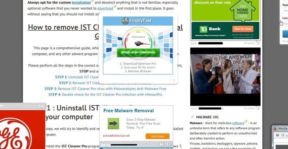
Pop-ups in the traditional sense are a hassle, a thorn in the side of every web user. Before the advent of pop-up blockers, it was not uncommon to close a window after a long session of browsing and see half a dozen or more pop-up windows open behind it. They hog system resources, they distract, and they were almost always filled with spam no one wanted to see.
The very fact that you didn’t see them until closing the original window made them horribly ineffective, and you’d get to see how many of them were all coming from the same ad network. You just close the obvious ads, which have become ineffective for their original purpose.
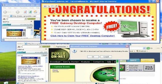
The worst was when one of those ads played a video or audio automatically. That kind of massive disruption in browsing was enough to make some web users, myself involved, blacklist the website they came from entirely.
That was years ago at this point, though. We’re in the modern age! Pop-ups and pop-unders have been relegated to the dark underworld of black hat ad spam, and reputable sites know better. Or do we? Pop-ups and the like do tend to have a negative effect on the user experience, but do they have a direct effect on SEO?
The User Experience
Before getting into a discussion of each type of pop-up, modal window and script, I just want to take a moment to say that I know some of them work. Exit intent scripts are all the rage these days, precisely because they work. Even if some users rebel against the idea and you lose a little traffic, you gain a significant boost to conversion rate. For many sites, that’s worth it.
That said, I believe there’s a right way and a wrong way to do anything. In general, pop-ups and pop-unders, anything that spawns a new window, should never be used. The only exception is for user-triggered actions, like clicking a button expressly labeled that it launches a new window. Even with modal windows, those lightbox scripts that pop up content over content in the same window, there’s a right way to do them.
Anything that obstructs the user experience is a negative. An exit intent script is useful because it captures the user’s attention when they’re otherwise done with your content. Time delay modal windows, in contrast, can disrupt a user reading your page. That’s a bad thing.
Now, let’s take a look at each kind of pop-up and modal window, and examine their role in SEO, marketing and the user experience.
Old-School Pop-Ups
It’s no secret that users hate traditional new window pop-ups. They’re pretty hard to find these days, just because of the fact that every modern browser has a pop-up blocker enabled. That alone should tell you something about using them.
Google also hates traditional pop-ups, but they aren’t broadly penalizing any time a website generates a new window. For example, a web forum might create a pop-up when a user logs in and a private message is waiting for them. That’s not something Google would penalized, for two reasons. First, because it’s a useful feature for a user. Second, because Google themselves would never encounter it; they don’t have user accounts and they don’t get PMs on forums.
Of course, Google won’t penalize a site opening other windows, for various purposes, so long as those purposes are legitimate. It’s only when pop-ups are vectors for advertising that Google starts to take notice.
Now, there’s no easy “don’t use pop-ups” message that I can find from Google. However, you can easily see that they don’t like pop-ups by the tertiary fallout. If a pop-up, for example, gets you blacklisted on Google Shopping, that’s a pretty clear indicator that you shouldn’t be using pop-ups if you want to take advantage of Google services.
You also have to consider the reputation that pop-up ads have accumulated over the years. When was the last time you heard about a pop-up that was legitimate? I haven’t heard or seen one for a long time. Every time I see one, it’s a shady ad slipping through blockers using obfuscated code or a new way to generate a window that the blockers haven’t blocked yet. They advertise pharmacies, they advertise adult sites, they put up big “malicious software detected” warnings in an attempt to get you to download their viruses.
Even if Google didn’t penalize pop-ups, why would you want to use them, if that’s the crowd you’re running with? It’s like spending all of your time hanging out with meth heads even though you don’t do meth. Everyone is going to think you do, your reputation will be shot, and you gain no benefit from the association.
Pop-Unders are another type of the same thing, and they have all of the same reasons to hate them. Anything, anything whatsoever, that generates a new window ends up being a nuisance at best and a malicious attack at worst. Just don’t do it.
User-Triggered Modal Windows
A modal window is like a pop-up, only it’s generated by a script and it appears on your site itself, not as a new window. This is a much less intrusive way of displaying content, but again, it all depends on how the modal window is used in the first place.
Like pop-ups, modal windows can be extremely irritating, or they can be minimally intrusive. It’s all about how you use them.
A user-triggered modal window, for example, would be a modal window that only appears when the user clicks something. For example, go to Amazon and pick a product. Click on the preview image for that product. It pops up in a modal window, zoomed in, for you to see in greater detail. This is a modal window, and it’s triggered by a user action, in this case the click on the picture.
This kind of modal window is perfectly acceptable. It’s adding value to the page without being intrusive or distracting. It’s not serving an ad; it’s just serving extra content. The user isn’t being confronted with it; they’re seeking it out.
Another example of a well-done user-generated modal window would be an opt-in form that hides most of the time on a landing page. For example, a user visits a landing page, and they click the button to opt-in. Instead of taking them to a new page with a form, they’re immediately presented with a short form in a lightbox on top of your content. This is beneficial because it doesn’t force the user through a delay, it doesn’t reload a page, and it doesn’t force them to go back if they want a second look at your page content.
The concern that many people have for this kind of modal window is a concealed content penalty. Google doesn’t like it when you hide content from the user. This goes back to the old days, when a site might hide keywords or stolen content with same-color text and backgrounds, or scripts to push the content off the top of the screen. I’ll talk more about concealed content later.
Time-Delayed Modal Windows
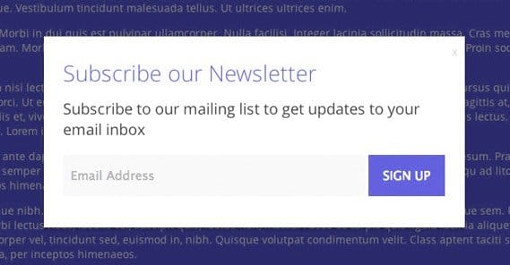
The most common form of modal window these days is the email capture script. Unbounce wrote about these in detail, but I’ll talk about them as well.
Essentially, a timed modal window is a screen-covering window that pops up once the user has been on the page for a certain amount of time. It might be 10 seconds, or 30 seconds, or a full minute, or however long you choose to set. Heck, you could put a message on a 10 minute time delay, just for people who idle on your site, as an easter egg.
The first issue you run across with these modal windows is the annoyance factor. They are pop-ups, after all. As a blogger, very often I seek out content to reference in my own posts. I’ll open up a bunch of tabs from marketing blogs to read, but when I go back to read them, half of them are covered by time-triggered modal windows that popped while I was away. Others will trigger when I’m still reading, which interrupts my thought process. Frankly, I often avoid linking to these pages, even though it’s petty and unlikely to make a difference to them in the long run.
The second issue Unbounce mentions is the engagement factor. With regular opt-in forms, you have two types of people; those who opt in and those who don’t. The ones who opt in are obviously going to be the more engaged set. When you capture emails through a time-delayed pop-up, however, you might discover something.
First, you’ll discover that you get more opt-ins this way that you do with just your passive calls to action. Second, if you keep track of users segmented by how they opt in, you’ll find that users who opt in via a time delayed modal window are less engaged than those who opt in via a landing page.
Think of it as the difference between “Oh cool, I’d love to be on this mailing list” and “Fine, I guess I’ll sign up, whatever.” Some people sign up even though they don’t really care.
That’s not to say you’re not getting valid and valuable customers from these time-delayed modal windows. Just that they’re not as engaged and not as valuable as the people you bring in from a dedicated landing page.
Exit Intent Modal Windows
There are two ways to do a modal window with an email capture form that work better than a simple time delay. I would highly recommend both of them, particularly over a simple time delay.
The first is to trigger the modal window based on scrolling. When a user has scrolled far enough down your content to have finished reading it, trigger the modal window. I find that this is much more effective for small modal notifications, like a window that sticks out of the corner of the screen. For example, Hubspot often has a small notification window in the lower right corner pop up as you read content.
The second is an exit intent script. These don’t trigger based on time or scrolling. Rather, they trigger when the user does something that indicates they’re going to close the tab or window. Typically, this means when the mouse cursor moves off the content and up to the navigation bar.
The reason an exit intent script is so much more effective is because the user is already done with your site. They’re clearly about to close it. It’s like at the tail end of a conversation, you said “wait, one more thing!” Or, to put it in late night infomercial terms, “But wait, there’s more!”
It disrupts the user’s intent to leave, which is very different from disrupting their intent to keep reading. You jar them out of their intent to leave and get one more glance at your content, often with a special offer involved. This is a great way to capture more users. You’ll have to test yourself to see if they have worse engagement in general; I believe they’re about the same.
Modal Windows Hiding Content
Google doesn’t have a particular stance on email capture modal windows, so long as they’re implemented properly. By implemented properly, I mean a few things.
- They don’t include ads for anything other than your own content, like an ebook offer.
- They don’t restrict the user’s ability to close the window. More on this next section.
- They have an obvious way to close them. I actually recommend using more than one close method; the typical X in the corner, a “no thanks” link, and the ability for the user to hit ESC to close it.
Google does, however, hate when a side hides too much content. Remember my example of the Amazon product image? That’s fine. Now imagine you have a different e-commerce site, and you have a grid of product images. In order to view the product description, the user has to click the thumbnail. This brings up a lightbox with a larger image, the product description, links, and all the typical information you would have on a product page. Pretty slick, right?
Unfortunately, to Google, that just looks like an empty page full of thumbnails. They can see the content; they can parse the script and read the product descriptions. The problem is, that just looks like a lot of hidden content. It’s not doing you any good, and in fact will cause a dramatic drop in search ranking. Always make sure that your modal windows add value to the page, but that the page is completely viable to use without them.
Scripts that Block Exits
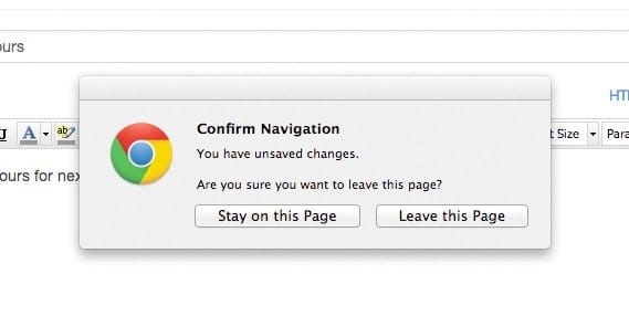
This one isn’t technically a modal window or a pop-up, but I have to mention it because I’ve seen it used with both before. The idea here is that “but wait, there’s more” exit capture, taken to an extreme. Rather than jar the user out of their action with a change to the window below, these scripts allow the user to click the X button and then block that action from taking place.
You’ve probably seen this before. A window pops up in the page when you click the X on the tab or window, and the window doesn’t close. The script gives you an offer, usually with an ambiguous answer. You’re not sure which of the buttons you should click in order to go away. “Are you sure you don’t want to not close this page?”
This is something Google absolutely despises; obstructing the user’s ability to use a website. It’s something that will earn you an instant Google penalty, and with good reason. Think back to any time you’ve ever seen one of these scripts in action. For me, 100% of the time it’s been on a thin, spammy affiliate page. I’d link one here, but I don’t even want to give them the benefit of a domain mention.
In Context with Other Advertising
You’ll notice that all of the above have been mentions of using modal windows or pop-ups for “legitimate” purposes, like advertising a coupon code, giving out a copy of your ebook, or encouraging users to sign up for your mailing list. The reason for this is because that’s the only real use of a modal window or pop-up.
When you start to use modal windows for advertising, you start to run into issues. Imagine an exit intent script popping up a modal window that includes nothing but an advertisement for some other site. As a potential customer, that doesn’t make me want to use your service; it just tells me that you’re trying to get money out of me even though I was leaving without buying your product. A sort of “well if they won’t buy from me, at least I can take advantage of their view” sort of outlook.
Google strongly dislikes hidden advertising like this. It’s grounds for deindexing, as well as removal from their various programs.
Even if you’re not serving ads in modal windows, using modal windows on a page covered with ads is another potential strike against you. It’s like how Google will penalize a site for having too many ads; it’s a sign that you don’t know what you’re doing, and that your site isn’t usable, useful or valuable to share.
Relating to Google AdSense
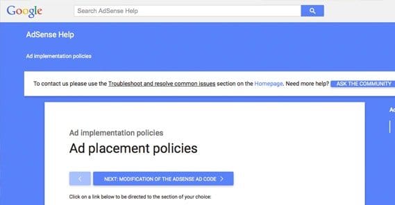
Speaking of removal from Google programs, AdSense does have specific rules against using pop-ups, pop-unders, and other such windows. If you look, you can see that they will remove you from AdSense if you have a timed pop-up, a self-closing pop-up, intermittent pop-ups, ad-generated pop-ups, download pop-ups, and more. They allow interstitial pages, but only so long as those pages don’t have ads and don’t hinder the user’s ability to leave the page.
You’ll note that they don’t specify modal windows here. You can assume that modal windows in general are fine, so long as you’re not putting ads in them. If they weren’t fine, well, a lot of websites that use them today wouldn’t be using them.
 ContentPowered.com


