15 Examples of Effective Retargeting and Remarketing

You’ve experienced remarketing, and you probably haven’t even noticed if you don’t know what you’re looking for. The two most common examples are Amazon and Facebook.
On Amazon, when you browse various products while logged in, they’re tracking your every move. When you show interest in a product, it sets a flag, and in a few days you can be almost guaranteed to get an email about deals on that specific product, or have it included in a “general” deals email that happens to be tailored to your interests. That’s remarketing.
On Facebook, it works with other sites you visit that themselves advertise on Facebook. You visit Bob’s Bait Shop, and within a few days you’ll start seeing ads for Bob’s Bait on your sidebar and in your news feed. You’ve unwittingly triggered the Facebook tracking pixel and added yourself to the List of People Who Have Visited Bob’s Bait Shop But Who Haven’t Made a Purchase. Since they know you were interested, they have a higher return on investment advertising to you than they do advertising to someone who may or may not know their store exists.
The Difference Between Remarketing and Retargeting
Technically, the two examples I provided above are different processes. Many of us, myself included, are guilty of thinking of remarketing and retargeting as the same process. And, in broad strokes, they are. They’re both the process of identifying people who have expressed interest in your brand, site, or product, and reaching out to them through advertising to get them back. Even Google gets it wrong.
Technically, retargeting is the Facebook example. Someone visits your site and triggers a cookie, and you make use of that cookie through display advertising on sites like Facebook or through services like Google Ads. You build an audience out of people who have visited you site and you market towards them. It’s called retargeting because you’re targeting them again; generally these people were part of a broader general audience you were targeting with other ads, though that’s not always the case.
Remarketing is the Amazon example, where they reach out to engage with you more directly. They aren’t using passive ads, they’re using direct, personalized emails. Shopping card abandonment campaigns, where you track people who have added something to their cart and not carried through with the purchase, are another example.
Honestly, I don’t see much of a point to making the distinction between the two. They’re the same process, just sub-categories, and it’s just pedantic to define them when you could be putting them into practice. I’ll probably just continue using the terms interchangeably while citing various examples of both.
Speaking of examples, the list below is designed to give you various ideas on how to reach out to people who have expressed interest in your brand and convert them into paying customers.
1. Kelley Blue Book
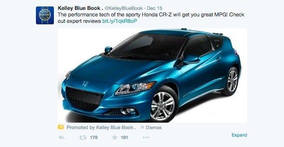
The KBB is a service that keeps track of the prices of various vehicles in various conditions, as an aid for those looking to purchase a new or used vehicle. When users click on the KBB site, they can browse categories of cars, specific vehicles within the category, and specific aspects of the vehicle to read about their quality and reviews.
KBB harvests this data, and will run targeted ads on Twitter and Facebook later, promoting specific concerns about specific vehicles to the users known to be interested in those specific topics.
2. Expedia
As one of many global travel agencies, Expedia wants to capture as much traffic as they can from those people looking for travel accommodations. Whenever you check their site, they’re recording information about your intent, including destination and time frame.
In particular, they like to retarget people looking for last-minute tickets, and will find deals to extend to those people. Do a little browsing and leave, and you’re fairly certain to see deals to your getaway show up on Facebook within the week. The only problem is, they might not necessarily be deals; you know what they say about marking up prices.
3. Hubspot
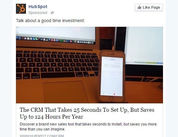
This remarketing ad reaches out on Facebook to users who have expressed interest in Hubspot, and it assumes some baseline level of knowledge of their product already. They’re skipping the introduction and the logo in your face, and they’re putting a value proposition front and center.
You can also tell that it’s an ad that’s been going around for a while, because it has hundreds of comments and shares, while their usual organic posts have been hovering at under 100 reactions and only a half dozen or so comments and shares. Hubspot are marketing folk, they wouldn’t keep that ad alive if it didn’t work.
4. SpecSavers
A company that does eye tests and sells glasses produces an ad targeted at people who are looking at getting an eye test. It’s a good ad, but the contest from the source of this ad is pretty telling. The user who experienced the ad called and booked an appointment, but the ad stuck around. It shows a disconnect internally between lines of communication.
If you’re going to use remarketing ads, make sure to actually remove converted users from the list, regardless of how they converted. You can add them to another customer list, fine, just don’t show them redundant ads. It’s a waste of good budget.
5. Confused
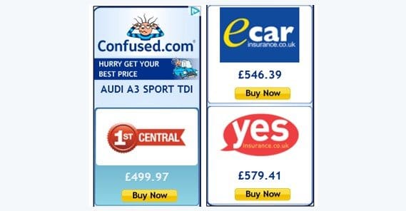
Confused.com is an auto insurance aggregator, an agent that will contact various insurance providers and will help you find the best deal for your vehicle and your insurance needs. This ad is one example of their dynamic retargeting.
When you visit and put in your information to get quotes, they go out and get them, even if you don’t take the time to view them right away. The retargeted ad will start showing up on other sites and social networks, showing your top three quotes from their network of providers. If one of them proves to be the best deal you’ve seen, it’s just one click to go get it for yourself.
6. Best Buy
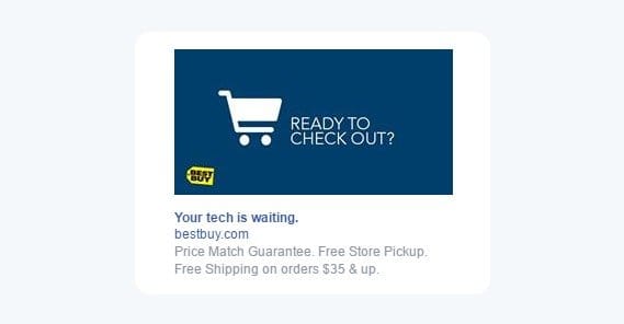
This ad is a very typical example of what a cart abandonment ad might look like. Go to best buy and shop around, find something you like, and add it to your cart. Leave, and you’ll start to see this ad pop up for a while, as long as they think you might still want to buy the product.
It’s not personalized, it doesn’t trigger based on specific types of items or anything, it’s just a very generic reminder that you were interested in buying something and that it’s still there waiting for you to purchase.
7. Best Buy #2
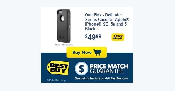
This is another example from the electronics shop, and it’s proof that you don’t have to stop retargeting when the user converts. In this scenario, the user bought a cell phone from the website, and with a cell phone comes the desire to protect it.
OtterBox is a leading protective case for phones, and Best Buy started running this ad to sell one to the person who just bought the phone. The ad is a little busy, with logos and information all over the place, but the price match guarantee does make it more attractive when this ad competes with something from Amazon or what have you.
8. Ted Baker
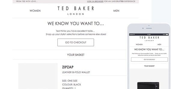
Another fashion store, this one cleans up abandoned carts within an hour in a lot of cases. Put something in your cart and, within an hour, they’ll send you an email reminding you that you have something in your cart.
If you haven’t made the purchase within a day, they’ll send a follow-up with your full cart information, so you can simply review and purchase from there if you want the item.
9. FatFace
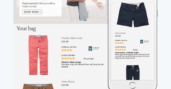
Another example of a remarketing email, this time from a company that knows how important reviews are to the conversion process.
Rather than put the conversion action front and center, they front-load the reviews. If you’re on the edge about making a purchase, and you’re not sure about the quality of the item, the reviews should sway you more towards making the purchase than not.
10. Handy
Handy is a cleaning agency that will come to your home and give it a solid once-over. The graphic design of their ad is simple and clean – with white being the symbol of cleanliness in a home – and it’s clear from the copy that this ad is only available to people who have visited, expressed interest, but not contracted them before.
It’s explicitly for first-time customers. It’s a good deal, too, which makes it very enticing for those who want someone to come and tidy up for them.
11. Altitude Sports
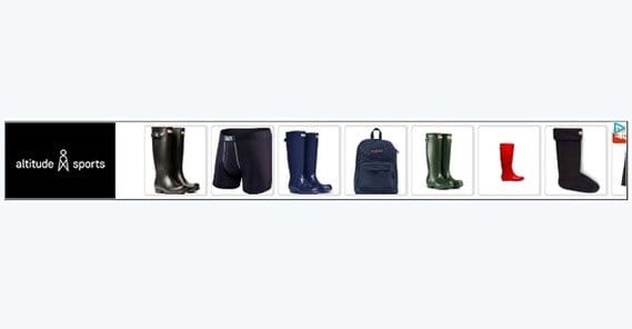
Altitude is a sporting goods store with a variety of items for an active lifestyle. This particular ad was targeted at someone known to be a frequent shoe shopper. The ad is noteworthy in that half of the images it uses are images of a particular style of boot the user was looking for.
The two downsides with the ad are that the product images are generally inconsistent in quality and variety. It’s basically the same thing in three different colors, and some filler to make the ad look a little less targeted. At the same time, it’s just some boring black-on-white product images with a logo in the corner, which isn’t very creative. Still, it’s a reminder of the product, which is often all it takes to earn the conversion.
12. ShopBop
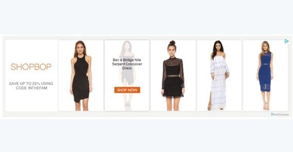
One of a million online clothing stores, this ad is very similar to the sports ad above, but it works much better. For one thing, it uses dynamic product selection for the ad – something some advertisers are experimenting with – to show the viewer exactly the products they were looking at.
For another thing, the images are more uniform and attractive. Then there’s the deal, a code for the user to get a discount that can tip them over the edge from window shopper to actual shopper.
13. WatchFinder
This British watch seller created a dozen or so of these ads and took advantage of both known interest and geolocation to advertise to entire demographics.
They identified that traffic from the London financial district was visiting fairly often, so they made a series of ads to attract those sorts of high-roller users and sell them pricey, gaudy watches. It worked well.
14. Amazon
No image for this one, because anyone with an Amazon account can just check their email to see it in action. Mine is particularly amusing, because I click on all sorts of products in the course of research for various clients that my recommendations are all over the place. Every time I see a product, Amazon thinks I want it, and it will remind me that it’s still for sale next week. Sometimes it even works, when it’s a product I actually want and I see a good deal. Amazon is the prototypical remarketing master, and they know you’re going to buy eventually.
15. Freshdesk
Freshdesk is one of many options for a helpdesk and ticketing system for businesses. This ad, unfortunately, doesn’t really have anything to make it stand out as remarketing.
It’s a basic ad and it’s a generic deal with a 30-day trial that is likely standard for anyone signing up. The only thing that makes it a retargeting ad is the fact that it’s shown only to people who have gone out searching for a new helpdesk system, have investigated the Freshdesk website, and have left without signing up for the free trial. It’s a reminder, albeit a generic one, that their service exists and can be used for free for a
 ContentPowered.com








Thank you for the succinct definition of retargeting on Facebook! Loved this post and included your definition in my recent blog on the fundamentals of writing Facebook retargeting ads. – Monica @ ScriptDoll