60 Things You Can Do to Increase Website Signups
 ContentPowered.com
Your email capture form is the first step in a long process leading from new reader to satisfied customer. The more people you can get reading your newsletter, the more people you have to market to, and the more people you can get to buy your product. Fortunately, you can do a lot to increase the number of signups you get in a million different ways. While I don’t have space to tell you all million, I’ll at least give you a list to work with.
Not all of these will work for you. In fact, many of them won’t. They’re just ideas to get you started, and they’re changes you can test. Testing is the key to any change you make, no matter how large or small. Don’t go all in on an untested change, unless you like gambling with your conversion rate at stake.
- Minimize distractions from your call to action. Consider that every link that leads away from your landing page is a potential lost conversion. This is why some websites go absolutely minimal on their landing pages and home pages; it boosts focus on the opt-in and sign up process.
- Increase contrast to make your CTA stand out. It might be images or font colors, it might be graphics, it might be a video; in any case, you want your call to action to stand out from the rest of the page so people know where to click and what to do.
- Test different positions, colors and phrasing for your CTA. Does your landing page work better with your CTA to the left or the right? Should it be at the top of the page or the bottom? Should it be red, green, blue, or another color? Test all these variations to find out what works best.
- Use more personal language for your CTA. It’s surprising how much changing one simple word in your call to action can affect your conversion rates. You can even try reverse psychology and tell people not to click if they want to keep their poor current service.
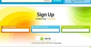
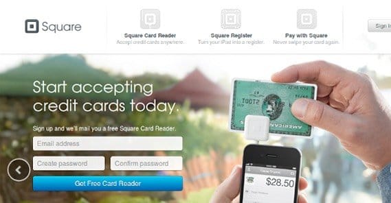
- Minimize the number of fields in your opt-in form. Users prefer to put as little information in as possible; preferably only an email. The less you ask for, the less you get, but the more often you’ll get it.

- Use a two-step opt-in form. These essentially trick users into starting the conversion process with a simple email harvest, and then go on to ask for more information. Most users shrug and, since they already started, decide they might as well finish.
- Make your opt-in form visible anywhere on your landing page. This is primarily for landing pages that have a ton of detail and scroll down. Either use a sliding opt-in that follows the user, or have links and buttons spaced to be visible at any point down the page.
- Harvest extra data when a user opts in. You can use hidden tracking code to pull information like browser version and geolocation when a user submits a form, without their knowledge. For some businesses, this is useful for segmenting new users.
- Offer a guarantee that you’re not selling user data. All it takes is a “100% spam free, your data is safe with us” line to make you seem a heck of a lot more trustworthy. Users who trust are users who convert.
- Offer a product satisfaction guarantee. A satisfaction guarantee, either in the form of a free trial or a money-back guarantee, helps users feel more confident with giving your product a try. They know there’s no risk if they decide they don’t like it.
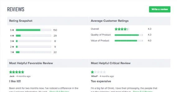
- Use user testimonials for social proof. Social proof is surprisingly valuable, and user testimonials are easy to write or to gather. It works best if you manage to get glowing praise from prominent industry influencers.
- Use company logos of trusted brand clients for social proof. If you work on a B2B model, using the logos of prominent businesses gives you social credit that you can leverage to get more customers. If it’s good enough for them, it has to be good!
- Use an exit intent script to capture bounce leads. These scripts are engineered only to appear when the user is leaving, so you don’t interrupt or aggravate them with a pop-up mid content. They can be highly effective, more so than you might think.
- Use a screen scroll script to pop a notification CTA. A lot of pages, like Hubspot and Buffer, use corner scrollers that pop up only when the user has scrolled far enough down a page. These aren’t disruptive because they don’t block the content on the page, but they do capture attention.
- Consider offering a free product as incentive. One of the most common offers is a copy of an ebook for an opt-in, though you can do anything from a free trial to a bonus product as a bonus for first time registrations.
- Create a referral program with achievements. Referral programs are great, but they’re even better when you don’t have to give anything away. Achievements are a popular way to make a game out of growth, encouraging users to become brand advocates in exchange for fame in a venue that doesn’t matter in the long run.
- Create a referral program with earnable rewards. Of course, you can always go with a traditional referral program, either with a basic monetary bonus or free subscription time for referrers, or with special products and prizes for converting referrals.
- Use time-sensitive coupons or deals for returning readers. One thing you can do with modal windows and pop-up scripts is use cookies to track returning but non-converting users. When they arrive, give them an exclusive offer to entice them to convert.
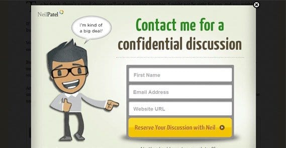
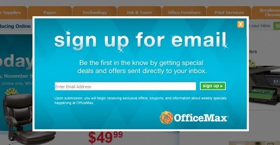
- Use a modal window for your opt-in form. By putting your opt-in form in an on-screen lightbox, you make it easier for users to convert without disrupting what they’re doing already. You also don’t take up valuable page space with a bulky form.
- Integrate opt-ins with blog commenting. Most blog comments already require an email for anti-spam verification and to contact commenters if you want their attention. Why not add a check box there to opt in to your mailing list? You can also make it checked by default, so unwary users will opt in without realizing.
- Send a multi-part follow up email campaign to new signups. These welcome campaigns should be geared towards front-loading value for new users, as well as giving them a reason to keep engaged with your newsletter so they assign more value and priority to future messages from your brand.
- Follow up an opt-in with immediate value. Whether this is a free product claim, an immediate coupon code, or a specialized monthly digest of valuable content, it’s up to you. Either way, you’re going to want to reward users immediately upon completing their opt-in. Even better if you can do it without sending them to their inbox – and thus off-site – first.
- Make sure visitors know what they get by opting in. This is the value proposition. Make sure that any user visiting your landing page knows what they get, both immediately and in the long term, when they opt in to your mailing list or sign up for your service.
- Create a simple opt-in app for Facebook. Facebook apps are basically just self-contained landing pages viewed through a frame in Facebook’s window, so it’s easy enough to make a completely customized and trackable opt-in form through the social network. You can then use Facebook ads for app engagement to promote opt-ins.
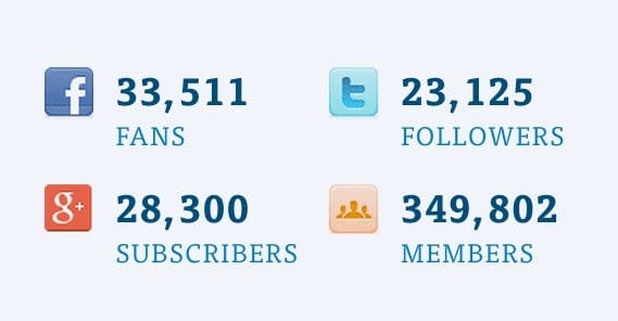
- Use a subscriber number as social proof once it’s high enough. You don’t want to tell people they can join your cool new mailing list with a whole 328 subscribers; that’s not a very compelling number. However, saying “join our growing audience of 100,000+” is a heck of a lot more compelling.
 How to Increase Your Landing Page Conversion Rates Your organic SEO drives people to more…

- Run a contest and require an opt-in to enter. You can’t like-gate content on Facebook these days, but you can opt-in-gate content on your website. No one can stop you. You have the power. You have the technology. You can rebuild your mailing list.
- Offer additional entries for contests for other beneficial actions. There are services that run an app for cross-social contests, I’ve seen at least two. They allow you to enter in a variety of ways, from retweeting to signing up for a mailing list to joining a Steam group; anything verifiable. Contests run with these encourage a lot of engagement and registration.
- Host exclusive giveaways for subscribers only. This comes as a beneficial surprise to those who have opted in; exclusive content, giveaways, and other free stuff makes them feel good about subscribing. Sure, anyone can opt in to get the stuff, but they were there and got it automatically.
- Analyze why users are visiting and cater to them with your CTA. This comes down to visitor intent. Some people want to buy, some people want to explore and learn more, and some just want your free stuff. Tailor your CTA and your landing page to the user intent whenever possible.
- Enroll customers in your newsletter on purchase. It’s really easy to require an email when making a purchase, and by opting in users to a special mailing list at the time of purchase, you can follow up with guides, tutorials, support links and testimonial requests.
- Give your newsletter an interesting name. “The Business Newsletter” isn’t very compelling. You’d be better off naming it something neat, like IndustrySpin or BusinessDigest, where Industry and Business are the names of your industry and business, respectively.
- Make sure subscribers know how often you’ll send messages. Users don’t want to sign up for a mailing list only to get one sporadic message every three months. They forget and then the message confuses them. They also don’t want to register for what they thought was a weekly letter only to get messages daily. Make sure you set their expectations, and then meet them.
- When in doubt, add more opportunities to opt in. Some companies have had very good success in boosting their conversions by adding more buttons, even on the same page. Buffer has a study about using multiple methods on the same page, including a top banner, a slide up notification, a homepage opt-in and other locations.
- Run ads on Facebook with an opt-in conversion objective. You’ll need to use the Facebook tracking pixel on a confirmation page to get this to work, but Facebook ads are cheap and funnel a lot of traffic to pages of your choice, making them ideal for starting a funnel.
- Test different styles for your pops and modal windows. A small plain box with a form, a larger graphical postcard, a quirky modal window sliding in from the side; you can do just about anything with modal code, so experiment to find what works.
- Test different language and format for email messages. Some businesses attract more casual audiences than others. Adjust your language and your layout to suit the atmosphere of your company and the attitude of your audience.
- Provide as much value as you can in your newsletters. The more worthwhile it is for a user to open your message, the better your open rates will be, and the more satisfied people will be about the messages you send. If you’re just posting a few blog links and a short message, people will wonder why they haven’t hit the unsubscribe link sooner.

- Manage your subscriber list with a professional tool. Aweber is great, Mailchimp is great, there are a ton of great programs out there. Some have more features than others, but I’m not going to tell you which one is objectively the best. Figure out what features you need to manage your business lists and go for the program that does that feature well.
- Promote opt-ins indirectly through other industry blogs. If you’re lucky, some blogs will be up for a mutually beneficial partnership. This is particularly useful when running contests sponsored by multiple businesses; you can share the mailing list results.
- Minimize outside ads to promote your own content. No one likes a site plastered with a dozen ads, least of all Google. If you’re going to promote your own content, you’re going to need to cut back or eliminate outside advertising, just to make sure people are focused on the right thing at the right time.
- Publish and promote more content to entice users with value. This is one of the core principles of content marketing; every piece of content is an opportunity. More content means more views of pages, which means more places for your call to action, which means more people signing up.
- Consider gating your opt-in behind an explainer video. Quicksprout mentions a site, Kimberly Snyder’s, that used an opt-in that didn’t appear until after an unskippable video played through. With a video of significant length, it was quite a surprise when it boosted conversions by a significant amount. Whether this is attributed to the wait or to the video’s value, though, I don’t know.
- Create a progress bar for longer opt-in processes. This is particularly useful if your registration process is lengthy but unavoidable. Make sure users know how far they are in the process, either through a progress bar or a “step 1 of 4” message at the top of each page.
- Add opt-ins to videos you create. This is particularly valuable through YouTube, where you can match a video message to an annotation link and a link in the description to your opt-in form. It’s like packing several links and CTAs in one.

- Add opt-ins to off-site content like slideshows. Anywhere you can post content that isn’t regulated by an editor is a place you can use a call to action. The end of a Slideshare, embedded in an infographic, these are just a few of the options available to you.
- Fill white space with guiding graphics. White space on a landing page can be filled with graphics, even if it’s as easy as some simple arrows pointing towards the CTA button. Unless you’re being very careful with your design, white space often tends to be wasted space.
- Limit availability to make registration more exclusive. If you’re only open for new registrations for a limited time, or you only sell your product for a limited time, it makes it seem extremely exclusive. This holds true even if you’re just selling software and have no actual limitations on how many copies you can send out.
- Give users invitations to get others to register. Ello, a social network that recently came to prominence, did so by limiting registrations to only those with invites. Google Plus did the same thing. You can do it too; just make sure you send out additional invites to people who run out; they’re active recruiters, and you don’t want to limit them.
- Make a comparison between your product and the competition. Kissmetrics is an analytics suite that is comparable to Google Analytics, so they compare themselves to Google’s product. You can do the same with your competition; explain what they have, and why what you have is complimentary or better.
- Use intriguing headlines to get people to keep reading. This is especially useful for multiple-page registration processes or landing pages in a funnel. Readers naturally go from one section to the next, one page to the next, and they look for continuity. Give them that continuity by letting your headlines flow.
- Test using the word “free” in CTAs. Avoid using it in email CTAs, because it’s a word that triggers spam filters. For landing page CTAs, however, it can be surprisingly effective. I’m not saying make your product free; I’m just saying use the word somewhere and see if it triggers the appropriate good feelings to boost your conversion rate.
- Display an interactive demo instead of screenshots of your product. Some products and services are complex enough that screenshots and text don’t explain them well enough. If possible, mock up a demo to show users just what they’d be getting into if they chose to adopt your product or opt in to your service.
- Ask users why they aren’t immediately opting in. This is where one of those sliders at the bottom corner comes in handy. If a user takes too long or scrolls too far, they might be on the fence about opting in. By popping up a window that asks them what’s stopping them, you can convince them to opt in right then, or you get a bit of feedback telling you what’s blocking your conversion funnel.
- Test the difference between a money back guarantee and a free trial. One is a time limited offer, the other is full paid service with the possibility of a refund. Different businesses operate in different ways, and sometimes your audience will prefer one method over the other.
- Test different lengths for free trials. Which is more effective for your site; a 14 day trial, a 30 day trial, or a 90 day trial? If you’re not sure, go ahead and run some tests to find out.
- Estimate the value of your free offers and promote that value. If you’ve ever seen a late night infomercial, you see “you’ll get X, Y and Z, valued at $300, for just $29.99.” This makes you feel like you’re getting a steep discount. You can use the same technique for your own sales.
- Promote your opt-in with offline advertising. Anything from a business card to a newspaper ad to a sticker on your laptop while you work in a coffee shop; they can all be additional methods of getting people interested.
- Test between minimal landing pages and lengthy, detailed pages. Some businesses, like Dropbox, find a minimalist approach works very well. Others find that a lengthy, detailed landing page that answers every possible question a user has work better. Find out which one works best for your business.
- Eliminate any link from your landing page that’s not an opt-in. Even links to FAQs, homepages, and blog entries are distractions. Do away with them to focus your funnel.
- Allow customers to segment themselves if possible. In an opt-in, you can have options for different levels of commitment, or any other segment you want to use. Let users sort themselves and you don’t have to do it later.
Written by James Parsons